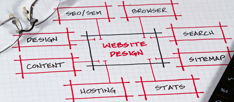
Design is a crucial part of web development; it has been so for so many years. The technologies that surround web design have also evolved these past few years, allowing designers to push their web designs further than ever. We now have animated and interactive elements built entirely using HTML5 and CSS3, something that wasn’t possible not too long ago.
When creating a website, the design of it is one of the most important factors to focus your energy on; even more so with the internet filled with millions of other websites competing for the same audience segment. Here are three main reasons why design is important when creating a website.
Design Dictates User Experience
User experience or UX is the main commodity of the World Wide Web today. Users have more websites to choose from and they have the tendency of going for websites with good UX. You can’t expect to succeed in a competitive market with a plainly designed website that delivers bad UX from the start.
The best web designers are good at finding a balance between aesthetics and functionality. Instead of flooding the site with animations or visual elements, they cherry-pick the best elements with the single purpose of making users feel at home when browsing through the site. Consistency, navigational elements, and the way content is delivered on every page are fine-tuned to perfection.
This is the approach to take when designing for user experience. A site can feel more fluid and pleasant to browse through with the help of good web design.
Design Has Psychological Effects
It is difficult to deny the psychological effects of good design, especially in web design. Those who are pursuing an online masters computer science degree at top universities such as New Jersey Institute of Technology are learning more about how colors, accents, and other design elements can persuade visitors to interact with the site.
When trying to persuade potential customers to finalize their purchase decisions, for instance, a strong call to action set on a blue or yellow background – plus a big button for visitors to notice instantly – is known to be very effective. This is good design combined with statistics, something that many masters in computer science online programs are beginning to take seriously.
Good Design Delivers the Right Message
Lastly, it is also worth noting that the visual elements used in a website send messages just as effectively as the site’s content. Pay attention to the websites of top companies and you will notice this almost immediately.
Tech companies tend to use blue as the dominant color. Companies whose operations are in the F&B industry tend to lean towards yellow or red, while hospitality companies often use blue, green, and orange to convey the right messages. These details deliver a certain feel to site visitors and they can be fine-tuned to better represent your brand and its key messages.
Not taking advantage of these visual instruments when developing a website would be such a waste of opportunity. Through good design – and by taking web design more seriously – you can develop a site that suits your target visitors as well as your brand perfectly.

