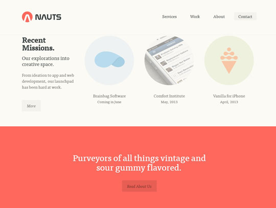
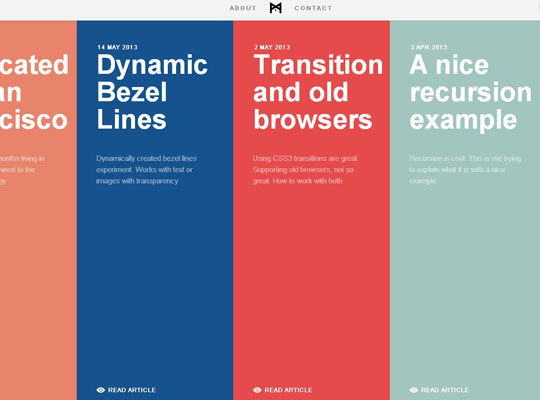
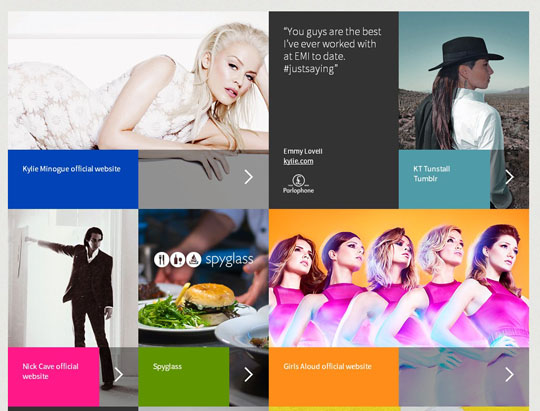
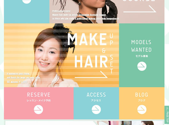
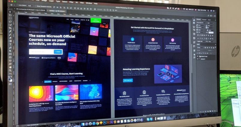
Flat design is a newish term for both print design, web design and mobile operating system design. Flat web design refers to a design form that does away with busy-looking patterned textured backgrounds, drop shadows around lettering and boxed sections within a web site. Google was one of the first to overhaul their suite of web apps using flat web design principles and many other sites have now followed suit as well.
This type of appearance creates a very clean looking WordPress theme and html-based template. As the pixel density and image quality from LED LCD monitors, tablets and smartphones has increased, shadows and other techniques used partly to make details stand out on small displays or low resolution displays, are no longer needed. As a result, non-flat designs are slowly being dropped in styling decisions, in favor of simpler, cleaner looking, more colorful designs.
Beyond flat web design, operating system GUI designers from Microsoft with the Windows Phone to Apple with their upcoming iOS 7 which is rumored to be currently making the switch to a flatter appearance.
Flat design looks set only to grow over the coming months as more design clients catch on to the new look they see on web sites and in apps, and request it for their next web site redesign project.
You may also take a look at our past website collections;
- Gorgeous Examples of Parallax Scrolling in Web Navigation
- 30 Great Examples of Web Design Sketches
- 21 Beautiful Website Designs With Large Landscape Photos
MapBox
 Visit MapBox
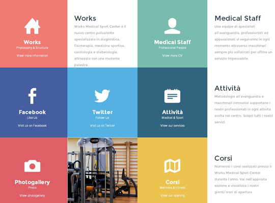
Works Medical
GidMotion
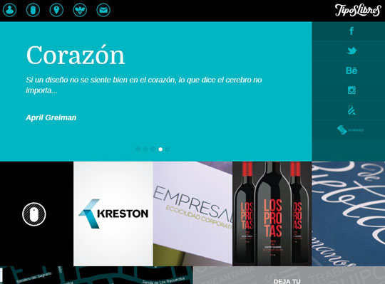
Tipos Libres
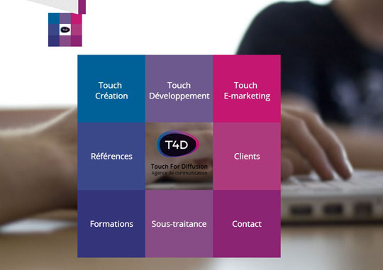
Touch For Diffusion
VK
Portably
Tequilla
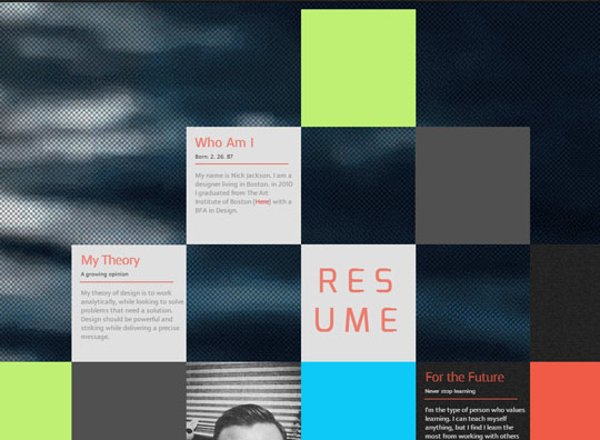
Nicholas Jackson Design
Global Compact
Moddit
Blind Alterations
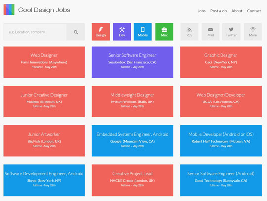
Cool Design Jobs
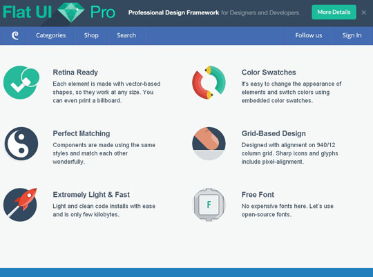
Flat UI Pro
Nineswiss
Kyle Thacker
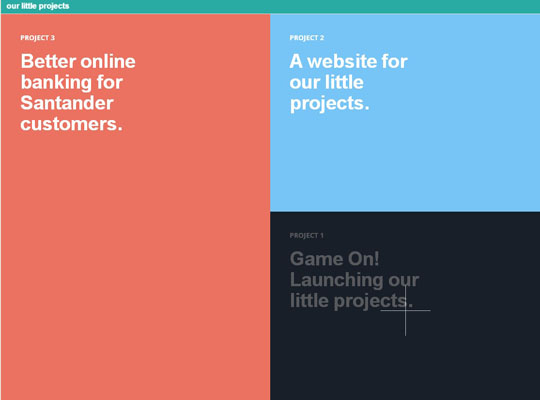
Our Little Projects
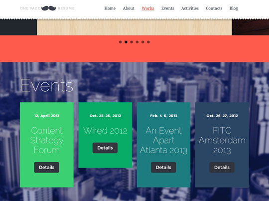
Mustache
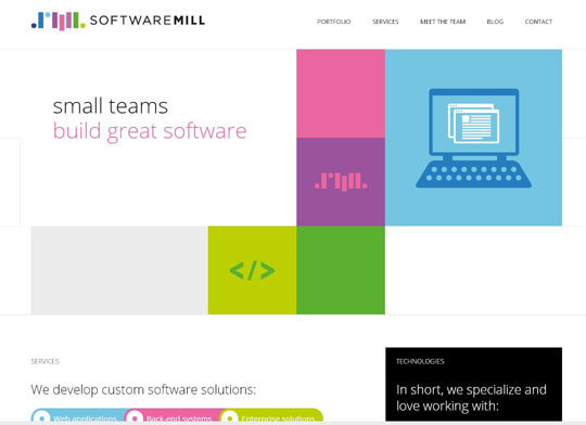
SoftwareMill
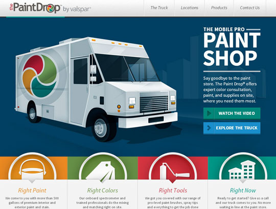
The Paint Drop
Tiny Big Studio
Appstronauts
Big Data Mornings
Involvio
Wistia
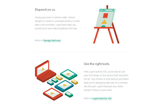
LayerVault
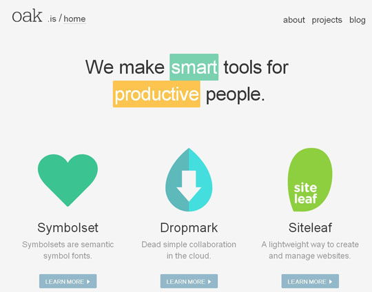
Oak
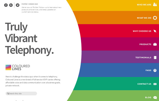
Coloured Lines
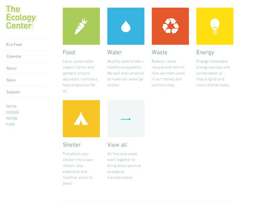
The Ecology Center
Etch
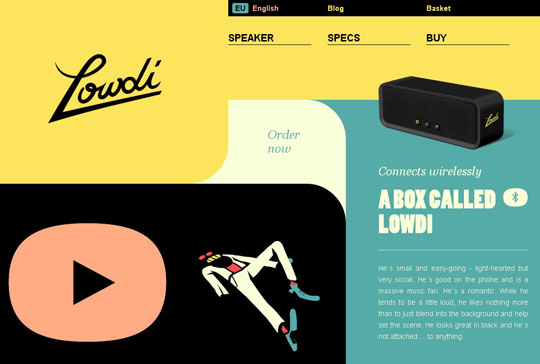
Lowdi
Fhoke
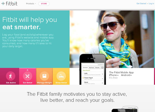
Fitbit
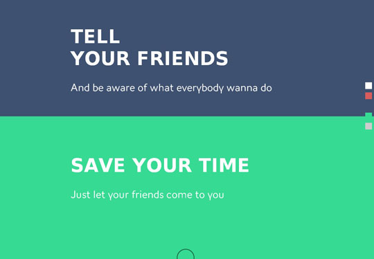
Who Wanna
SpellTower

Minimal Monkey
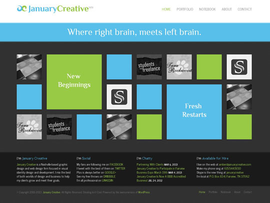
January Creative
Neue Yorke
Palace
Invoisse
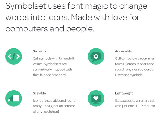
Symbolset
Very-Make

