

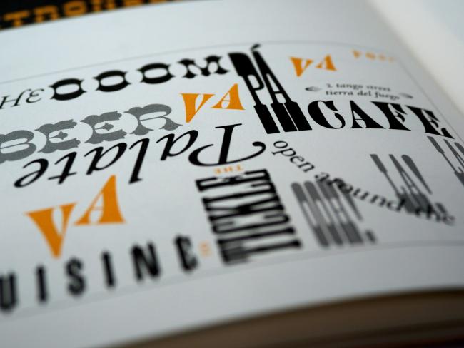
In visual communication, typefaces are not just aesthetic choices. They contribute to how messages are conveyed and perceived.
The power of compelling typefaces can transform simple messages into enticing and persuasive narratives. They can also foster an emotional connection with your audience.
However, the typeface selection process can be complex. Just because a typeface is visually pleasing doesn’t mean it’s appropriate for your project.
Additionally, you must understand how to use typefaces to amplify your messaging and make your design pop.
In this guide, we’ll outline the best practices for choosing the appropriate typefaces for your projects. First, let’s discuss the difference between typefaces, typography, and fonts.
The Difference Between Typefaces, Typography, and Fonts
Many people often use the terms typeface, typography, and font interchangeably. While they are essential components of graphic design, they have different meanings.
Understanding the distinction between these terms will help you choose the most suitable typeface based on your project’s goals.
- Typefaces are design characteristics that give letters, numbers, and symbols their distinct styles.
- Typography is arranging text to make it clear, readable, legible, and visually compelling.
- Fonts are part of typefaces. They have various styles within a typeface family. For example, Arial Bold, Arial Regular, and Arial Italic are font styles under the Arial typeface.
Simply put, typefaces are what you see, and fonts are what you use.
Meanwhile, despite being discussed simultaneously, typeface selection isn’t necessarily part of typography.
Typography is more about arranging typefaces to ensure readability and legibility. This practice is paramount to building web applications, print advertising, mobile app development, packaging and merchandising, social media marketing, and other graphic design-related projects.
Best Practices for Typeface Selection
Here are the best practices to observe when choosing typefaces for your design projects.
Determine your project’s scope by creating a project list
The project’s scope is the first thing you must consider. For instance, the typefaces for limited projects, like slide decks, don’t need to be as flexible as the ones for your brand’s visual presence.
It’s also best to determine whether you’ll use the typeface only for digital projects, in print, or both. At the same time, considering the usage time frame—limited time or indefinitely—will help you define how responsive your typeface should be. Can it withstand the rapidly changing trends, or is it best for short-term projects?
As such, outlining your potential projects will help you establish the scope, enabling a more targeted typeface selection process.
Identify the mood to ensure an experience-driven design
Every project requires a mood, which is the core of experience-driven design.
Mood is considered crucial in design for two reasons: dynamic user profiling and its impact on well-being.
Dynamic user profiling refers to mood-stimulated thoughts and actions. This approach can enhance traditional profiling methods like persona and usage activities. For instance, you can use a mood-driven design to improve user experience.
On the other hand, the impact of moods on well-being has sparked design innovations that alleviate negative feelings and amplify positive ones.
Whether your project’s mood is formal, informal, fun, serious, modern, or classic, it should evoke the appropriate emotions. Identifying the mood will help you align your chosen typefaces with the vision and avoid clashing designs.
Are you considering Comic Sans for your legal website? You should rethink that because font styles under this typeface evoke informal moods. Thus, typefaces like Helvetica and Crimson Text would be better for this project.
Research for inspirations or references
You can start researching inspirations once you know your project’s scope and mood. This step will help you mix and match existing designs or develop a suitable one for your vision.
Magazines, graphic design blogs, and websites like Pinterest can provide a broad range of design insights. You can also browse graphic design influencers and brands for direct references or advice.
Let’s say you’re working on a poster design to promote an event. On Pinterest, you can search for a specific keyword like bold or minimalist poster design. The site will then generate image results showcasing different designs and typefaces that could match your goals.
Consider the typeface’s function and performance in different sizes and contexts
Not all typefaces are readable and visually appealing in every size. Typefaces that are aesthetic in larger sizes may become illegible in smaller ones and vice versa.
However, some typefaces can function and perform well in any size. It’s best to test your chosen typefaces to see how they affect the project’s overall design.
One way to test a typeface is by creating mock-ups in various sizes and contexts. If designing a website, apply the typeface to sample headlines, body texts, and buttons. Then, view the mock-ups on different devices and screen resolutions to evaluate legibility and visual impact.
Maximize usability with versatile typefaces for multiple projects
Some typefaces for web design may not translate well in print and vice versa. If you’ll only use the typeface for a single project, it’s best to focus on one functionality to maximize elements and font styles.
But for multiple projects, you must ensure the typefaces work in every medium.
For example, a project about establishing brand identity across digital and print platforms—like a website, business cards, social media profiles, product packaging, and marketing brochures—requires a typeface that maintains readability and messaging.
Align the typeface with your project’s target message
The wrong typeface can derail the message you’re trying to convey. If the message is formal, the typeface should be traditional. The same goes for casual and fun messages.
The appropriate typefaces have suitable personalities to amplify your project’s message. Thus, it’s best to consider the following characteristics that contribute to a typeface’s overall impression:
- Length
- Roundness
- Weight
- Movement
Testing is also essential to ensure the typeface aligns with your message.
This test involves applying your typeface choices to the text of your message. You can also create mood boards with other visual elements like colors, images, and layouts. Then, ask for feedback from your peers, friends, or family.
Pay attention to the perceptions regarding the typeface’s personality and how well it communicates your message’s mood and tone. This process will help you gauge if the typeface reinforces or weakens the message you wish to convey.
Perform readability tests on multiple platforms
Readability and legibility aren’t the same.
Readability refers to how easy it is to read words, while legibility shows how easy it is to recognize letters within typefaces.
If your typeface isn’t readable, people will struggle to read and understand your message, no matter how well-designed the content may be.
Spacing, size, and weight can also impact the typeface’s readability. For instance, some font styles that look good at 18 pixels may be illegible at 10 pixels.
To ensure readability, perform a readability test across digital and print materials. Based on these assessments, adjust the sizes, weight, and line spacing to find the optimal settings that maintain readability across platforms.
Pick the appropriate font style
The three font styles include serif, sans serif, and display.
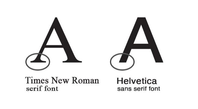
Serif
Serif fonts have small lines attached to the end of their strokes, often called “feet.” They are more formal and traditional, typically used in magazines, books, and newspapers.
Times New Roman is the most common typeface with serifs.
Sans Serif
“Sans” is the French word for “without.” It means that sans-serif fonts don’t have serifs at the bottom of the letters. They are instead more bold and modern. Arial and Helvetica are among the most popular sans-serif typefaces.
Both serif and sans serif can work well in any medium.
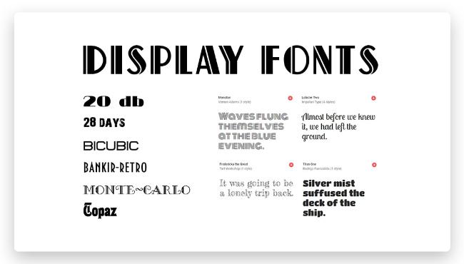
Display
Display fonts have decorative elements that can be scripts and monotypes that add character to designs. However, you should avoid using them for body texts and long paragraphs because they can be challenging to read.
Display fonts are best on titles, headlines, and short text blocks.
Review the licensing or copyright requirements
While many typefaces have general licenses that allow use for any situation, some only allow use for one or two mediums.
For instance, you can use a typeface for personal use or promotional materials but not for sold products. So, you must review the licensing requirements to understand a typeface’s imposed limitations and prevent copyright violations.
Experiment with different font styles to find the right combinations
Not all fonts complement each other. Some are neutral enough that you can pair them with various styles. Meanwhile, others are particularly unique, limiting the combinations.
Fortunately, both have advantages:
- Limited combinations can make designing faster.
- More options mean more flexibility and versatility.
Ultimately, combining typefaces and their font styles is the art and science of experimentation you must master to create the best arrangements and patterns.
Elevate Your Project’s Design Impact With Strategic Typeface Selection
Your typeface choices can make or break your project’s design. By implementing the tips above, you can elevate your design’s visual impact, ensuring it resonates with your audience and stands out in a saturated marketplace, professional, or casual setting.

")


