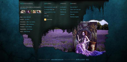
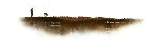
A footer in terms of web pages is the text that appears at the bottom of the page and which traditionally contains the information like the author of the document, copyright information, links to terms of use, contact information, etc. Different website owners choose to display different types of information in the footer. Some people use it to only display the copyright sign and year while some others use it so as to contain a list of links to other pages of the website or links to the site’s social media profiles. No matter what you want to do with your footer, you can always do it with style.
The traditional view about the footer is that it is the most unimportant element of the website because very few readers will scroll all the way down to find what is contained there. Therefore many designers choose not to work on their footer properly. Well you can use this very fact to attract visitors. If you design your footer with all beauty and charm your visitors will be surprised by what they see as they are not used to seeing it on other websites.
Who says your footer should merely be a text in black and white? Below I show you 45 creative ways to design your site’s footer. These are intended for your inspiration and I hope these will help you design your site’s footer beautifully.
You may also take a look at our past website collections;
- Showcase of Websites Using Hexagons
- 25 New Examples of Beautiful Minimalist Websites
- Showcase of Websites Using Gradient Effect
Adventure World
 Visit Website
Bei Blog
Northern Music
K Digit
Kitaro10
Mc Clanahan Studio
Lignetreize
Made By Vadim
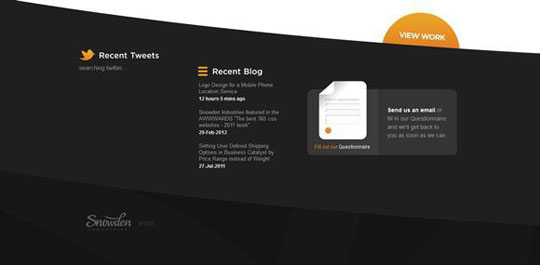
Snowden Industries
Zagreb Fever
Web4Biz
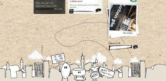
Urban Pie
Uforia
The Midnighters Club
Tap Bots
Dean Oakley
Grzegorz kozak
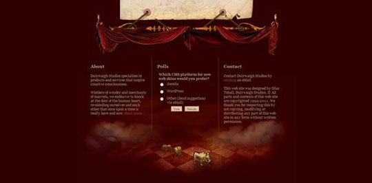
Duirwaigh
Curious Generation
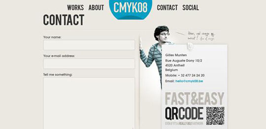
Cmyk08
Poogansporch
Productive Dreams
Nudges
Ready Made Designs
The Rissington Podcast
Twither
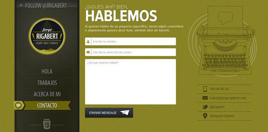
Jorge Rigabert
Launchmind
Meomi
Snail Bird
Allen Dickens
Steez
Groovy Web Design
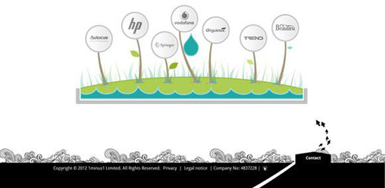
1Minus1
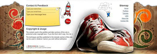
Mecannical
Gardener & Marks
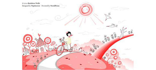
Rainbow Walk
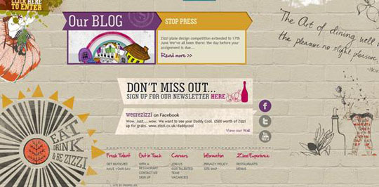
Zizzi
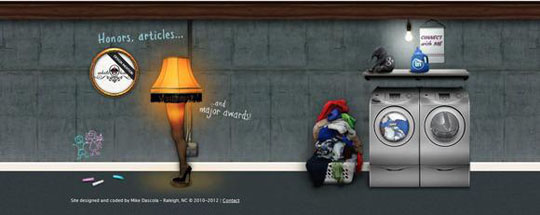
Michael Dascola

