In this article, we introduce you to the best hotel website designs of 2019 and explain how to create a design that draws the eye.
Hotel booking websites and services are becoming more and more popular. A hotel booking website must be attractive to visitors. If you’re about to create a hotel booking website, start by looking at these designs for inspiration.
You can also find exclusive island events in this below list of websites.
Today, we’ll look at the nine best hotel website designs and analyze their UI and UX solutions. All of these hotel websites have been nominated by Awwwards for the best hotel website design of 2019.
Phos Villas
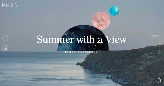 This website presents three unique holiday villas on the Greek island of Tinos, in the center of the Aegean archipelago. The Phos Villas website has simple user experience and a user-friendly interface.
The main UI attributes are moving planets mixed with views of Tinos. On the landing page, you can also find information about the island, hotels, and the services they provide.
Conscious Hotels
 Conscious Hotels is an eco-friendly hotel group with four locations in Amsterdam. These stylish hotels have unique interiors and styles but are all environmentally friendly.
The simple design of the Conscious Hotels website is different from our previous example. Apart from high-quality pictures of the hotels, you can find all the details you might want:
– List of hotels
– Information about green locations
– Booking form
– Events and showplaces in Amsterdam
– Information about Extra services
11 Mirrors

The website’s UI is full of warm browns that show a hotel is a comfortable place where you can relax the mind. On the landing page, you find a film about the concept of the hotel and information about the services they provide.
Hôtel Particulier Montmartre
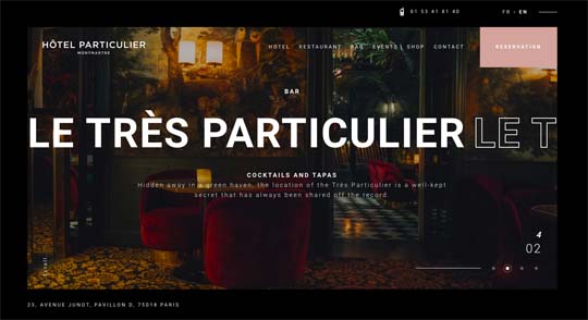 The Hotel Particulier Montmartre is one of the smallest hotels in Paris, with only five suites. Its unique features include a private garden, a French restaurant, and a cocktail bar.
What about their website design? When you enter the Hotel Particulier Montmartre website, you find a landing page that shows the private garden. You can also find information about all the services.
HOTEL MIRABEAU ZERMATT

The front page shows a view of the snowy mountains. You can click to cycle through images, and when you scroll down, you can find the general information about the hotel, rooms, and spa services.
Resplendent Ceylon
 Resplendent Ceylon’s collection of small luxury resorts offers the discriminating traveler a remarkable circuit across Sri Lanka with a range of authentic experiences.
The Resplendent Ceylon website is full of bright, rich colors and views of exotic hotels, beaches, and local sights. Visitors can compare resorts and choose the one they like. All of this information is illustrated with high-quality photos.
Hôtel du Phare
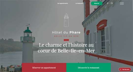 A French hotel and restaurant ideally located at the end of the Port de Sauzon, the Hôtel du Phare offers one of the most beautiful views of Belle-Île-en-Mer.
The main colors of the landing page are white, green, and red. These colors appear not only in the background photo but also in the buttons and other design elements. The landing provides basic information about the hotel, including unique features like the lighthouse.
Cap Rocat
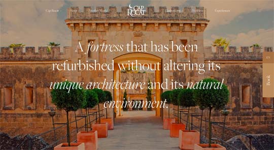 Cap Rocat is an ancient fortress located in the most secluded area of the Bay of Palma.
The design of this website shows the most unique feature of this hotel: the ancient fortress. The landing page is designed in a style that fits with the fortress theme, including italic fonts. Like all of the previous examples, the Cap Rocat website also shows the services the hotel provides.
Cheval Blanc
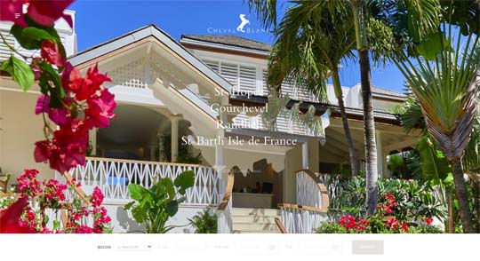 “Cheval Blanc was born from the desire to redefine the notion of hospitality experiences in rare and exceptional destinations.”
This website is not about showing a detailed description of the services the Cheval Blanc hotels provide. Its unique feature is the story of these hotels and their philosophy. Additionally, Cheval Blanc shows attractive pictures.
Things to keep in mind when designing a hotel booking website
Let’s have a look at the most important details and trends we can see in all the website designs we’ve looked at:
– High-quality background image
This is the first detail you notice on each website. It’s important to make a great first impression. Use rich colors and a picture showing a fine view.
– Hotel name and logo in the center
This is the second thing the visitor should notice after the background image.
– Smooth animations
When visitors scroll through your website, they should relax and enjoy the animations and pictures. This user experience is a must for a hotel booking website.
– Navigation bar
It’s important that the user can find everything they need in one click. You shouldn’t show them a 30-minute animated story about the hotel if they’re already there to book a suite.
These are the main points you should keep in mind to make a great design for a hotel booking website.
Good luck with your business. We hope this article will inspire you to make something great.


