Thousands of websites are being launched every day. In this scenario, your website needs to do everything and then some more to stay ahead of its competition. If this doesn’t happen, prepare yourself to see your customers prefer your competitor’s website over yours. This will lead to a loss of revenue and if this situation continues, your business might have to suffer from continuing losses.
To get noticed in this ever growing sea of websites, your website should be able to keep pace with the changing expectations and requirements of its target audience. A site that simply looks aesthetically appealing is not sufficient. You need to create a website that implements the latest design trends to attract today’s tech and trend savvy customers.
If you have an existing site that looks outdated, you need to redesign your site and make sure that it conforms to the latest trends.
Here are some of the trends you need to keep in mind while redesigning your site:
Build Responsive Website
 Responsive design is certainly not a trend, it’s a requirement. Responsive layout is in demand owing to the massive increase in the use of smartphones and tablets among consumers. Responsive web design will ensure your website adjusts to all screens irrespective of its size without compromising on its design features. RWD, thus, makes for an optimal experience for those browsing your website.
Chances are that your competitors aren’t making use of responsive layouts, which means they are losing out on potential customers. And, it is at this point where you can stay ahead and take those customers away.
Use the Minimalist Concept in Web Design
The current online trend in website design is the “less is more” approach, also known as design minimalism. Today, simplicity is the key, so make sure you create a simple feel around your website by incorporating a minimalist concept in your web design.
Minimalism is achieved by reducing a design to only the most essential elements and avoiding the use of over the top graphics and unrelated content. If you want your website visitors to choose your company over a competitor, it is essential that your website is easy to navigate and understand. The foundation of minimalist design rests on the very valid assumption that what people are looking for, from websites, is easy access to information. The easy convenience offered by minimalism gives your website the competitive edge.
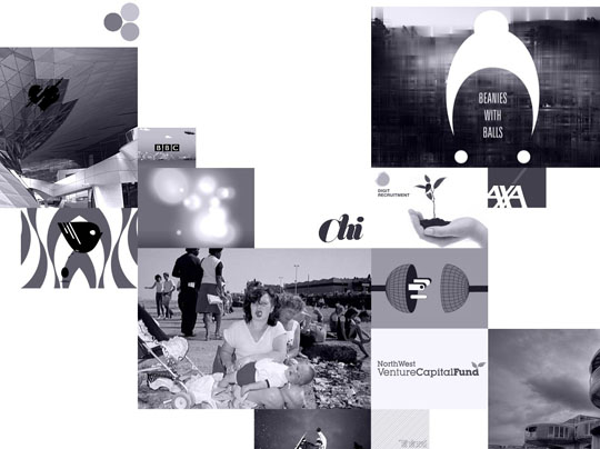
We Love Noise
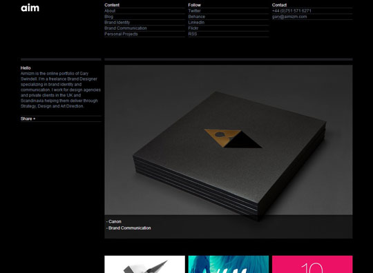
Aimizm
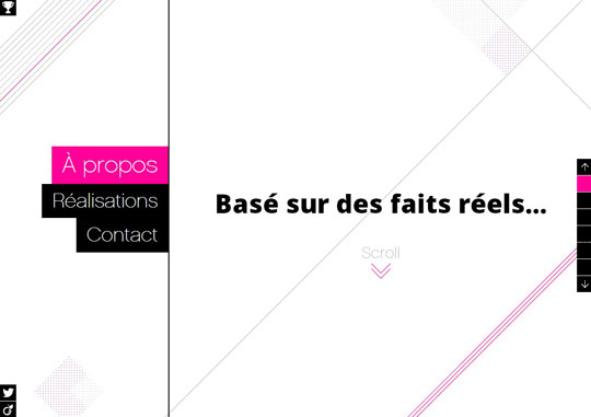
Gaston Bouchayer
Use Vertical Scrolling
Minimalistic website design is the hottest trend doing the rounds right now, but what if you’ve loads of information you want to share with visitors? You can’t use minimalism then!
Don’t worry, in that case create long web pages and use vertical scrolling. Vertical scrolling is another trending web design approach. As more and more people, use their mobile devices to surf the web, it’s important to create long webpages rather than designing pages horizontally. Vertical scrolling comes very handy when people are using their mobile devices. Such scrolling will allow them to scroll down with relative ease.
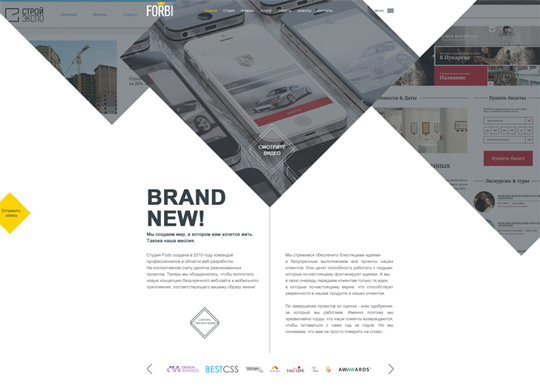
Forbi
The Colors of Motion
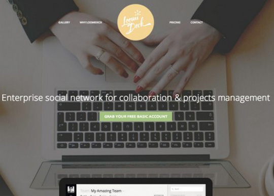
Loomideck
Use Fixed Header Bars
The trend of using fixed heading styles in web design has grown exponentially recently. Actually, the popularity of fixed headers has a lot to do with long scrolling. If you are using long web pages, it will be highly inconvenient for your visitors to scroll back up to use the navigation menu. By using fixed header bars, you allow your site visitors to browse freely, without moving upwards and downwards all the time.
By simply having the header fixed to the top of the screen, users can navigate deeper into your website without wasting time.
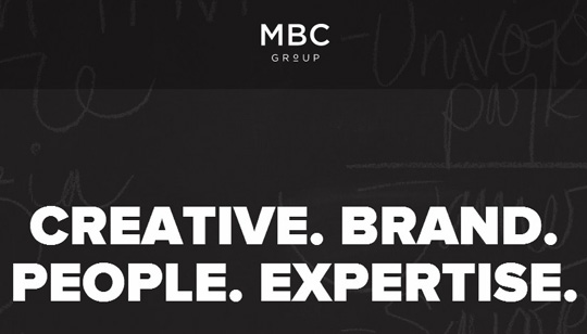
MBC Group
Use Right Typography
Typography occupies a major chunk of website real estate. Good typography can grab and retain the attention of users. With the emergence of large varieties of fonts, each promising better visual appeal and increased readability than the other, it is easy for designers to experiment with a collection of fonts they believe will enhance the design of their site.
Designers should find fonts that will not only add a touch of uniqueness to a website, but also earn the attention of its target audience. Readability and legibility are the primary reasons you should use typography in your designs.
The type of fonts that you use, the way you use them, colors and whitespace – all these factors will decide whether your design is a success or a failure.
Optimize Your Site for Search Engines
This is one of the best ways to stand out from the crowd. It is a given that all your competitors will have a website, but if your website ranks higher or appears above all others in a query from search engines, there will be a significant increase in your site traffic.

For this, it is necessary that your website be easily indexed by external search engines like Google, Yahoo and Bing. So, when you redesign, it is doubly important to keep SEO at the back of your mind to make sure your website is tremendously SEO friendly. This is basically done by using relevant keywords in your content and making sure that the website delivers a highly satisfying UX.
Avoid Using Hamburger Menu
A hamburger menu is a way to display navigation menu (three little lines in the top left hand or right hand corner of many websites). There have been several studies that suggest not using hamburger menus for your website as a menu that is buried behind the hamburger will be forgotten or used less. Hamburger buttons are less efficient, since you have to tap once before you’re even allowed to see the option you want.
Hiding your essential features behind an icon is a poor design choice. Hamburger button should rather be replaced by a tab bar or some other navigation scheme.(We will remove it in our next redesign)
Add Social Plugins
It’s very hard to keep pace with ever changing technology trends and make sure your website is updated all the time. But it needs to be done.
Embracing the trends mentioned in this article will make a big difference in your site traffic and help you stand out from the crowd.


