Herb Lubalin (March 17, 1918 – May 24, 1981) is universally considered one of the greatest and most influential figures in the history of graphic design, typography, and art direction. He is remembered for his expressive and bold experimentation with type, and his uncanny skill to locate illustrative ideas and emotion in every word or note. Lubalin’s groundbreaking and adventurous typographic innovations – particularly his emphasis on tight type – have influenced the state of visual communications, but his wonderful accomplishments in the arena of graphic arts and advertising goes well beyond typography.
 Herb Lubalin is often considered as one of the greatest and most influential graphic and type designers in history.
Early life and career
Born on March 17, 1918, in New York City, Herb Lubalin graduated from Copper Union and started his early career as an art director for Deutsch & Shea Advertising. After leaving this place he worked for a number of other prominent firms such as Fairchild Publications and Reiss Publications, but it was his two decades of experience at Sudler & Hennessey, Inc. where – as a partner – he brushed aside the traditional norm of copy-driven advertising and added a new visual dimension to art direction.
Lubalin went on to establish his own design studio – Herb Lubalin, Inc. – in 1964. He also co-founded International Typeface Corporation (ITC) in late 1969, which soon became one of the largest type foundries in the world.
His amazing body of work broke with tradition in every possible way. He gained a reputation for using tight-letter-and-line spacing and conveying type in a very unique illustrative way that influenced generations of type designers around the globe, and cemented his status as one of the world’s most inventive and inspiring designers.
Known for its crisp geometric appearance, the contemporary sans serif typeface ITC Avant Garde designed by Lubalin, is widely regarded as one of the most influential fonts ever created. As a logo designer, Lubalin incorporated visual metaphors into typography and created memorable wordmarks that ignored conventional letter spacing. ‘Marriage’ (1965 – the two “R’s” facing each other to symbolize marriage), ‘Families’ (1966 – a depiction of a family with clever typographic elements) and ‘Mother & Child’ (1980 – portraying fetus inside the logo) are some of the groundbreaking logos that are particularly for their imaginative use of letters and ideas.
Final years
Herb Lubalin became the editor-in-chief and design director of the highly influential typographic journal U&lc (Upper & Lowercase) which ITC began publishing in 1973. This smart, tabloid-size publication had a major impact on contemporary typographic design and, with Lubalin’s groundbreaking typographic ideas; it became one of the most widely-read design publications of its time and a perfect training ground for the new typeface designers.
Lubalin died in New York City on May 24, 1981 at the age of 63.
Where to learn more

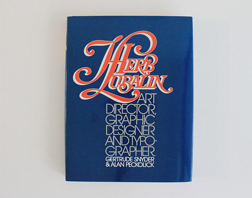
Co-authored by Snyder and Peckolick, this book sheds light on Lubalin’s amazing body of work as a revolutionary graphic designer and art director
Books
- Herb Lubalin: Art director, graphic designer, and typographer by Gertrude Snyder and Alan Peckolick
- Type Rules!: The Designer’s Guide to Professional Typography by Ilene Strizver
Online Resources


