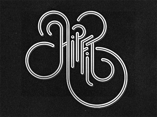
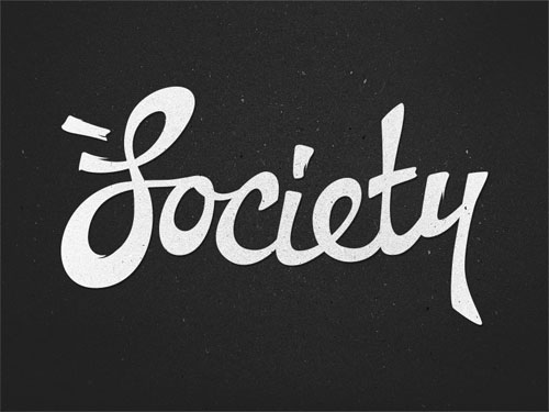
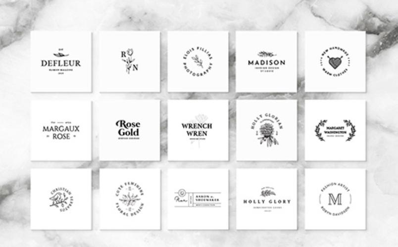
Logos can say a lot about you, or your company. Despite only being a small design, it’s one of the first things customers see on anything related to your business. It appears on business cards, on your website, in the emails that you send and – often – on the products that you make, and so it’s extremely important that you choose a logo that reflects your brand accurately. My favourite logo designs almost always have one thing in common – they use a custom typeface.
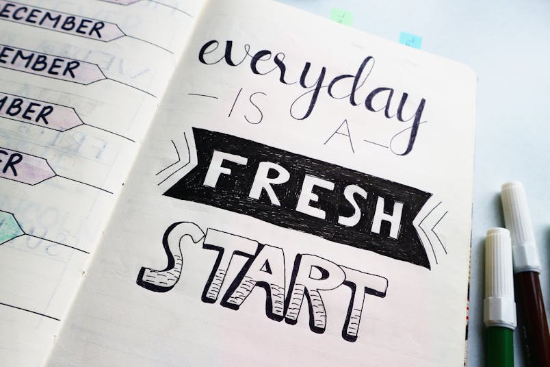
Custom typefaces add a personal touch to logo designs because they stand out from the crowd. Instead of a design that (like many logos) uses Helevetica Neue, you can have something that’s truly unique. Something that’s yours and yours alone.
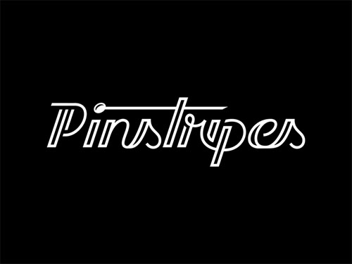
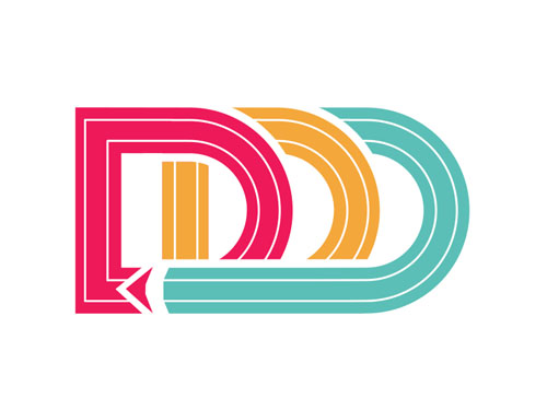
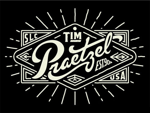
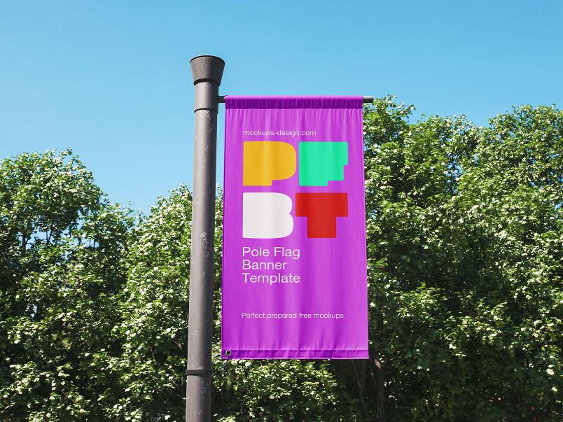
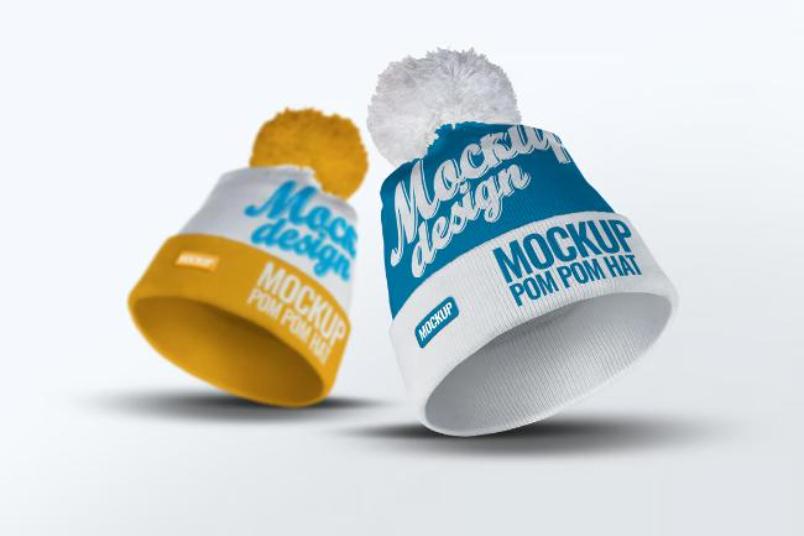
I’ve created a collection of some of my favourite logo design examples – each one has been crafted with care and precision, and is the result of hours, days and weeks of thought, patience and attention. Each one is elegant and refined, yet adds a bit of personality to the brand. If there are any examples of logos that use custom type well that I haven’t featured, I’d love to hear about it in the comments at the end.
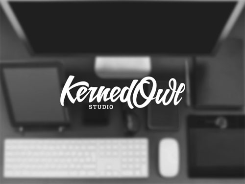 Source
 Source
If you’ve come across any creative, interesting and fantastically designed logos that make use of custom lettering well, I’d love to hear about them. Let us know what you’ve found in the comments below!

