A logo design is the cornerstone of a brand identity. They help in portraying the long-term vision and direction of the company and its business activities. But in the current state of fragile economy, businesses require a steadfast visual representation for their corporate identity. The challenge for a creative designer is to inculcate such features in the logo that it displays growth and prosperity. One such technique that achieves the same is called sequential logos. One of the most famous examples of this style is Adidas logo. The three lateral stripes on its emblem are place in a sequential manner to show that the company is visionary, ever-growing and progressive.
Sequential logos exhibit movement and motion using progressive arrangement of symbols along with transparency technique. This style of logo designing greatly helps in illustrating an impression of growth, development and progress for an organization. By showing symbols in motion, you indicate that the company is dynamic and emergent. The idea behind this technique is to stack relatively similar symbols in an overlapping and sequential progression to depict growth and movement.
For your inspiration, have a look at 25 creative sequential logos that employ progressive technique to show movement and growth.
Elastic Digital
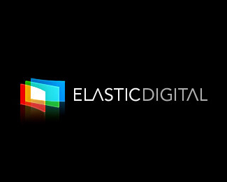 Logo Source
Collective Feedback
Malabar Studio Creativo
MORE Productions
Future Architects
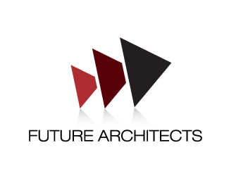
DigiFarm
Dorough Properties
Colorshine
Easever
Vision Creative
Lorena Gardens
Brite Click
Sortfolio
Workers In Motion
Vivid Ways
BirdPrint
Andy Fiord


