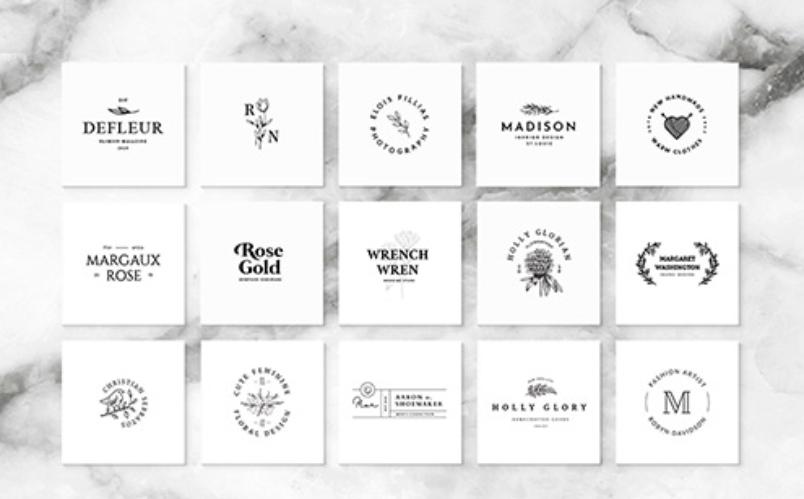
Minimalist means something that has been stripped down to its bare bones, or its essentials. It is just simple, elegant art. Typically, minimalism is not prominent when it comes to logos and logo designs because most logos have to say so much in such a little space. However, it has become a recent trend where logos are trying to use less to say more. Most logo designers try to achieve this in a subtle way, by coming up with subtle, unique ideas that will allow them to create a minimalist logo while keeping the client happy. By using negative space effectively, the logo designer can come up with amazing logos that send across the right messages without being busy or cheesy. Here are some well designed minimistic logos for your inspiration.
UP
ROCKET GOLF
PENDULUM
ONE FUND
FACE TO FACE
SUPER BOOKS
HAFIZ BACOTE
247
SAFARI BAR
FANTOM
MR WRITE
BULL
MISSING
PENCIL
CITY DIRECT
ILLUSION
LOCKS
FRANKENSTEIN FILMS
FENCE
FOLDER
TULIPART
ED’S ELECTRIC
BRAND
BIRD
ATACK

All in all, minimalist logos are not easy to create. Most clients have extensive demands for what their logo should say, but then also ask for it to look simple and understated. While that is an easy request to make, it is a lot harder to achieve. However, with the use of techniques such as negative space and by being cleverly creative, logo designers still manage to create great logos that tick all the boxes their clients ask for.


