CSSnano is a modular minifier that aims to utilise small modules from the PostCSS ecosystem, rather than being an all-encompassing module that may be difficult to contribute to. Because it is written on top of PostCSS, it is able to do more than simple whitespace transforms – including advanced optimisations such as custom identifier reduction, z-index rebasing, and adjacent selector merging. What it does CSSnano takes your nicely formatted CSS and runs it through many…
Stretch is a super simple responsive CSS grid system. For now, it is a 12 column grid that can have any gutter size you want. Columns can be pushed and pulled to make manoeuvring content really easy and breakpoints can be customised. The naming of classes is readable and easy to understand.Columns can be specified differently for three devices sizes. Stretch can be implemented in two ways: Use the stretch.scss stylesheet in this repository and…
This is a handy snippet to let users customize a product directly from the products gallery, and add it to the cart.It’s beeb developed by Codyhouse. By showing customers a “quick add to cart” panel while they interact with a product preview, we can reduce the number of steps that separate a user from purchasing an item, and, potentially, increase our conversion rate. So this is what it does.As you see in the demo,you can…
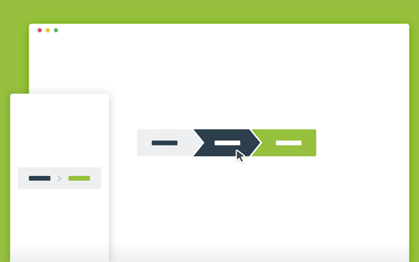
This is a handy snippet to create responsive CSS breadcrumbs or multi-step indicators with ease.It’s been created by Codyhouse. Since both breadcrumbs and multi-step indicators share a similar structure (a simple list of items),this is a handy snippet to create and customize them with a preset of time-saving classes. The easiest way to understand how this resource works is by checking the source files: most classes can be combined, all possible combinations are covered in…
Stretchy is a good script for form control autosizing, one that worked on multiple types of form controls (inputs, textareas, even select menus).It’s been developed by Lea Verou You can also use it as a bookmarklet, to autosize form controls on an existing page, if a form is bothering you with its poor usability. Stretchy has a spartan API, since in most cases you don’t need to call it at all. Stretchy works via event…
This is a perfect tutorial by Codyhouse.It’an animated page transition effect with a slide-in content animation triggered by a side tabbed navigation.Basically hover effect turns into a loading bar, that finally expands with new content. When a user clicks one of the item in the side navigation, the triggerAnimation() function is executed. This function triggers the loading bar animation (loadingBarAnimation() function) and loads the new content (loadNewContent() function).
AcceCSS is a Sass Mixin that debugs & checks the accessibility of your designs.This mixin will allow you to get an overview of all the zones of your layout, get a grayscaled version to check the contrast, as well as 8 different filters to emulate the most common coloblindness types. The AcceCSS mixin will work in any major evergreen brother : Google Chrome, Safari, Mozilla Firefox, IE (partial). “The API” is the few parameters you…
This is a responsive product grid layout with touch-friendly Flickity galleries and Isotope-powered filter functionality.It’s been created by Codrops. This Blueprint is a responsive Isotope-powered product grid layout where each grid item is a Flickity image slider. A small cart icon animation indicates that a product was added to the shopping cart. The product filter utilizes the Isotope filter functionality. Some example media queries are used to show how to make the layout adaptive. …
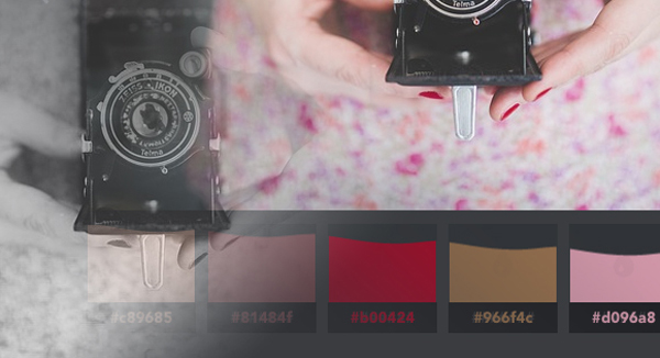
Color Extraction Effect is a little slideshow with a color palette creation effect using CSS Filters and Vibrant.js. The idea is to create a color palette from an image with a subtle effect on the image itself and some fanciness on the palette. Vibrant.js by Jari Zwarts is used to extract the colors from the images, and CSS Filters to transition the image to a black and white version.And also a special ”curtain effect” is…
A subtle tilt effect for images. The idea is to move and rotate semi-transparent copies with the same background image in order to create a subtle motion or depth effect. Basically add a tilt effect to an image by subtly moving copies of layers of semi-transparent divisions with the respective background-image. This technique uses some CSS properties that only work in modern browsers (i.e. 3D Transforms). The effect only works on hover which means that…