
What Is the Easiest Font to Read?
What is the easiest font to read? The answer depends on screen vs. print, but this guide breaks down the top options backed by research and practical use.
Font choice affects how long someone stays on a page, how much they retain from what they read, and whether they finish the document at all. If you are designing a website, writing a report, or putting together a presentation, the easiest font to read is not just a design preference. It is a practical decision that affects how well your content lands.
The short answer is that Georgia for print and Arial or Inter for screens consistently rank among the most readable fonts across studies and real-world use. But the full answer depends on context, and that context matters a lot.
What Makes a Font Easy to Read
Before getting into specific fonts, it helps to know what readability actually means at a typographic level. Researchers and designers look at a few key factors:
- Letterform clarity: How distinct each character is from the others. Fonts where “l”, “1”, and “I” look nearly identical score lower on clarity.
- X-height: The height of lowercase letters relative to capitals. A taller x-height generally improves readability at smaller sizes.
- Stroke contrast: The difference in thickness between thick and thin parts of a letter. High contrast can look elegant but reduces legibility at small sizes.
- Spacing: Both the space between letters (tracking) and between lines (leading). Cramped text slows reading down regardless of how good the font is.
Fonts that score well across these factors tend to feel invisible while you read. That is the goal.
The Easiest Fonts to Read on Screen
Screen reading is where most people spend most of their time, and the demands are different from print. Screens have lower resolution than printed paper (even on high-DPI displays), so fonts need clear, open letterforms to render well at a range of sizes.
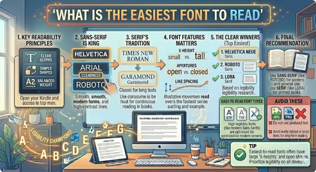
Arial has been a standard screen font for decades. It is a humanist sans serif with open letterforms and solid x-height. It is not exciting, but it is consistently readable across browsers, operating systems, and screen sizes.
Helvetica is similar to Arial in structure but slightly more refined. It is the go-to font for a lot of professional design work and reads well on screen from small body text up to large headings.
Inter was designed specifically for user interfaces and screen reading. It has exceptional letterform clarity, a high x-height, and distinct characters across all its weights. It is the font of choice for many modern websites and apps, and for good reason.
Verdana was designed by Matthew Carter specifically for screen legibility at small sizes. Its wide letter spacing and generous x-height make it one of the most legible fonts at 11pt and 12pt, even on lower resolution displays.
Georgia also works well on screen despite being a serif font. It was designed for screen use and holds up better than most serifs at body text sizes.
The Easiest Fonts to Read in Print
Print allows for more detail and finer strokes than screen rendering. Serif fonts, which have small decorative lines at the ends of letterforms, traditionally perform well in print because those serifs help guide the eye along a line of text.
Times New Roman is the default academic and publishing font for a reason. It is compact, clear, and readable across a wide range of print sizes. It is not exciting, but it does the job.
Georgia is a softer, more open serif than Times New Roman and reads with slightly less effort. Many designers prefer it for long-form print documents.
Garamond is a classic typeface with a long history in publishing. It is elegant and readable, and its slightly tighter spacing makes it efficient for longer documents without sacrificing legibility.
Palatino has a larger x-height than many classic serifs, which improves readability particularly for readers who find smaller text challenging.
The Easiest Fonts to Read for People with Dyslexia
Standard readable fonts work well for most readers, but people with dyslexia often benefit from fonts with more distinct letterforms, particularly letters that are commonly mirrored or confused like b, d, p, and q.
OpenDyslexic is a free font designed specifically with this in mind, using heavier bottoms on letters to reinforce orientation. Research on its effectiveness is mixed, but some readers find it genuinely helpful.
Arial and Verdana also perform well for readers with dyslexia because of their open, distinct letterforms and generous spacing. The British Dyslexia Association recommends both as practical, accessible choices.
Lexie Readable is another option worth knowing. It is a free font built on the same principles as OpenDyslexic but with a more conventional appearance that works in professional contexts.
Font Size and Spacing Matter as Much as the Font Itself
The best font in the world becomes hard to read at 9pt with tight line spacing. Readability is not just about the typeface. These settings matter just as much:
- Body text size: 16px (roughly 12pt) for web, 11pt to 12pt for print.
- Line height: 1.5x the font size for screen reading. Tighter works for print but should still be at least 1.2x.
- Line length: 50 to 75 characters per line is the readable sweet spot. Longer lines cause eye fatigue. Shorter lines interrupt reading flow.
- Contrast: Dark text on a light background is still the most readable combination. Pure black on pure white can cause eye strain for some readers. Off-white backgrounds like
#F8F8F8reduce this without hurting contrast.
The Bottom Line
The easiest font to read depends on where the reading happens. For screens, Arial, Inter, and Verdana are consistently strong choices. For print, Georgia, Garamond, and Times New Roman hold up well. For accessibility, open letterforms and generous spacing matter more than any specific font name.
Pick a font that suits your medium, set it at a readable size with good line spacing, and the typography will stay out of the way so your content can do its job.


