
Are you bored sick of your Ecommerce website’s design? A humdrum of a design with a text box here, a gaudy pop up there, the not so catchy taglines filling the pages, the non-uniformity of colors (unavoidable), and in worst case scenario, a spammy look and feel throughout – all of these are typical of an Ecommerce site.
Ecommerce websites all across the web suffer from more or less the same syndrome. Their designs go kaput for the sake of displaying all the information right there for the users to catch and this is when these sites fail to create for themselves a differentiator. A good design, more importantly, modern web design is what Ecommerce websites need to take hold of their visitors.
Read Also:
Design Trends Of The Top 200 eCommerce Websites [Infographic]
Now, since the online stores have to be so dynamic and full of information, how do you really design them modishly and in a way that falls in sync with their theme? There are several requirements you need to chart out first. And you need to understand that the UI of your site should be such that the user finds it easy to navigate through your site, finds your site clean and clutter free and does not face issues like slow loading times and non compatibility.

Here are a few things you can try:
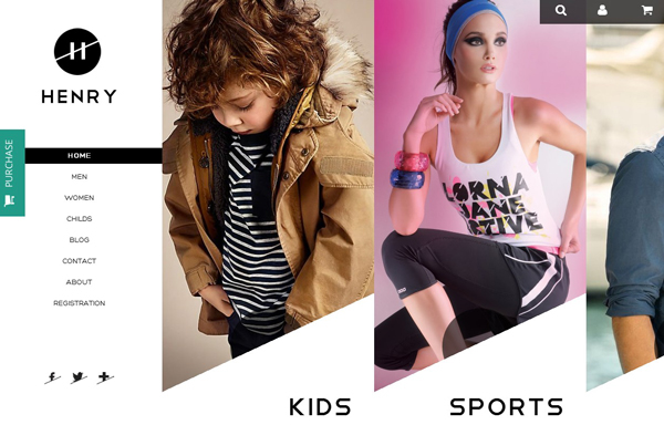
Image Sliders
When introducing your visitors to your best offerings is on the agenda, image sliders can work in a manner most perfect. They are known to be catchy and with a host of options in terms of the effects you can add to them, the sliders can really help your site stand out to great effect.
Henry
Munditia

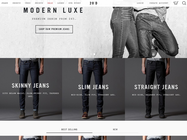
Many website managers are also preferring big images or videos to sliders for grabbing the attention. These usually are displayed in the background in somewhat a blurred fashion with a piece of text over them. CSS or Javascript can be used to enhance the effect.
Whichever way you choose to go, what matters is that you pursue creativity and a number of things will take care of themselves.
Read also:
Integration of Multi-store eCommerce to Maximize Productivity
More Hues and Vibrancy
Making your site clutter free doesn’t imply you have to make it devoid of colors. An Ecommerce website can (and should) catch onto the emotions of the visitors for them to make purchases with a greater degree of keenness. And this is where the hues and textures on the site contribute. Like a brick and mortar store, you need to make your online store vibrant and full of life. However, don’t go bonkers with colors since it can also have some disastrous results when not done right.
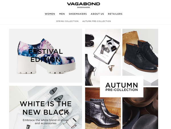
Go for Grids
The websites structured in terms of grids have always been sought-after, and the trend seems to be trendier today. Grids let you present your website to the user in a far more comprehensive manner that, at the same time, it looks good. Bootstrap, for example, can be made use of to create grid structure and it has to be blend with creativity on your part if your really want your website to make a boast of its uniqueness.
Modern Luxe
Vagabond
Read Also:
5 Annoying Ecommerce Customer Experiences and Solutions to Overcome
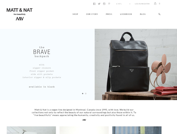
Minimal Design Can Do the Job as Well
There is a thing with minimalism – it is timeless. Whether you are fond of them or not, the minimal designs are never gonna be off-the-radar. The fact that they make any website look clean, fresh, and unfailingly free of clutter. Use some non fussy CSS buttons and try to steer clear of animations and shadow effects.
Matt & Natt
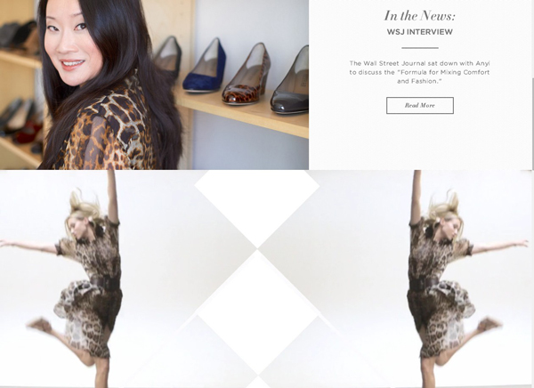
ANYI LU
Go for Animation Instead
If minimalism isn’t your brand’s strong suit, or doesn’t fit its character, animation can be the most ideal solution. There is only one challenge though. It’s pretty darn hard. So, if you have someone who is expert at animation, start measuring your options. Take the CSS3 animation browser compatibility into account before you go ahead with animating your site.
Blue Lagoon

Touch-Friendly Design
Mobile responsiveness is the order of the day. You don’t need to check your analytics to determine that a large chunk of your visitors browse your site on their mobile devices. Use tools like TouchSwipe jQuery plugin that can add mobile responsiveness to your site and make it more dynamic.
Using the above techniques ensures good – and at times great – user experience. And that’s just about the first thing that matters when you are trying to sell.


