
With the passage of time, more and more people are moving away from desktop onto mobile-optimized websites even for shopping products. Mobile eCommerce experience is an important matter to talk about as it has been found that 67% of people are more likely to make a purchase if their favourite websites can be accessed from their Smartphones. Therefore, designers are using established design patterns to Kickstart a mobile eCommerce project.
Significant development with the mobile designing pattern to boost eCommerce sales has led various businesses to consider mobile eCommerce. So let us focus on the fundamental mobile designing pattern to increase your eCommerce conversion rate.
Home pages
Make the home page user-friendly rather than focusing on the content. This pattern will provide more room to the users to find whatever they were looking for. The best design is to form a single column layout at the center of the homepage devoted for promotion and single column lists of links to showcase product categories and website areas. Home pages also include keyword search and links to store locators. Additionally, it also contains registration form to feature loyalty programs and promotional emails.
The home page should also have dashboard pattern to include search function and list pattern function for those shoppers who visit your website to compare prices. This approach is also useful if the visitors are coming to your site to explore sales and promotions. Get a site analytics to analyse what customers are doing on your site and then design a home page accordingly
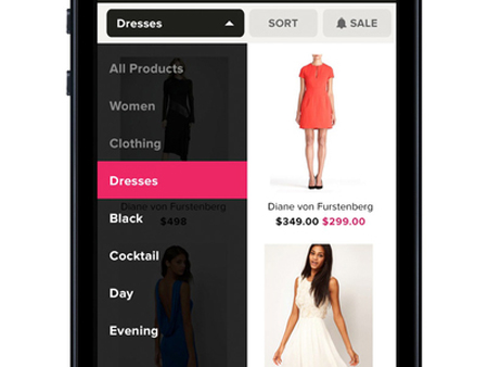
The Navigation Menu
Many websites have navigation menus in the header besides using home page as their primary navigational hub. These navigations help shoppers to hop from one part of the website to another without the need of retuning back to the home page. Designers use site-wide navigation menu to help users concentrate on their main tasks. Site-wide navigation has individual icons for each function. To make it simple, it can also be a two-way column layout for navigations and buttons instead of list items. In addition, some site also have site-wide menu that comprised of sub-menu options as well.
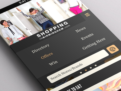
Interestingly, it has been observed that large eCommerce websites do not easily display the navigation options. They carefully check for the number of items to be included in the global navigation. Before designing the navigation menu in the mobile device, conduct A/B testing and usability tests to check which menu options on your site are clicked the maximum number of times by the shoppers accordingly design the navigation options.
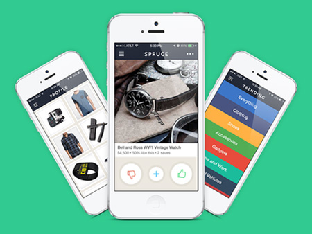
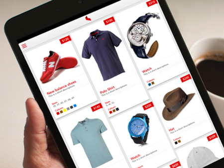
Pages to Showcase Products

There are two common patterns to design a product page. These involve either a long page or pages broken with tabs or accordions. Long page showcase the detailed information of the products while the latter allow progressive disclosure of product information. It has been observed that shopper prefers page broken into logical chunks as it requires more scrolling with long product pages.

Autocomplete Search
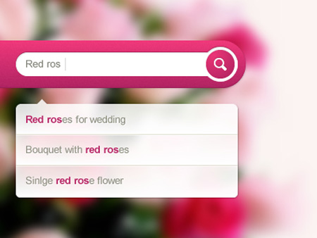
Autocomplete search also known as suggested search or type-ahead exhibit the potential results as soon as a shopper type a few characters. This is beneficial for the shoppers particularly if the search term is too big to type. So integrate an auto-suggest pattern to reduce the time needed to enter a query. Designers prevent visitors from getting misdirected to the product pages by integrating drill-down lists for product categories or giving side-wide menu of top-level categories.
Filtering
 Click the image to see the gif
Designers use common interface patterns for displaying filtering options. Filters enable a search to narrow down its results based on certain features including brand, size and colour. The interface pattern to show filtering option is menus, accordion displays or drop-down lists. This designing pattern is organized by type also called facet with various values appearing under each of the facets. For instance size is a facet, while M or L is facet values. If each number of items can be displayed under each facet value, it offers a higher level of transparency regarding what shoppers will get with every selection.
Search Pattern
The mobile eCommerce websites use two main design patterns for search results- the table display and the grid display. The former shows thumbnails photos with basic information while the latter display large images with less descriptive information. However, designers follow a better approach of listing subcategories under search filters, where these can be presented in the forms of tags and other filters.
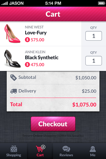
Shopping Cart
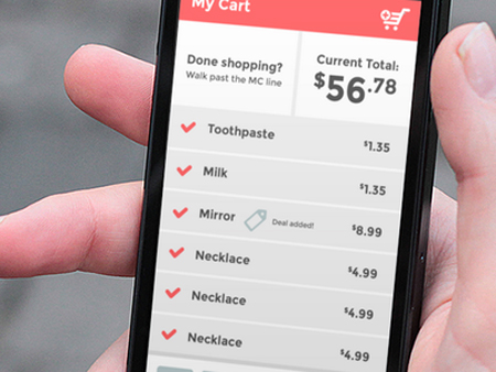
Designers mostly use a table pattern to display products. Besides displaying products, shopping cart also provide added functionalities including the advantage of saving any products, update quantities of products or remove products, save an order, save a product to the favourite list, apply coupon and promotional codes or choosing shipping. Design the shopping cart in a manner that allows shoppers the flexibility to modify their purchases. Usually, an icon in the website’s header or ab option in the navigation menu is used to reach the shopping cart.
Photographs
The common designing patterns used to include photos in mobile website are either double-tap to zoom, thumbnails for choosing pictures or swipeable galleries. These patterns allow flexibility to the shopper to check products from different angles and get a better view of the products from their Smartphones or tablets. However, image quality is critical especially when looking at the expensive items
Better Mobile Checkout Process
Designing a checkout is more of a process than a pattern. It is important for the retailers to design a seamless and user-friendly checkout process for every mobile-eCommerce websites. Here are few important designing tips to consider when designing a check-out process-
– Include only the crucial fields
– Allow shoppers to check-out as a guest
– Control the mobile UI elements
– Remove distraction when the customer is in the checkout process, but so not remove the content
– Allow customers to show the progress of their shopping, where they are heading towards and how much long they need to wait to complete the shopping and checkout process
– Provide security assurance to the shoppers by using iconography, SSL certificate and callouts.
Few important tips to consider:
Never make shoppers scroll sideways
Make important navigational elements accessible
Too much of text can make shopper distracted. The best way is to use collapsible elements in the design
Create mobile design for people with fat fingers. Convert text based links into large buttons.
Make provision for the mobile sites to load faster.


