Web designing, the web that has caught on many designers, is indeed an ever changing world. Every year, something new catches up with this world that you as a web designer would want to know about. This year, web designers, have a lot of things to wait up for. Many of the trends from last year would be carried forward this year as well, while there are some exciting trends that are coming up this year.
Here are a few trends that you as a designer need to look out for this coming year. Let’s hope it excites you and proves to be great for your designs.
Unconventional & Interesting Typography
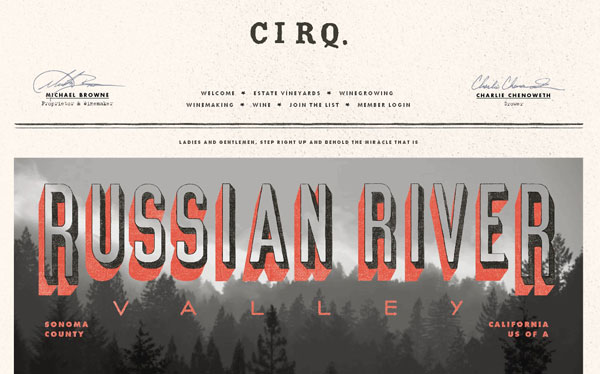
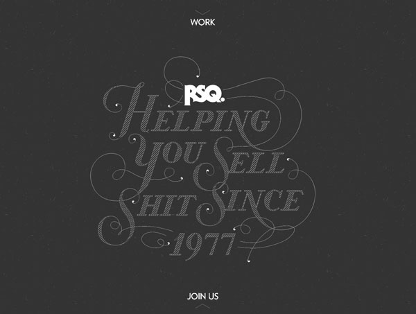
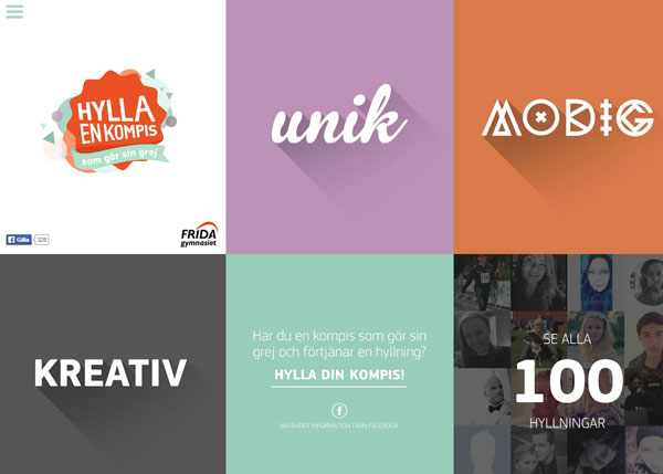
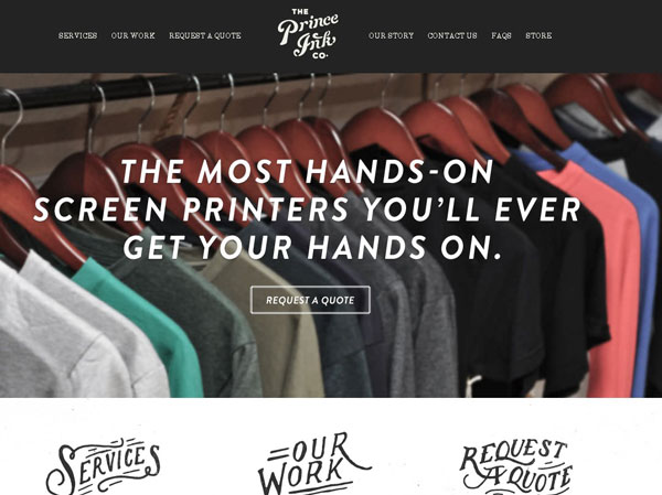
This year would see designers trying on new typography styles that would give an edge to their designs. Fonts define the personality of a web designer and the way you design a website. No longer do you need to use standard fonts like Helvetica or Ahem to describe your website. Now, you can change over to amazing and exciting fonts. This year would see more web design straying away from old serif fonts and discovering their own personalities.
Flat Designs in Vogue
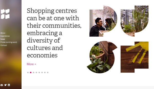
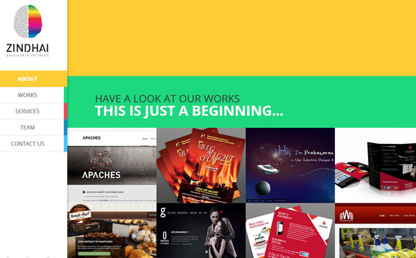
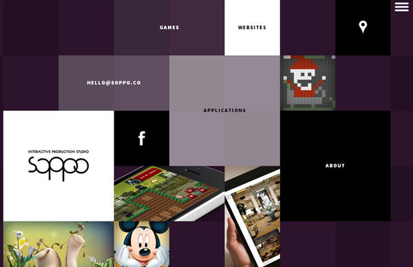
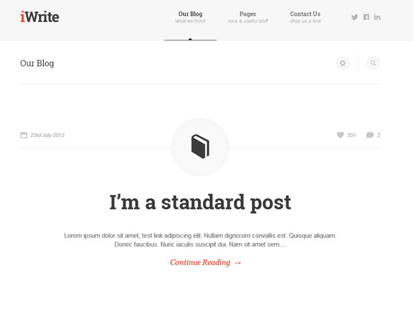
You will see that in the coming year flat designs would come as a major trendsetter. This design came into existence when iOS7 was first launched. Apple was the first to create this design aesthetics which allows you to create any kind of website that would appear appealing to the eyes. Flat design is indeed a trend to wait for. So, basically there wouldn’t be any of those flashy illustrations to show off any more. The designs would base themselves on usability. Crisp edges, bright colors, open space etc. would be trending this coming year for web designs.
Hero Areas instead of Sliders
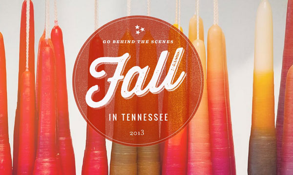
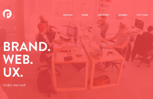
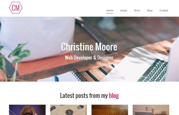
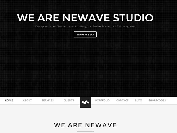
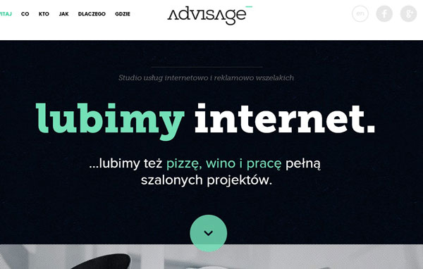
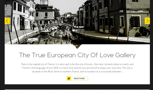
Sliders were pretty much the in thing till sometime back. But, now it seems hero areas are going to be the new trend for websites. Hero areas are basically an intro area followed by an image which is seen at the top of the website. It can either be a blurred image or a centered image with a heading. Basically it is a self moving image that is pretty soon going to be the trend of web design.
Increasing Use of Videos
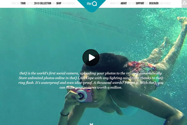
The new trend in the hero area of your website that would be doing round this year is videos. While many people loved having images with text, more and more web designs are coming up with a trend of introducing themselves with a video. With jQuery plugins, your video won’t occupy a lot of space either and you will find that your videos are much easier to share and view on a website. With less data being occupied, the site loading time won’t be affected either. Now, designers can communicate effectively with videos and check on hits with sites like YouTube.
Long Scrolls: An Interesting Trend
Now, that most of you are quite comfortable with scrolling through a site, more and more web design techniques are involving long scrolling sites to use up space, increase the responsiveness and build a brilliant site. With long scrolling sites, the content appears to be more organized and the format is not only easily readable but also easy to digest. So, basically long scrolls are in trend this coming year.
Basic Color Schemes
This year basic color schemes will be majorly trending while designing websites. You will see that designs will contain one or max two color schemes. Basically schemes like this would make the website seem simple yet attractive. You would have seen a lot of websites in the past month or so, appearing in plain white or blue or a single color which makes it attractive, brilliant yet keeps the look simple.
This predominance of a single color would be essentially trending this coming year and would make web design a schematic platform.
Twitter Style Content
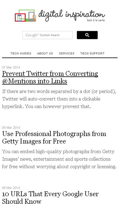
Yes, when you talk of web design, you need to talk of content as well. Yes, simple and less content will be the trend of this coming year. You would find loads of website putting up short content, which would seem similar to twitter style. This is so that more consumers are able to read a lot of information in those short bursts that have compensated the long, boring content.
Sidebar No More
Most blog and magazine sites used to use a sidebar. But, seems like the trend that is coming on is planning to drop the sidebar altogether. This way there would be no flashing signs that would distract the visitor of your website. It would make things more pleasant for the visitor. This is probably why the sidebar distractions would no more be a part of web design this coming year.
Now that you know what’s trending, web designing will be a better platform. You can devise various ways for better user interface and ensure more visitors to the site.
And finally….
Focus on Mobile
With the world going gaga over smart phones, it is not surprising that web design will also need to think of mobiles. Most designers are concentrating on responsive web design treatment so that they don’t have to make separate websites for the various devices. Web designers are trying to concentrate on making websites more compatible with all sorts of devices. For this they have tried integrating the websites with social media, long scrolling sites and fast loading of these sites too.

