Material Palette is a website for generating and exporting Material Design color palettes. The website simply requires you to click on two different colors from a wide selection: red, pink, purple, deep purple, indigo, blue, deep blue, light blue, cyan, teal, green, light green, lime, yellow, amber, orange, deep orange, brown, grey and blue grey. Then, a color palette is automatically generated and can be downloaded in CSS, SASS, SVG, XML or PNG format.
Layrs Control 2 is a collection of 7 scripts that make tedious job easier.Compatible with Photoshop CC & CC 2014. Features Layer name editor Remove unused effects Flatten all layers effects Delete empty layers Rasterize smart objects Find similar files & folders Convert to smart object Compatible with Photoshop CC & CC 2014
Web-based accessibility tools are ideal choice for anyone who wants to know whether their website has been designed using Web Content Accessibility Guidelines (WCAG) or not. These are the tools that help you make your website accessible to everyone including those who are dealing with some kind of visual disability. Just like the normal, disabled people also represent a large market share and thus beginning to demand a better online accessibility. Therefore, one needs to…
Size Marks is a helpful Photoshop script for web designers and front-end engineers. Script converts rectangular marquee to labeled measurement mark. Landscape marquee → horizontal mark. Portrait or square marquee → vertical mark. Install – Right click: Size-Marks.jsx-v0.1.1.zip and choose Download Linked File As…. – Unzip and place Size Marks.jsx in the Photoshop’s Scripts folder. For OS X: /Applications/Adobe Photoshop CC 2014/Presets/Scripts/ and restart Photoshop. – Now script is available in File – Scripts -…
Coolors is a very easy to use color scheme generator for designers.You can create your own color combination for your design projects. How To Use: – Press spacebar to generate color scheme – Click on a color to lock it and get cool color combinations – Finally copy your copy your palette link and share it. You can also type in your color codes to get nice matching palettes
Transparent PNGs are great, but they come at a price: file size. Wouldn’t it be nice if there were transparent JPEGs instead? Unfortunately there is no such thing, but ZorroSVG gives you the power of transparent PNGs for the size of a JPEG. It achieves this by converting your PNG to an SVG which uses the compositing capabilites of SVG to create a masked bitmap on-the-fly using JPEGs for both the image and its mask…
As a graphic freelancer you a getting pulling from all sides. It is important that you streamline parts of your business so you will have time to dedicate to talking to your clients and building them an exceptional design. Here are two tools that can be used to help free up your time and also add variety to your product offerings. Time Tracking & Invoicing Tool Minterapp is an online time tracking/invoicing tool that you…
Dimensions is a browser extension for coders to measure screen dimensions.Currently Dimensions is only available for Chrome so you can download from Chrome web store.Link is at the bottom. Features: – Images & HTML Elements Measure between the following elements: images, input-fields, buttons, videos, gifs, text, icons. You can measure everything you see in the browser. – Mockups Your designer handed you mockups as PNGs or JPEGs? Just drop them into Chrome, activate Dimensions and…
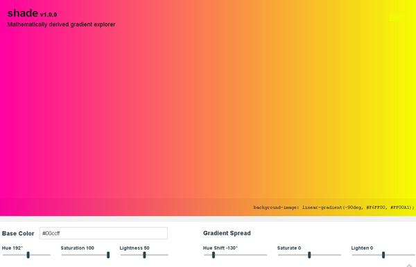
A handpicked collection of beautiful colour gradients for design and code. Hopefully this little effort will help you draw inspiration and serve as a resource for picking gradients for your own projects. Adding a gradient to the library is super simple. All the gradients are loaded and rendered from a single gradients.json file. Currently only gradients with two colours are allowed.
FocusPoint is a jQuery plugin for ‘responsive cropping’. Dynamically crop images to fill available space without cutting out the image’s subject. Great for full-screen images. Websites don’t have a single layout any more. The space you have for an image may be portrait on a laptop, landscape on a tablet, and square on a mobile – particularly if you’re using a full-screen image. If you have to use the same image file in all these…