
Product Tour is a responsive tour snippet, with a step-by-step guide to help users understand how to use your website.This is a handy tour snippet powered by CSS and jQuery, characterized by a user experience that changes according to the device size.
On mobile devices, the tour is open as a modal window with a smooth scale effect achieved adding a CSS3 transition.
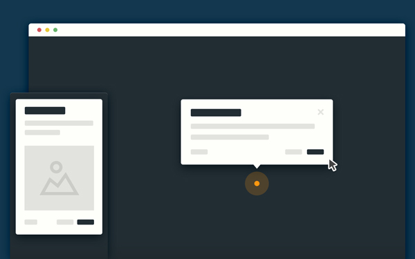
4 different classes have been defined to control the position of the tooltip relative to the dot indicator (.top, .bottom, .left and .right)
[gpp_button color=”blue” url=”http://codyhouse.co/demo/product-tour/index.html” title=”Product Tour snippet” icon_left=”external” target=”_blank” size=”medium” display=”inline”]Demo[/gpp_button] [gpp_button color=”blue” url=”http://codyhouse.co/gem/product-tour/” title=”Product Tour snippet” icon_left=”cloud-download” target=”_blank” size=”medium” display=”inline”]Source[/gpp_button]


