
Product Comparison Layout & Effect is a basic responsive product grid layout with comparison functionality and a slide-in effect.
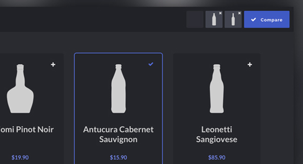
This Blueprint is a responsive product grid layout with comparison functionality. A maximum of three items can be selected for the product comparison. The comparison view shows flexbox-powered columns or rows (depending on the viewport size) that appear with a slide-in effect. There are a couple of example media queries for smaller viewports.
You can integrate or build upon it for free in your personal or commercial projects.
[gpp_button color=”blue” url=”http://tympanus.net/Blueprints/ProductComparison/” title=”best wordpress themes” icon_left=”external” target=”_blank” size=”medium” display=”inline”]Demo[/gpp_button] [gpp_button color=”blue” url=”http://tympanus.net/codrops/2015/05/26/product-comparison-layout-effect/” title=”wordpress theme” icon_left=”cloud-download” target=”_blank” size=”medium” display=”inline”]Tutorial & Download[/gpp_button]


