
This is a responsive and easy to customize mega-dropdown component tutorial by Codyhouse.
One of the most challenging part when you’re working on a web projects with lots of content is to make it easy for a user to navigate through this content. One example we can all think of is Amazon: infinite categories, each one with its own sub-categories… that’s why they currently provide an easy-to-access navigation, in the form of a mega-dropdown element on the top-left corner of the page.
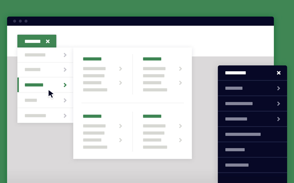
As you can notice from the demo,this dropdown menu is activated with a tap/click. You could have achieved the same result using a :hover state instead, no need for js . However these decisions should be based on what we think is the best user experience. Users generally expect to click to access new content, while :hover effects mostly detect a “potential action”.
[gpp_button color=”blue” url=”http://codyhouse.co/demo/mega-dropdown/index.html” title=”Mega Dropdown” icon_left=”external” target=”_blank” size=”medium” display=”inline”]Demo[/gpp_button] [gpp_button color=”blue” url=”http://codyhouse.co/gem/mega-dropdown/” title=”Mega Dropdown” icon_left=”cloud-download” target=”_blank” size=”medium” display=”inline”]Source[/gpp_button]


