
Why Horizontal Paintings Work Harder Than Any Other Format in Interior Design
Architects obsess over proportions. They specify ceiling heights to the inch, calibrate window-to-wall ratios, and argue about whether a hallway is 36 or 42 inches wide. Then the same building gets furnished, and the artwork goes up by instinct: whatever fits the frame, whatever was on sale, whatever orientation the canvas happened to come in.
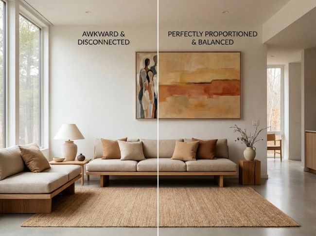
The result is rooms full of vertical paintings on wide walls, undersized squares floating above oversized sofas, and art that looks like it wandered in from somewhere else. The problem isn’t taste. It’s that most people don’t think of painting orientation as a design decision with spatial consequences. It is. The format of a painting, portrait, or square changes how a room reads. Horizontal format does specific work that no other orientation can replicate, and understanding why makes every future art decision sharper.
Why Format Is a Design Decision, Not an Afterthought
Architecture has always used horizontal lines to communicate stability, calm, and breadth. Prairie-style houses stretch low and wide to anchor themselves to the ground. Contemporary open-plan interiors trade vertical drama for horizontal flow. According to ArchDaily’s coverage of interior design trends (2025), horizontality has become a defining spatial philosophy in contemporary architecture, with major projects such as Bangkok’s Cloud 11 Creative Park deliberately conceived as “an architecture of horizontality, blurring the boundaries between architecture and urbanism.”
Wall art follows the same logic. A horizontal painting functions like a wide architectural window on an interior wall – it stretches perceived width, grounds the composition beneath it, and echoes the building’s own proportional language. That’s not a stylistic preference. It’s spatial mechanics.
The market reflects the momentum. Fortune Business Insights (2025) reports that the global wall art market was valued at USD 66.89 billion in 2025, projected to reach USD 70.94 billion in 2026, with canvas holding a 45.11% share of total material sales. Buyers are investing in art as a serious interior element, not an afterthought. ArchDaily’s 2025 trend report makes the connection explicit: the spatial philosophy of contemporary architecture and the format logic of wall art have arrived at the same answer. The question is whether buyers choose the format deliberately or let it happen by default.
The Spatial Problems Horizontal Paintings Solve
Most rooms have at least one of three problems that horizontal format solves directly:
- Low or standard ceilings. In a room with an 8 or 9-foot ceiling, a tall vertical painting draws the eye upward and makes the ceiling feel closer. A horizontal painting shifts attention laterally, broadening the perceived footprint of the room. The eye reads width instead of height, and the room feels more generous.
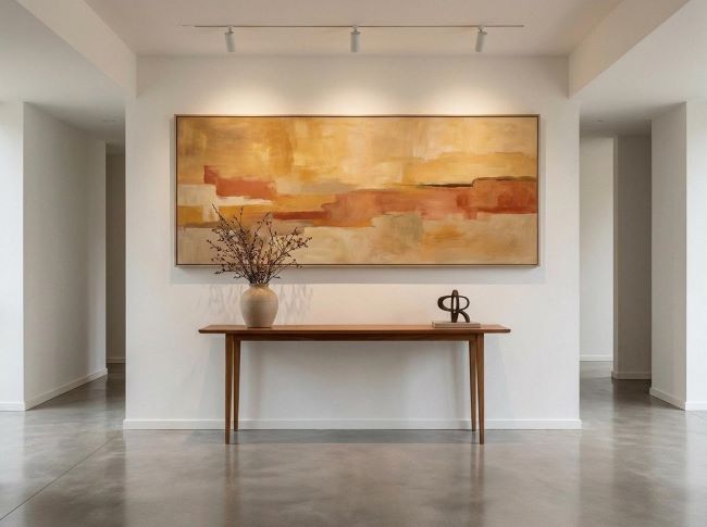
- Wide walls without a natural focal point. Open-plan living spaces and dining rooms often have long horizontal wall runs that need a wide-format piece. A vertical painting on a 12-foot wall looks like a stamp on a billboard. It fills a narrow vertical slice while leaving the surrounding wall bare and unresolved. A horizontal painting commands the wall proportionally and turns the whole surface into a considered design moment.
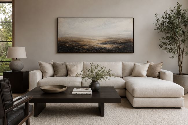
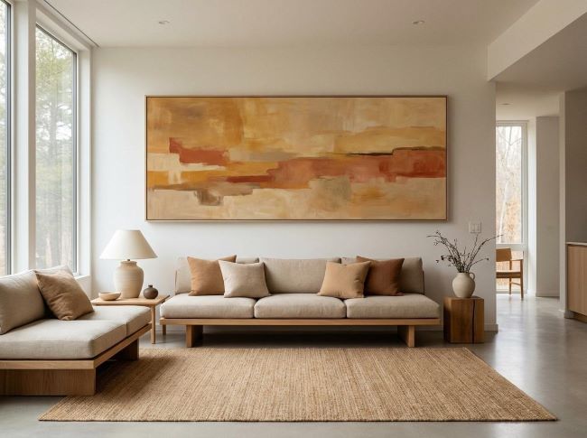
- Furniture alignment. Sofas, headboards, sideboards, and console tables are all inherently horizontal objects. Hanging a vertical painting above them creates visual tension because the vertical element fights the horizontal furniture line rather than continuing it. A horizontal painting extends that line upward naturally, unifying the furniture and the wall into a single compositional unit.
Urban Road’s 2026 Wall Art Trends Report notes that large-scale horizontal statement pieces create “clarity without requiring full renovation” – a precise description of what format-matched art does to a room. You don’t change the architecture. You work with it.
Choosing the Right Horizontal Painting for Your Space
Scale is the first decision, and it’s not complicated. A horizontal painting above furniture should span 60-75% of the wall width or the furniture piece below it. For a 90-inch sofa, that means a canvas between 54 and 68 inches wide. Go narrower and the painting looks timid. Go wider and it overruns its context.
Color and material context shape the second decision. The 2025-2026 interior design shift toward warm earth tones, terracotta, ochre, sand, and warm neutrals means that abstract horizontal canvases in those palettes connect directly to the material story of a room. A painting that echoes the tone of stone flooring or wood cabinetry doesn’t match the decor in a literal sense – it deepens the room’s material coherence, which is something different and more valuable. Understanding how materials shape interior character helps clarify why a painting that harmonizes with stone or timber reads as architecture rather than decoration.
Done right, this kind of visual layering is what separates a room that simply looks expensive from one that feels genuinely luxurious.
Abstract and panoramic formats suit horizontal canvases because the subject matter follows a horizontal visual rhythm. Wide-field compositions and panoramic abstracts move the eye laterally in the same direction the canvas format establishes. Portrait paintings in a horizontal frame tend to fight the format. Abstract and panoramic works complete it.
A Canvaspop survey of over 2,000 Americans, cited by Fortune Business Insights (2025), found that 51% of buyers choose artwork meaningful to their home, while 39% choose art that matches their decor. The best horizontal painting does both: it matches the room’s proportional logic, and it’s something you’d stop to look at.
For room-specific guidance on building a cohesive visual anchor, living room focal point strategies covers how horizontal compositions work within broader living room design systems.
Where Horizontal Paintings Work Best in a Home
Horizontal paintings work best in spaces where the room itself already follows a wide visual layout, allowing the artwork to reinforce the proportions that are already there:
- Living rooms. Above a sofa or media console, a horizontal painting becomes the room’s primary visual anchor. It completes the seating composition and gives the eye a destination. This is the most common placement, and it’s common because it works.
- Dining rooms. A horizontal canvas above a sideboard or buffet echoes the spread of the dining table, reinforcing the room’s horizontal axis. It also fills a wall that’s often left blank because nothing seems to fit – a wide-format painting resolves it immediately.
- Hallways. One long horizontal piece transforms a transitional corridor into a gallery moment. Hallways are inherently narrow and long. A painting that follows that geometry turns what’s usually dead wall space into the strongest design statement in the home.
- Home offices. A horizontal canvas behind a desk creates a composed backdrop that reads as authoritative and considered on video calls. It establishes a clear focal wall and signals that the space was designed rather than just occupied.
- Bedrooms. Above a headboard, horizontal format paintings are the most appropriate choice because headboards are wide-format objects. A vertical painting above a king-size headboard creates the same proportional conflict as a vertical painting above a sofa – it fights the furniture line rather than extending it.
Buyers in 2026 are selecting art to influence how a space feels, not just how it looks. Horizontal paintings do both simultaneously: they correct proportion and they set a mood. That dual function is what makes them the most versatile format across different room types.
Common Mistakes to Avoid When Hanging Horizontal Art
Most horizontal art mistakes have less to do with taste and more to do with placement, scale, and how the piece interacts with the room around it:
- Hanging too high. The center of a horizontal painting should sit at approximately 57 to 60 inches from the floor, the same standard museums use. Most people hang art 6 to 12 inches too high, which disconnects it from the furniture below and makes the room feel ungrounded.
- Going too small. The 60-75% width rule isn’t aesthetic preference. It’s a safeguard against the most common horizontal art mistake: choosing a wide canvas that’s still too narrow for the wall or furniture it serves. An undersized horizontal painting looks timid because the format implicitly promises scale it then fails to deliver.
- Ignoring the room’s existing horizontal lines. Architecture provides a built-in alignment system: moldings, window sills, door frames, and furniture rails all establish horizontal references. A painting hung so its bottom edge aligns with a window sill or its top edge aligns with a door frame integrates into the room’s geometry rather than competing with it.
- Over-framing. Heavy ornate frames on large horizontal canvases overpower the work. A minimal float frame or a gallery-wrap finish keeps the focus on the composition. Gallery MAR’s 2025 interior design trend roundup puts it clearly: art selection “should have less to do with matching decor” and more to do with how the work makes you feel.
For practical guidance on getting visual impact right without a full redesign, home renovation visual upgrades covers high-impact changes that don’t require structural work.
The Architecture of the Wall
Choosing a horizontal painting is an architectural act. You’re not just filling wall space – you’re making a decision about how the room reads, how furniture anchors to its backdrop, and how the eye moves through the space. Horizontal format is the most versatile, spatially intelligent choice for most residential interiors because it works with the proportional logic those spaces already have.
The process is straightforward. Measure your wall and the furniture below it. Apply the 60-75% rule to set a minimum canvas width. Then choose a piece whose horizontal rhythm you’d want to live with, not just look at once. That’s the whole decision, and it’s one worth making deliberately.


