
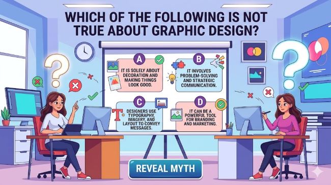
Which of the Following Is Not True About Graphic Design? Common Myths Debunked
If you have ever taken a design course, sat through a marketing meeting, or scrolled through an online quiz, you have probably run into the question: which of the following is not true about graphic design? It is the kind of question that tests whether people understand design as a discipline rather than just a visual activity. The problem is that graphic design carries a lot of assumptions and half-truths that circulate confidently in classrooms, workplaces, and online communities. Some people think it is only about making things look good. Others think anyone with the right software can do it. Others assume that rules in design are fixed and that breaking them always leads to design fails. This post takes a clear look at the statements about graphic design that are commonly presented as true, identifies which ones are false, and explains what graphic design actually is and what it is not.
First: Which of the Following Is the Best and Most Complete Definition for Graphic Design?
Before you can identify what is not true about graphic design, you need a solid definition of what it actually is.
Here are four common ways people define graphic design:
A: Graphic design is the process of making things look attractive using colors, fonts, and images.
B: Graphic design is the art of visual communication that combines images, words, and ideas to convey information or a message to an audience.
C: Graphic design is the use of software like Adobe Photoshop and Illustrator to create digital artwork.
D: Graphic design is a creative field practiced by people with natural artistic talent.
Which of the following is the best and most complete definition for graphic design? The answer is B.
Here is why the others fall short:
- A focuses only on aesthetics. Making something look attractive is a byproduct, not the goal. A sign that is beautiful but confuses the reader has failed at graphic design even if it looks good.
- C reduces graphic design to a set of tools. Designers used pencil, ink, and letterpress long before software existed. The software is how you execute the design, not what design is.
- D conflates natural artistic ability with trained design skill. Graphic design is a discipline with principles, methods, and a body of knowledge that anyone can learn. Natural artistic talent helps in some areas but is not required and does not define what the field is.
The complete definition, B, captures the three elements that make graphic design distinct: it involves visual communication, it uses a combination of elements (images, words, ideas), and it serves an audience with a specific purpose.
Which Statements About Graphic Design Are Not True?
Now to the core of the question. Below are statements about graphic design that circulate widely, along with whether they are true or false and why.
“Graphic design is purely subjective. There are no rules.”
This is false.
Graphic design has well-established principles that determine whether a design communicates effectively. These include:
- Hierarchy: Organizing elements so the viewer’s eye moves through information in a deliberate sequence
- Contrast: Using differences in size, color, weight, or shape to make key elements stand out
- Alignment: Creating visual order by connecting elements along a shared axis
- Proximity: Grouping related elements together so the viewer understands they are connected
- White space: Using empty areas intentionally to reduce visual noise and direct attention
- Repetition: Repeating elements to create consistency and visual unity
These principles are not arbitrary preferences. They are grounded in how human vision and cognition work. A design that ignores hierarchy makes it harder for the viewer to know where to look first. A design without sufficient contrast makes text difficult to read. Design fails often trace back to ignoring one or more of these principles, not to a matter of personal taste.
That said, there is a legitimate layer of subjectivity in design. Aesthetic preferences, cultural associations with colors, and stylistic trends all involve judgment calls. But the principles that determine whether a design communicates are consistent and teachable. The statement that there are no rules in graphic design is false.
“More design elements make a design more effective.”
This is false.
This is one of the most persistent misconceptions in graphic design, and it produces some of the worst bad graphic design examples in practice. Adding more colors, more fonts, more graphics, more text, and more decorative elements does not strengthen a design. It creates visual noise that competes for the viewer’s attention and makes the core message harder to receive.
Some of the most effective graphic design in history is minimal. The Apple logo. The FedEx arrow. The Swiss International style of the 20th century, where clean grids, limited color, and restrained typography communicated with exceptional clarity.
A useful test for any design: identify the most important thing the viewer needs to understand, and check whether every element on the page either supports that or distracts from it. Elements that distract should be removed, not decorated.
“Graphic design is only about print.”
This is false.
Graphic design applies across every visual medium. Print design, the original context for the discipline, covers things like books, magazines, packaging, posters, and branding materials. But graphic design also encompasses:
- User interface (UI) design: The visual design of apps, websites, and software
- Motion graphics: Animated text and graphics in video, film, and digital advertising
- Environmental design: Wayfinding systems, signage, and spatial graphics
- Social media design: Templates, static posts, story graphics, and branded content
- Data visualization: Turning numbers and statistics into visual formats that communicate patterns
Saying graphic design is only about print is like saying architecture is only about houses. The core discipline is much broader than any single medium.
“Anyone who can use Photoshop is a graphic designer.”
This is false.
Software proficiency is a tool. It is not the same as design thinking. A designer who works in Photoshop or Illustrator uses those tools to execute decisions about hierarchy, typography, composition, color, and communication. Someone who knows how to use filters and layer effects in Photoshop has learned a technical skill, but design is the decision-making layer that sits on top of technical execution.
This distinction matters practically. Many people who are skilled Photoshop users create bad graphic design because they have not developed the design thinking that determines what to do and why. And many trained designers produce excellent work with only a few tools, because their decisions are sound even when their technical execution is modest.
“Good design is about making clients happy.”
This is partly false.
A design that makes the client happy but fails to communicate with the intended audience is not successful design. It is flattery.
The audience for a piece of design is not the client who commissioned it. The audience is the customer, the voter, the reader, the user, or whoever the design is meant to reach. Effective graphic design serves that audience’s ability to receive and act on the message. Client satisfaction matters for a professional relationship, but it is not the measure of whether the design works.
The best client relationships in design are ones where the designer can explain decisions based on how they serve the communication goal. When clients understand that design choices are not arbitrary but purposeful, feedback and revisions become more productive.
“Graphic design is a new discipline.”
This is false.
The term “graphic design” was coined by William Addison Dwiggins in 1922, but the practice is far older. Cave paintings, Egyptian hieroglyphics, medieval illuminated manuscripts, and the design of Gutenberg’s printed Bible all involved deliberate decisions about how to combine visual elements and text to communicate. The printing press in the 15th century created an entire industry of type design, layout, and visual communication that was unmistakably graphic design in everything but name.
The modern profession as a formal discipline with trained practitioners and defined methods developed in the late 19th and early 20th centuries, particularly through movements like the Bauhaus in Germany and the Swiss International Style after World War II. But the activity has always been part of human communication.
“Bad graphic design doesn’t matter that much.”
This is false, and the evidence is clear.
Bad graphic design has real consequences:
- A poorly designed warning label leads to misuse or injury
- An unreadable road sign contributes to accidents
- A confusing checkout flow on a website drives customers to competitors
- A poorly formatted legal document creates ambiguity and legal exposure
- A menu with poor hierarchy slows ordering and frustrates diners
Design fails in high-stakes contexts can be serious. The ballot design in the 2000 US presidential election in Palm Beach County, Florida is one of the most analyzed design fails in political history. The layout of the “butterfly ballot” confused voters who intended to vote for Al Gore but accidentally punched the hole for Pat Buchanan. The margin in Florida was 537 votes. The design failure had a significant potential impact on a national election.
Bad graphic design is not harmless. It costs money, drives away audiences, creates confusion, and in some contexts causes direct harm.
“Graphic design and art are the same thing.”
This is false.
Art and graphic design share tools and sometimes aesthetic sensibilities, but they serve different functions.
Art is self-expressive. A painting or sculpture communicates whatever the artist intends, and the audience interprets it without a fixed correct answer. Success in art is not measured by how well it completes a task.
Graphic design is communication-oriented and problem-solving. A designer takes a brief, identifies the communication goal, and creates a visual solution that serves that goal for a specific audience. The measure of success is whether it works for the intended audience, not whether the designer expressed something personal.
A designer can make work that is also beautiful, thought-provoking, and expressive. But if it fails to communicate the intended message, it has failed as design regardless of its artistic merit.
What Bad Graphic Design Actually Looks Like
Understanding the false statements above gives you a framework for recognizing bad graphic design when you see it. Common markers:
- Poor contrast: Text that is difficult to read because the color of the text and background are too similar
- Too many fonts: Using three, four, or five different typefaces in a single document creates visual chaos
- Misaligned elements: Objects that almost line up but do not feel arbitrary and unresolved
- Cluttered layouts: More information packed in than the design can hold, with no hierarchy to guide the eye
- Irrelevant imagery: Stock photos chosen because they look nice rather than because they support the message
- Inconsistency: Different styles, colors, and treatments used across related materials with no connecting system
- Scaling without maintaining proportions: Images or logos stretched or squeezed out of their original proportions, which looks careless and signals low production standards
Design fails often come from the false beliefs listed above: the belief that more is better, that rules don’t apply, or that making the client happy is the goal.
For real examples of effective graphic design thinking applied to identity and branding, award-winning logo design shows how restrained choices communicate clearly. Understanding typography principles is fundamental to avoiding the font-related design fails that undermine so many designs. And looking at creative ad design demonstrates how the best design communicates a complete message with minimal elements.
Key Takeaways
- Which of the following is not true about graphic design? Several widely held beliefs are false: that it is purely subjective, that more elements make it better, that it is only about print, that software skill equals design skill, and that its only goal is client satisfaction.
- Which of the following is the best and most complete definition for graphic design? Graphic design is the art of visual communication that combines images, words, and ideas to convey information to an audience. Definitions that focus only on aesthetics, tools, or talent miss the core purpose.
- Graphic design has established principles (hierarchy, contrast, alignment, proximity, white space, repetition) that are not subjective. They are grounded in how human perception works.
- Graphic design is not art. Art is self-expression. Design is purposeful communication for a specific audience.
- Bad graphic design has real consequences: lost revenue, confused audiences, legal exposure, and in some cases direct harm. It is not a minor concern.
- Design fails most often trace back to false beliefs about design: that rules don’t matter, that more is better, or that the client’s personal reaction is the measure of success.
- The discipline of graphic design is not new. It has formal roots in the late 19th century and informal roots in every culture that combined text and imagery to communicate.


