Stencil fonts are a powerful and distinctive typeface style that continues to hold a firm place in both digital and print design. Known for their bold lines and strategic cutouts, stencil fonts offer a unique combination of utility and style, making them perfect for a wide range of creative projects. Whether you’re designing military posters, vintage-themed branding, or urban apparel graphics, stencil fonts bring a commanding visual impact that few other fonts can match.
What Are Stencil Fonts?
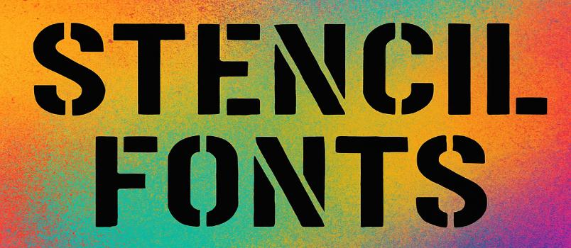
Stencil fonts are typefaces that are designed to appear as if they’ve been cut out or spray-painted using a stencil. The signature feature of these fonts is the presence of small gaps or breaks within each letterform. These breaks allow letters to maintain their structure when cut from a surface—just like real stencils used for painting or signage.
This practical origin gives stencil fonts a rugged, industrial feel. They are often associated with military, shipping, construction, and street art themes, but they’ve also evolved into a trendy option for branding, posters, and digital artwork.
Popular Uses of Stencil Fonts
-
Military Designs
With their origins tied to stenciled crates and equipment, these fonts are a go-to for military or tactical branding. -
Urban and Industrial Art
Street artists and graphic designers use stencil fonts to replicate the raw look of graffiti and industrial labels. -
Vintage Packaging
Many brands use stencil typefaces for a nostalgic or utilitarian aesthetic in packaging and labeling. -
Event Posters and Flyers
Their striking appearance works well for music festivals, protests, sports events, or any occasion that requires bold typography.
Stencil Fonts
Boston Traffic

There’s something about urban typography that just clicks with me, and Boston Traffic nails that street-smart aesthetic perfectly. This font feels like it was born on a busy intersection – bold enough to grab attention but refined enough for serious design work. I’ve found it works incredibly well for headlines that need to convey both authority and approachability.
CargoCrate

CargoCrate brings that industrial warehouse vibe that’s been trending in design circles lately. What I love about this typeface is how it manages to feel both sturdy and modern at the same time. It’s perfect for brands that want to communicate reliability without looking outdated – think logistics companies or craft breweries that want that authentic, no-nonsense appeal.
Due Date

Sometimes you need a font that means business, and Due Date delivers exactly that energy. This typeface has this great sense of urgency built right into its letterforms – hence the name, I suppose. I’ve used it for project timelines and deadline-focused materials where you really need the typography to reinforce the message that time matters.
Gunplay

Despite its edgy name, Gunplay is surprisingly versatile for display work. The letterforms have this sharp, angular quality that works brilliantly for gaming graphics, action movie posters, or any project that needs to convey intensity. It’s one of those fonts that immediately sets a tone – you know exactly what kind of energy you’re working with.
Itomi Vinca

Itomi Vinca has this beautiful balance between elegance and readability that makes it stand out in the crowded world of display fonts. There’s something almost botanical about its name and character – it feels organic yet structured. I find myself reaching for it when I need something that’s distinctive but not overwhelming.
Kaiser

Kaiser commands attention without having to shout for it. This font has that classic European sensibility – strong, confident, and unmistakably authoritative. It’s the kind of typeface that works beautifully for luxury brands or any application where you need to convey heritage and quality. The weight distribution is particularly well-balanced.
Lintsec Regular

Lintsec Regular feels like it emerged from the tech world – clean, functional, and surprisingly friendly for a technical-looking font. I appreciate how readable it remains even at smaller sizes, which makes it more versatile than a lot of display faces. It’s perfect for that modern, slightly futuristic aesthetic without going overboard.
Major Snafu

The name alone tells you this font has personality, and Major Snafu doesn’t disappoint. It’s got this military-inspired aesthetic but with enough character quirks to keep things interesting. I’ve found it works great for projects that need to balance professionalism with a hint of rebellious spirit – think independent magazines or alternative brand identities.
MKStencilsans Black

MKStencilsans Black is exactly what you’d expect from a stencil font, but executed with real finesse. The black weight gives it serious presence on the page, and those characteristic stencil breaks add visual interest without sacrificing legibility. It’s my go-to choice when I need something that screams “industrial strength” but still looks polished.
Rafika

Rafika brings a touch of international flair to any design project. There’s something worldly about this typeface – it feels like it could work equally well for a travel magazine or a cultural arts center. The character shapes have this subtle sophistication that makes even simple text layouts feel more refined.
Carrier Stencil

Carrier Stencil takes the military stencil aesthetic and refines it for contemporary use. What sets it apart from other stencil fonts is how well-proportioned the letterforms are – you get all the visual impact of a stencil cut without the crude, hastily-made feeling that some stencil fonts can have. It’s professional-grade stencil work.
Stencil Export

Stencil Export feels like it was designed for shipping containers and warehouse labels, which gives it this authentic industrial credibility. The letterforms are clean and highly functional – this isn’t about decoration, it’s about clear communication in challenging environments. Perfect for brands that want to tap into that logistics and transport aesthetic.
Stencil Four

There’s a mathematical precision to Stencil Four that I really appreciate. Each character feels carefully calculated, with stencil breaks that enhance rather than interrupt the reading experience. It’s one of those fonts that works equally well for technical documentation and creative projects – that versatility is rare in the stencil category.
Stencil Gothic

Stencil Gothic brings together two classic typographic traditions in a way that shouldn’t work but absolutely does. The gothic influences give it more character than your typical stencil font, while the stencil cuts keep it grounded in that practical, functional aesthetic. It’s perfect for projects that need both personality and authority.
Stencilia

Stencilia feels like the refined cousin of traditional stencil fonts. The letterforms maintain that characteristic stencil functionality while adding just enough sophistication to work in more upscale applications. I’ve used it for high-end packaging projects where clients wanted that industrial reference but needed something more polished.
Weltron Urban

Weltron Urban captures that gritty city energy perfectly. This font feels like it grew up on subway walls and construction sites – there’s real urban authenticity in these letterforms. It’s ideal for projects that need to communicate street credibility or connect with urban culture without trying too hard to be edgy.
Densmore

Densmore has this solid, dependable quality that makes it perfect for brands that need to communicate stability and trustworthiness. The letterforms are substantial without being heavy-handed, and there’s a timeless quality to the design that suggests it’ll age well. I often recommend it for financial services or professional consulting firms.
HVD Peace

Despite its peaceful name, HVD Peace has plenty of visual strength. What I love about this font is how it manages to be both calm and confident – it doesn’t need to be aggressive to make its point. The character spacing and proportions create this sense of harmony that lives up to the name while still maintaining strong visual presence.
Armalite Rifle

Armalite Rifle is unapologetically bold and tactical in its approach to letterform design. The sharp angles and aggressive spacing give it serious impact on the page. While the name might suggest limited applications, I’ve found it works well for any project that needs to convey strength, precision, or cutting-edge technology.
AG Stencil

AG Stencil represents everything good about functional typography. The letters are clean, readable, and purposeful – exactly what you want from a stencil font. There’s no unnecessary decoration here, just solid letterforms that do their job efficiently. It’s particularly effective for wayfinding systems or any application where clarity is paramount.
Sistemas

Sistemas has this systematic, almost algorithmic quality that makes it perfect for tech-related projects. The name suggests organization and methodology, and the letterforms deliver on that promise. I find it works particularly well for software interfaces or any brand that wants to communicate efficiency and logical thinking.
Top Secret

Top Secret brings that classified document aesthetic into contemporary design work. There’s an inherent drama in these letterforms that immediately suggests confidentiality and importance. While it might seem like a novelty font, I’ve found it surprisingly useful for legitimate applications where you need to create a sense of exclusivity or insider access.
ICBM SS-20/25

ICBM SS-20/25 is definitely not your everyday typeface choice, but when you need something with serious military-grade impact, nothing else will do. The technical designation in the name hints at the precision engineering that went into the letterform design. It’s perfect for projects that need to communicate advanced technology or strategic importance.
50 Blizzards

50 Blizzards has this weathered, battle-tested quality that tells a story before you even read the words. The letterforms feel like they’ve survived harsh conditions, which makes it perfect for outdoor brands, extreme sports, or any application where durability and resilience are key messaging points.
President Gas

President Gas closes out this collection with serious political undertones built right into the design. The letterforms have this authoritative weight that commands attention, while subtle details suggest both power and controversy. It’s the kind of font that works for editorial design where you need typography that takes a strong stance.

