Mike Davidson, CEO of Newsvine a user-updated news blog, remarked that, “Because the competitive landscape of the web is such that the site which looks and works best gets the most traffic, developers and designers put a premium on the presentation of that content and let structural markup take a back seat.” Although thought provoking ideas and well written articles are important, a great deal of your success as a site has to do with design and performance.
In the book Mindless Eating, Brian Wansink describes a lot of the senseless food phenomena that influence our eating habits. One of his findings is that presentation not only would influence how likely someone was to buy a particular food product, but also that it’s packaging would influence the way it tasted. This same principle can be applied to your website. The design and performance of your website can not only influence how many people come to your website, but also their perception of your site as a whole. There are a few types of bad sites that we at A Small Orange typically see.
Seeing The Top and Going Right Over It
There is a host of designers who have forgotten the age old adage that “less is more”. A good example is the picture above which is a therapy firm that has created a rather ostentatious website. Somewhere in between the moving butterflies, pictures of nude women, scrolling text, twinkling stars, and cheesy music, the serene feeling they were aiming for is lost. In the new age of web design simplicity is valued. If you have to throw in as many cool effects as you can think of you’re probably trying too hard.
The Box Of Chocolates
I’m all for mysteries, but the place that I really don’t like to see them is in the home page of a website I’m trying to navigate. This website pictured above is not very clear about what links go to where. The problem is that looking for something in particular becomes a journey through the labyrinth of a website that this becomes. If you have the patience to browse through hundreds of photos then this could be the site for you, but if you’re looking easy navigation then this isn’t the place for you.
Attention Deficit Designing
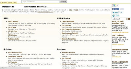
This next archetype of bad design is an interesting combination of the last two archetypes. On one artwork is rather messy ad busy, but what really makes it problematic is that even though you can tell where each of the hyperlinks will take you, they’re scattered all across the site. Navigation should be easy, and a big part of that is having a consolidated section that can take you anywhere in the site.
Content Explosion
If you’re designing a website and your client says, I want my content to be as dense as possible. This website pictured above seems to have felt this way. I guess some people want their visitors to be bombarded by content, but for the most part a simple and tasteful website will bring more traffic and thus more sales. The problem with these websites more than anything is the lack of organization that comes with this layout. You want designs to be smooth and fluid, rather than overwhelming.
Conclusion
[alert-success] When you are designing a website, it’s important to look at it from the user’s standpoint. Ask yourself, would I spend my free time looking at this? For the most part when people design websites they are thinking about themselves and what they want out of the site. However, good design comes from considering the other person and understanding your mutual interests that can be expressed virtually. If you can figure out how to tastefully and elegantly appeal to someone’s interests, you have the internet in the palm of your hand.[/alert-success]


