If your website is meant to draw users to search for and share videos, images, people, or data, then keep the design as simple as possible. Take some web design courses to give yourself an idea of what has been done in the past and what is trendy right now.This will increase the likelihood of revisits and promote the notion that you’re an established source that doesn’t rely on gimmicks to get visits.There’s a reason why Internet powerhouses like Google, its subsidiary YouTube, Wikipedia, Twitter, 4chan, and Flickr have the means to develop and design state-of-the-art homepages teeming with the latest in interactive bells and whistles, but choose instead to keep their designs stuck in the mid-2000s.
Keep the Design Simple
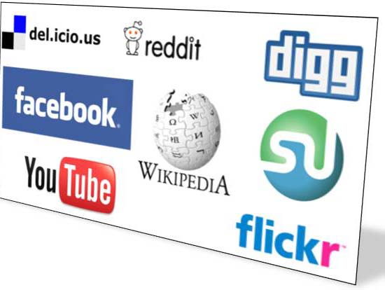
Visit these sites and you’ll see barebones sidebars, plain Jane forums, and certainly nothing flashing at you, and then realize you are one of millions of people who will visit this unassuming website that day. Granted these websites mentioned are particularly powerful cases, whose services speak for themselves, but the idea that heavy design is a significant booster in a website’s success is ignoring the truth that online, it’s function that matters.
And you don’t want to get in the way of that function. An aspiring content sharer/provider will coordinate with its internet marketing agency to “catch the eye” and said agency will professionally oblige and suggest the multi-colors, sounds, and automatic playback of video that very correctly does in fact help entice users to probe deeper into a website. But unless you choose an agency that foresees the importance of function over form, without your input regarding simplicity you can end up having an overzealous online presence that overwhelms the searching and sharing your website is attempting to initiate.
Focus on the logo. When you think of the words “Google” and “Twitter” aren’t you picturing them in the font style depicted on their homepages? Coming up with a good name and designing a clever logo layout are what online marketing agencies do best. Other than that all you need are a few hyperlinks and a search window and you’re good to go.
Facebook is a good example of a giant with simple style who decided to instead engage its users with a sophisticated new layout. I can’t say it hasn’t worked for Facebook since they’re still growing exponentially, but consider the charges against Facebook these days: privacy invasion, data mining, etc. The addition of a barrage of outside advertisements and applications, the increasing complication of profile layout, and a sense of losing control on the part of the members, certainly contributes to the general suspicions about Facebook’s intentions these days.
Conclusion
But let’s be honest, you’d kill to be in the position where you could upset millions of your websites members. In the meantime, while you compile those millions, try and keep it simple. It may just be the easiest choice you make.


