
How effective are your product pages when it comes to conversion rates? The truth is, product page is the final chance to influence the users to buy. Users expect to find all the relevant information before they make a purchase decision. It is indeed challenging for the designers, because there is so much information to be delivered in so little space. Probably, this is the reason the product detail pages end up looking so messy and cluttered. But you do not worry for your eCommerce site! Hire the best designing team to present your information in the most convenient and easy-to-understand style.
Today’s blog post specifically target the usability techniques to make you understand the factors behind high conversion rates. There is no point creating a site that fails to cater to the needs of your audiences. A good eCommerce site demand for a better categorization and user features to help consumers find what they want to buy.
So here are some of the best designing guides to create conversion friendly eCommerce site.
Easy navigation
 Dimensional navigation is probably the best option. Prospective shoppers always want navigation that can easily get them from point A to point B with a minimum fuss. When you have large assortment of products and filters to hide them away from the viewers , think of some interesting ways to showcase your products, thereby, helping the users find the best fit. So design your navigation in such a way that will allow users to browse your product portfolio within a fraction of a second.
Get as few categories as possible to make the search process smooth and make sure they operate in the fly-out menu style that can make navigation easier. Include detailed filters for product features, prices, brands, shipping charges, or customer ratings. Most importantly, offer an advanced search field to help them visit their destination quickly. Offering breadcrumb trail provides practical conveniences.
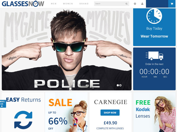
Impressive visuals
 Selling of your products depends a lot on the way you present them. You cannot deny the fact that the tech giants including Facebook, Twitter, or Google are emphasizing the importance of photos and video content. The same theory should be applied when you design your eCommerce site. Bringing the most impressive, high resolution photos, videos or 360 degree view of the product to the users definitely works well. Zoomable product images especially taken from different angles are a great conversion booster. In short, product page in eCommerce website play a major role when it is a question of conversion.

Right choice of color and typography
Most of the designers love to play with typography and color. The twisting, shaping, contorting letters and words help to form a beautiful masterpiece of beauty and skill. Up front and to the point messaging is not the only criteria. Styling your information to grab the attention of the viewers is essential. Make the headers, sub-headings and body consistent across the website. The website should have a well-defined style guide – creative style guide and copy style guide.
In addition, pay attention to the minute details of the product colors. For instance, you may use RED color for error messages and GREEN to direct customers to proceed with their purchases. Also if your brand and its logo has RED color in it, consider using some other color for your website. How about using BLUE text with an alert icon? It will certainly work well.
Product detail page
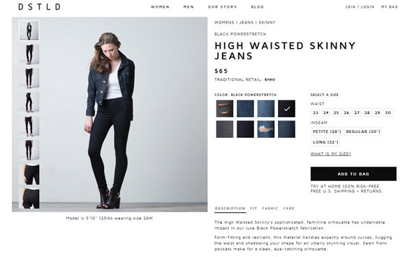 There is no point focusing too much on the design and usability of the home page and failing to show the same effort to the rest of the pages. The majority of the user’s time is spent on the product detail page than any other. Make sure you design the possible options in your site to give your customers all the information they’re looking for. For instance, the recent trend for designing eCommerce website is to insert ‘no-click’ alternate images and swatches. The more your customers need to click on things, the more tired they get. However, these features enable users to roll over an image, without clicking on it, to get immediate result. You may also use Ajax to make quick product previews to blow up from thumbnails. The second best option is to feature some specific products on your landing page to help the confused shoppers focus on the products they would like to buy.
However, the most important elements in a product page are the product title, pricing, short description, payment options, and shipping and delivery method.
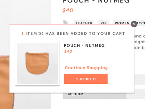
Visibility of shopping cart
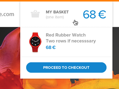 When a customer trust your online store enough to add a product to the shopping cart, she actually wants to keep an eye on that cart. Therefore designing a small and unobtrusive shopping cart is not a good idea. It is highly distracting for the shoppers to press on the ‘Add to Cart’ button and not really knowing if their choices are accepted. So ensure that the shopping cart is visible at all times, preferable at the top right hand corner of the screen. You can also add shopping cart widget to some part of the website to display it all the times. Another best option is to add a drop down menu to the shopping cart to help users get information about the product. Shoppers have the habit of checking items ready for purchase and therefore want continuous access to their shopping cart. So make the shopping cart appear prominent, and easy to see.
Smooth checkout process
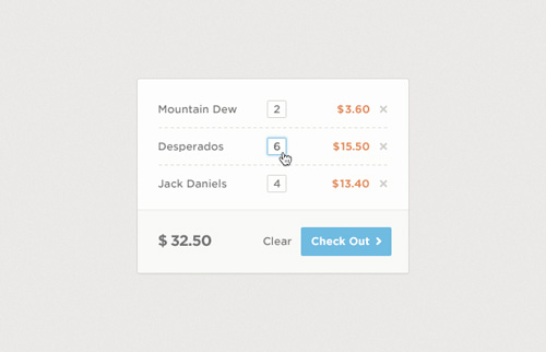
The thumb rule for eCommerce website design is that you’re there to make a sale. So there should not be any sort of distractions on any page. This is especially applicable for the checkout page. Remember the following designing guide while constructing the checkout process
– Design blinkers into your checkout process
– Remove the sidebar
– Don’t ask users to register for an account
– Opt for single-page checkout process that doesn’t not distract the customers with anything else.
Clear call-to-action (CTA)
Needless to say that a clean call to action (CTA) is the real game changer especially in an eCommerce website. And that counts for a good CTA. A working CTA should be
– Visually contrasting and easy to locate
– Brief, but action-oriented
– Coherent
CTAs are the best way to guide a user throughout their purchase process. However, the importance of CTA is even higher on a product detail page. You may also design a great call-to-action for your contact page as ‘Contact Us Now’ instead of subscribe. To know which CTAs work best for your particular website, you may run a couple of A/B tests with different colors, shapes and wording with CTA. Study conducted by Kissmetrics found that making CTA more prominent can increase conversion by 591 percent.
Detail contact information
Mentioning contact info on your eCommerce website can make it conversion-friendly. The contact information should be clearly visible and easily accessible. Making customer struggle to find your contact information is not a pleasant experience. The design of your contact page should be able to help customers contact you as soon as they face any issues or even has a question.
Setting up an eCommerce website demands proper design, constant analysis of website performance and optimization. So never stop improving and walk in pace with new technology. In this context, you can check out the winners of inaugural design awards as announced by Shopify last year.
