
The primary goal of any ecommerce website is to sell. Sure, the overall impression, attractive product images, and convincing descriptions do their job.But are you sure you made everything to develop a navigation that helps to sell more?
Very often whether the visitor buys on your website or takes their wallet elsewhere depends on how easy and fast finding a product is. Internet users are busy people, and unless they are devoted fans of your store and your store only – which is rare – they will wave goodbyeif the e-shop takes more than two seconds to figure out. So, here are several tips on how to make the navigation of your ecommerce website more buyer-friendly – with positive and negative examples of the leading e-stores on the web.
Your ecommerce website has a huge product assortment with gorgeous photos that should make visitors click “Add to Cart” right away. You have invested into professional design of ecommerce site and action-provoking copy, thoroughly tested all payment methods – but the sales are still not good enough. What have you done wrong?
The reason can take you by surprise.Even though you considered usability when building the e-store, there is a good chance you never expected its navigation to actually influence the sales. But, as a recent research study shows, poorly planned navigation can make visitors leave an ecommerce website in frustration instead of buying a product or two. Putting it simple, if the user has to struggle to find something, they won’t bother.
With that in mind, ecommerce website navigation should make finding a product effortless and intuitive. Here are several tips for developing navigation that makes your online store easier to use – and ultimately, more profitable.
Use Parent Categories and Make Them Clickable
Before visitors move to narrower categories, they want to explore broader groups of products. Many websites do use parent categories, but make them unclickable in the navigation, which doesn’t meet the user’s expectations. You want to give the visitor as many opportunities to explore the products as possible, and clicking on a category is the natural way they expect to do that.
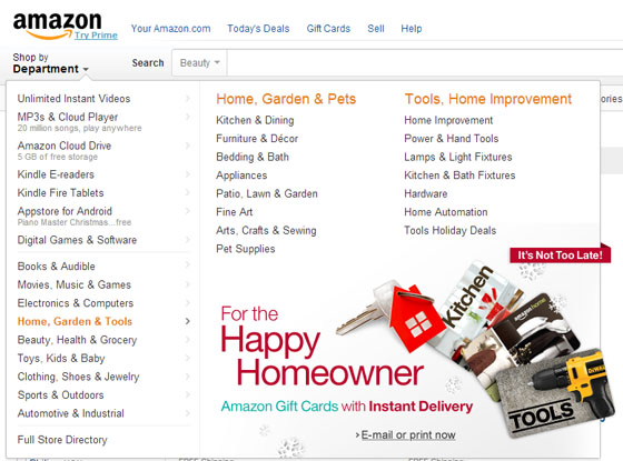
On Amazon.com, one of the top ecommerce websites in the world, the user can’t click on “Home, Garden & Tools” in the drop down menu, nor can they click on further subcategories “Home, Garden & Pets” and “Tools, Home Improvement”. That forces them to go into narrower categories or search for other ways to access the parent category they can’t access right away.
Link Contextual Images to Relevant Products
Images are eye-catching, especially contextual images, where your products are shown in a natural environment – just the way they would look, say, in your customer’s home. When the user sees a product they love on an image, they want to get it immediately, instead of browsing through dozens of other similar products. So if you want your contextual images to sell, make sure you link them to the products they demonstrate, so that the customer could make the purchase on the spot.
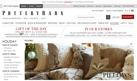
This photo on PotteryBarn shows several lovely pillows, but there is no way for the user to get direct access to them. In fact, the image is not even clickable. By linking this image to the pillows that are shown on it, the store would make a few extra hundred bucks on the immediate purchases.
Feel Free to Include a Subcategory WithinDifferent Categories
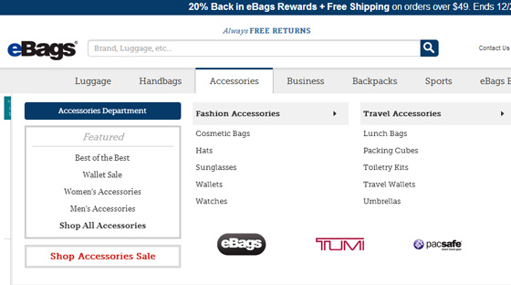
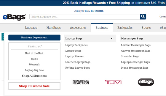
Our minds work in different ways, so your visitor may be expecting to find a certain subcategory not within the category you thought logical. They might also be unsure where to look for what they need: for example, do you look for iPad cases in the “Accessories” section or in “Business”? eBags includes them in both, which is a smart thing to do: not being able to find the right subcategory is frustrating for the user and decreases the odds of your e-store making a sale.
Internet users are overwhelmed with information and easily distracted, so if you want them to buy from you, make sure you put your products at their fingertips! And the right navigation is your key to ecommerce website design that sells.
Now, does your ecommerce website handle navigation the right way? What would you improve? Share your thoughts in the comments.


