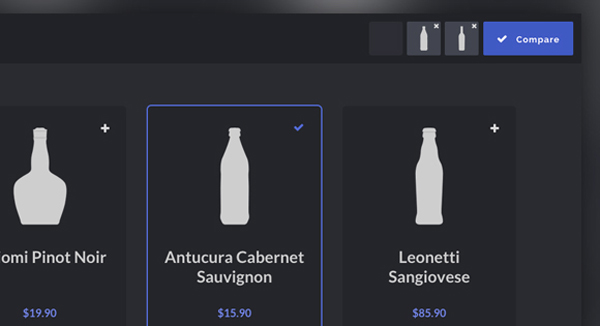
Product Comparison Layout & Effect is a basic responsive product grid layout with comparison functionality and a slide-in effect. This Blueprint is a responsive product grid layout with comparison functionality. A maximum of three items can be selected for the product comparison. The comparison view shows flexbox-powered columns or rows (depending on the viewport size) that appear with a slide-in effect. There are a couple of example media queries for smaller viewports. You can integrate…
iCheck is a highly customizable checkboxes and radio buttons.iCheck works with checkboxes and radio buttons like a constructor. It wraps each input with a div, which may be customized by you or using one of the available skins. You may also place inside that div some HTML code or text using insert option. Features: 32 options to customize checkboxes and radio buttons 11 callbacks to handle changes 9 methods to make changes programmatically Identical inputs…
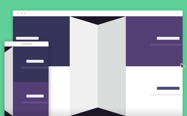
This is a tutorial to create a secondary content panel that folds flat, powered by CSS Transformations and jQuery.Developed by Codyhouse. These kind of folding panels are being integrated quite often in mobile apps ane became very popular. There will be cases when you need to load content, a process that requires time (even if it’s just half a second). In these cases an animation can be a nice way to replace a loading bar,…
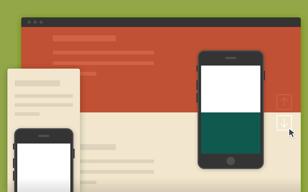
This is a simple template that takes advantage of the background-attachment CSS property to create a fixed background effect. Today’s snippet comes from Codyhouse.It is all about a single CSS property: background-attachment. You can set the background to be fixed within the viewport (background-attachment: fixed;). The new trick here is having the same element (in this case a phone) in the exact same position in all background images, so that while you scroll…
In user interface design, a modal window is a graphical control element subordinate to an application’s main window which creates a mode where the main window can’t be used.It can be used to generate alert or confirm messages with few lines of code. animatedModal.js is a jQuery plugin to create a fullscreen modal with CSS3 transitions created by João Pereira.You can use the transitions by animate.css or create yourself their transitions. It has cross browser…
TouchSwipe is a jquery plugin to be used with jQuery on touch input devices such as iPad, iPhone etc. Detects single and multiple finger swipes, pinches and falls back to mouse ‘drags’ on the desktop.Time and distance thresholds can be set to distinguish between swipe gesture and slow drag.Allows exclusion of child elements (interactive elements) as well allowing page scrolling or page zooming depending on configuration. Detects swipes in 4 directions, “up”, “down”, “left” and…
This is a call-to-action button that animates and turns into a full-size modal window coded by Codyhouse.Modal windows are used to display related content, by hiding temporarily the main content. If we imagine our web page as layers distributed along the z-axis, modal windows are on top.The main idea here is the button that triggers the action animates and turns into a full-width new page. The final result is powered by a combination of CSS…
Flickity is a carousel,slider,gallery library created by David DeSandro.Flickity makes galleries, sliders and carousels that feel lively and effortless. Start using Flickity in three steps. Download Flickity flickity.css and flickity.pkgd.min.js files Add the Flickity .css and .js files to your site Add js-flickity class to gallery elements That’s it! You’re all set to start using and customizing Flickity.
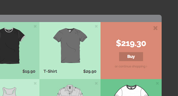
This a collection and tutorial of some fun effect and layout ideas for the first step of a checkout process in an online store by Codrops.Mary Lou is using morphing buttons concept together with CSS transforms and transitions. The checkout process in online stores is one of the most challenging and crucial in terms of UI design. Done well it can create a pleasant and smooth purchasing experience for the user; done wrong, it can…
Auto-hide sticky header makes site navigation easily accessible anywhere on the page and saves content space at the same. Auto-hide means hiding the header automatically when a user starts scrolling down the page and bringing the header back when a user might need it: they reach the bottom of the page or start scrolling up. There are at least two manners of hiding a header: reactive and lazy. The source of the demo consists of…

