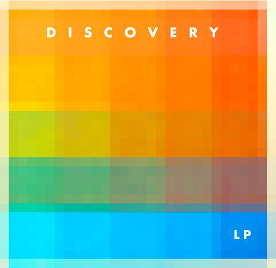
Few things are more daunting for a designer than staring at a blank canvas. Usually, when you’re working for a client, you have a guideline or an idea of where to start – and the vast majority of regular client work needs to look smart and professional and fits the image of the business. This all goes out of the window when you’re designing an album cover, though. The cover for an album needs to…
Traditionally, in the days before the Internet, logos were often designed to look good on paper, and so would often need to be in black & white. Apple broke from this when they launched, with Steve Jobs famously choosing a multi-colored logo despite the printing costs being significantly higher (at a time when the company didn’t have much money). But it’s not like that anymore – designing for the web means that there’s been a proliferation of colorful logos in the last 15 years, particularly among Internet startups, and this injection of color helps to show off the quirky, interesting personality of the company behind the logo.

