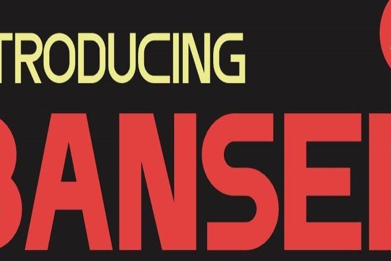
Bansed Font Bansed by Kendra Orozco is a clean, versatile sans-serif font family built for modern graphic design and contemporary text display. Its various styles give designers genuine flexibility — from bold headlines and logo work to refined body-adjacent display use — while maintaining a consistent, approachable personality across the full range. With uppercase, lowercase, and multilingual character support in both OTF and TTF formats, Bansed arrives as a practical, well-rounded toolkit for branding, editorial,…
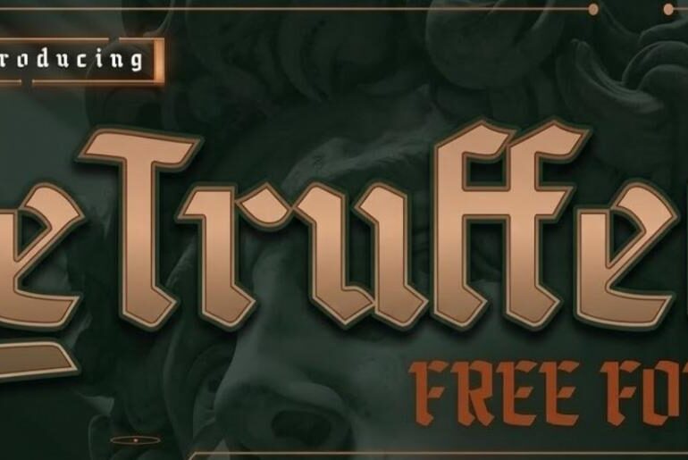
Le Truffet Font Le Truffet by Drizy Studio is a display retro blackletter typeface that wraps old-world Gothic drama in a warm, vintage sensibility. Its ornate letterforms — spanning uppercase, lowercase, ligatures, numbers, punctuation, and multilingual characters — carry a nostalgic weight that feels equally suited to craft beer labels, editorial headlines, tattoo-inspired branding, luxury packaging, and any design that wants to feel rooted in history while remaining visually striking. The demo release delivers a…
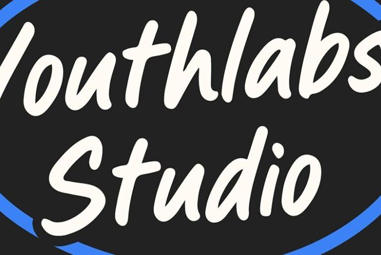
Midable Font Midable by Youthlabs Studio is a high-impact bold marker font that brings raw, hand-crafted energy to every character without sacrificing professional polish. Its swift, deliberate strokes strike a compelling balance between urban grit and modern confidence — making it equally at home on cinematic titles, sports branding, social media graphics, and disruptive packaging that needs to stop the scroll. Designed by Fathi Al Ghazi, Midable is a typeface built for creators who need…
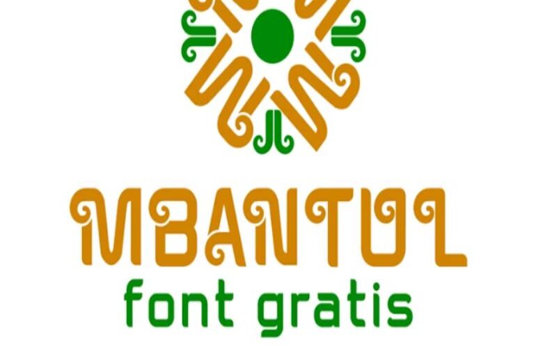
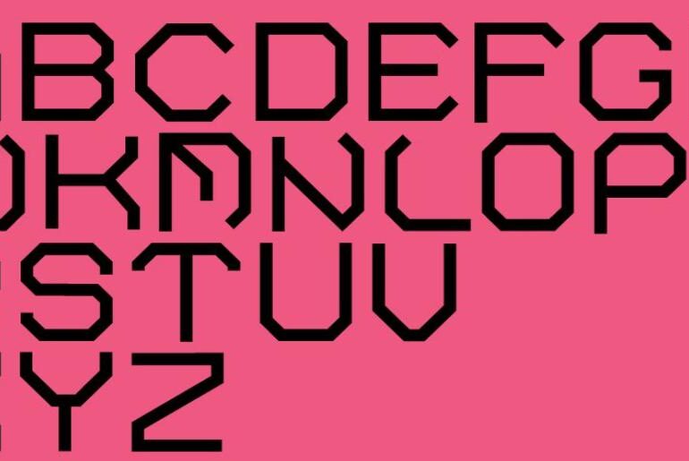
Mbantul Font Mbantul by JVMIYO DSGN is a stylish decorative sans-serif display typeface with a bold, iconic character that translates effortlessly across branding, social media, advertising, and visual identity work. Named after the Yogyakarta regency of its creator’s home, its confident letterforms bring a distinctive, contemporary personality to headlines and logos without sacrificing legibility. With 99 characters in a single Regular style, it arrives as a practical and generous free release for designers looking for…
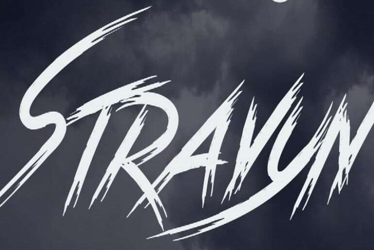
Stravyn Font Stravyn by NDNL Studio is a wild, high-energy brush display font that channels raw rebellion and unstoppable motion in every stroke. Its sharp, textured letterforms carry genuine attitude — rough at the edges, bold at the core — making it an immediate fit for posters, album covers, horror and Halloween graphics, logo design, and any creative project that demands intensity over elegance. This is a typeface that doesn’t ask permission; it commands attention…
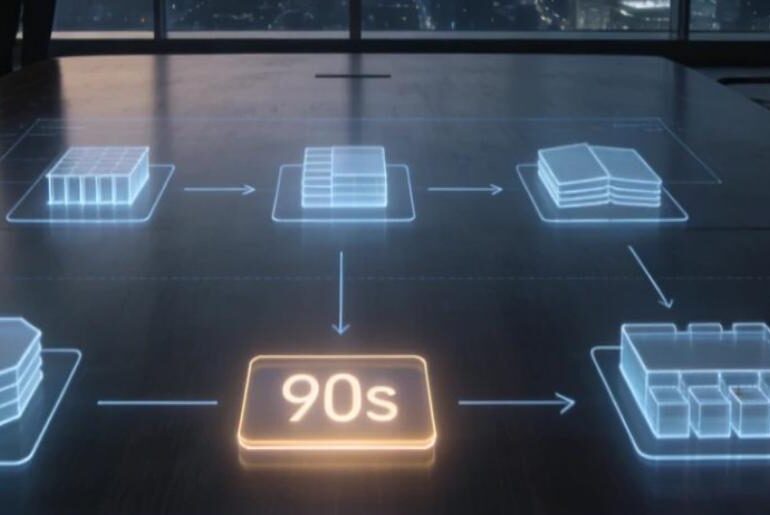
In the rapid-paced digital economy of 2026, organizational agility is the primary differentiator between market leaders and laggards. For departments spanning marketing, product design, and digital commerce, the production of 3D assets has historically been a significant operational bottleneck. The traditional 3D pipeline, characterized by long lead times and high manual labor costs, often forces managers to compromise between quality and speed. To maintain a competitive edge, forward-thinking leaders are now moving away from fragmented…
Lucania Font Lucania Regular by Gustavo Brigante is a thoughtfully crafted display typeface that draws its name from the ancient region of southern Italy — and carries that classical pedigree with understated elegance. Its letterforms feel considered and deliberate, with a refined personality that suits editorial headlines, logo design, branding projects, and any typographic context where character and craft matter as much as impact. The Regular weight arrives as a generous free release from a…
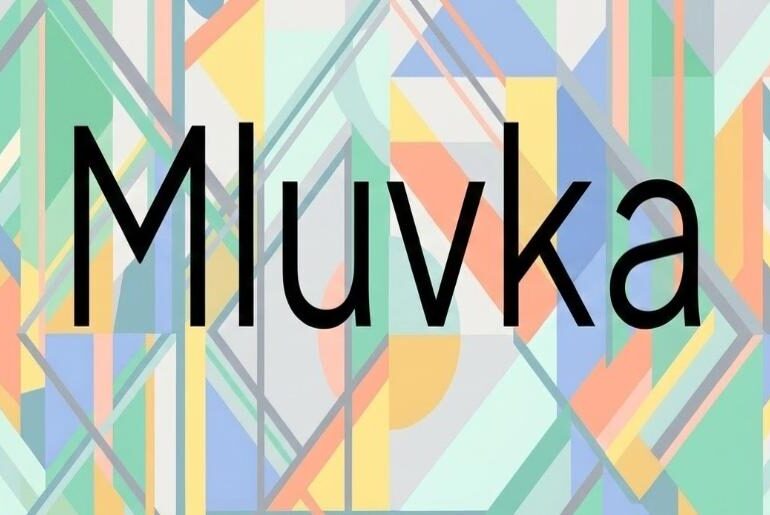
Mluvka Grotesk Font Mluvka Grotesk is a contemporary geometric sans-serif designed by Czech type designer Jiří Krblich, released as the second iteration of his earlier work and built specifically to address readability limitations identified in version one. The name comes from the Czech word for speech or talking. Krblich distributes the font through GitHub under the SIL Open Font License, making it available for both personal and commercial use and allowing derivative works within the…
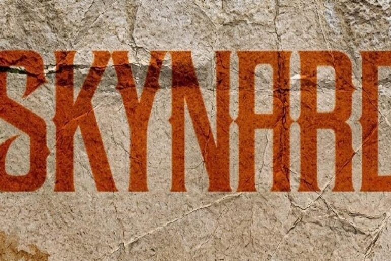
Skynard Font Skynard is a Victorian-inspired ornate gothic display typeface by New Zealand designer Rob Hindley of Fine Line Creative, built as a direct formal response to a specific piece of rock lettering history: the hand-rendered title treatment on Lynyrd Skynyrd’s 2009 album God + Guns. That reference point tells you everything essential about where this face lives and what it is trying to do — it is a typeface for the territory where Victorian…
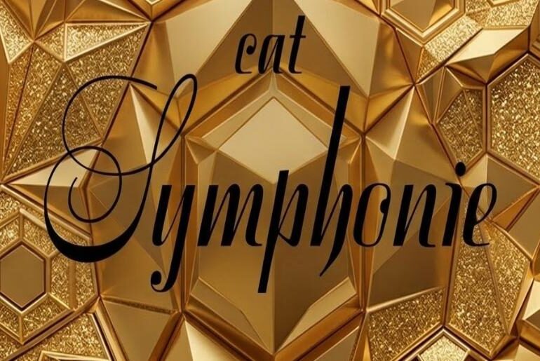
Symphonie Font Symphonie is a digitisation of a 1938 calligraphic script by German type designer and digital font archivist Peter Wiegel, whose CAT-Fonts project has spent decades preserving and reviving pre-digital lettering work that would otherwise be inaccessible to contemporary designers. The original design embodies what copperplate-influenced calligraphy was doing in 1930s European lettering culture — an era when the formalism of classical penmanship was being inflected with the slightly looser, more flowing qualities that…

