Yokohama Font
What Font Does Yokohama Use?
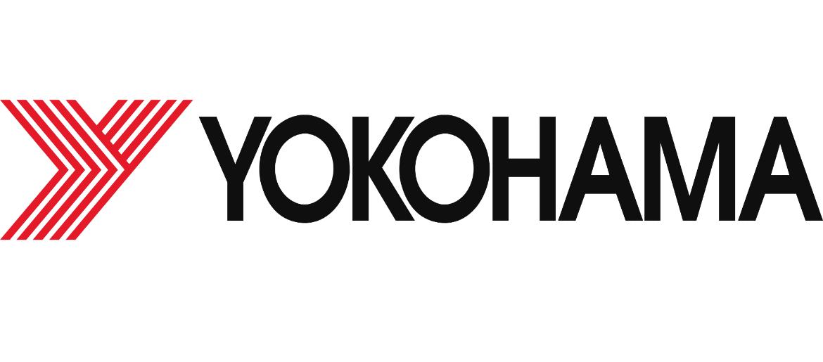
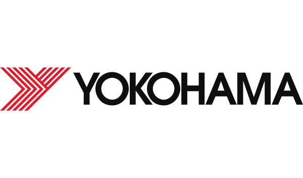
The Yokohama Font is very close to ITC Avant Garde Gothic Pro Medium, the typeface used in the Yokohama logo and branding. It is a geometric sans-serif font with rounded shapes, clean lines, and balanced proportions, giving the Yokohama wordmark a modern, technical, and professional look. The smooth geometry and strong structure reflect the brand’s focus on precision, engineering, and high-performance automotive products.
ITC Avant Garde Gothic Pro Medium is a commercial font that requires a paid license for professional use. However, there is also a free alternative available that closely matches its geometric style, making it suitable for personal projects, fan graphics, and non-commercial designs.
About Yokohama
Yokohama is a Japanese tire and rubber products company founded in 1917. The brand is best known for its high-performance car, truck, and motorsport tires, as well as industrial rubber products used around the world. Yokohama has built a strong reputation for innovation, safety, and racing technology.
The company’s bold and modern visual identity reflects its commitment to engineering excellence and global performance. The clean, geometric Yokohama logo and typography reinforce its image as a reliable, technologically advanced, and performance-driven automotive brand.
Explore NHL team and rock band fonts with Anaheim Ducks Font, Nirvana Font, Taylor Swift Font, Chris Rea The Christmas Album Font, and Speak Now Font — and more.
Please make sure to follow the license terms for each font. All fonts provided are free for personal use, while some may also allow commercial use. For details, check the included Read Me file with each download. If you’re uncertain about usage rights, we recommend contacting the font’s creator directly.

