CNBC Font
What Font Does CNBC Use?
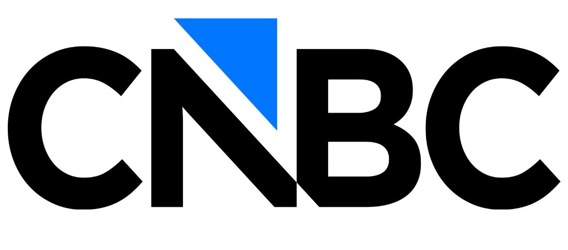
The CNBC Font used in the 2026 logo is most likely Gotham Bold, the typeface applied to the updated CNBC wordmark and branding. It is a geometric sans-serif font with clean lines, wide proportions, and strong vertical strokes, giving the logo a bold, authoritative, and highly modern look. The solid structure helps CNBC project trust, clarity, and global financial credibility across broadcast, digital, and mobile platforms.
Gotham Bold is a commercial font that requires a paid license for professional use. However, there is also a free alternative available that closely matches its bold, geometric style, making it suitable for fan graphics, mockups, and personal projects.
About CNBC
CNBC is a global business and financial news network launched in 1989. It is best known for its real-time stock market coverage, breaking business news, and financial analysis, serving investors, professionals, and general audiences around the world. CNBC broadcasts from major financial hubs and provides coverage of markets, technology, economics, and global trade.
With its 2026 visual refresh, CNBC continues to emphasize a clean, modern, and authoritative brand image. The bold typography in its logo helps reinforce its role as a trusted source for fast, accurate, and professional financial reporting in the modern media landscape.
Find holiday and drama film fonts like Christmas Calling Font, Platonic Font, The Last Duel Font, Conclave Font, and Luminous Christmas Font — and more.
Please make sure to follow the license terms for each font. All fonts provided are free for personal use, while some may also allow commercial use. For details, check the included Read Me file with each download. If you’re uncertain about usage rights, we recommend contacting the font’s creator directly.

