Garmin Font
What Font Does Garmin Use?
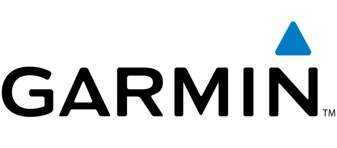
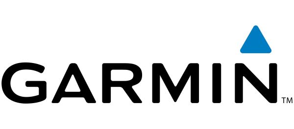
The Garmin Font is closest to Media Gothic, the typeface used in Garmin’s logo and visual branding. It is a clean, modern sans-serif font with sharp edges, compact spacing, and a strong technical feel, giving the Garmin wordmark a precise, sporty, and high-performance look. The straightforward letterforms help communicate Garmin’s focus on accuracy, navigation, and advanced technology.
Media Gothic was designed by Studio Media and is free to download, making it a convenient option for designers who want to recreate or be inspired by the Garmin logo style without licensing restrictions.
About Garmin
Garmin is an American technology company founded in 1989 that specializes in GPS navigation and wearable technology. The brand is widely known for its products in fitness, aviation, marine, automotive, and outdoor recreation, including smartwatches, cycling computers, and navigation systems. Garmin has built its reputation on precision, durability, and data-driven performance.
The company’s visual identity reflects these values through a bold, technical logo and clean typography that feels both modern and dependable. Whether on a smartwatch screen, a car dashboard, or a sports device, Garmin’s branding reinforces its role as a leader in navigation and performance technology.
Explore premium beer brand typography including Carlsberg Font, Budweiser Font, Amstel Font, Beefeater Font, and Ballantines Font — and more.
Please make sure to follow the license terms for each font. All fonts provided are free for personal use, while some may also allow commercial use. For details, check the included Read Me file with each download. If you’re uncertain about usage rights, we recommend contacting the font’s creator directly.

