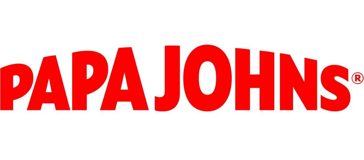
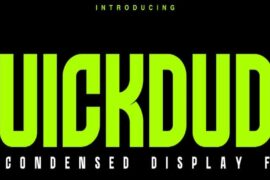
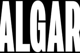
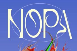
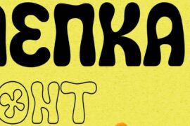
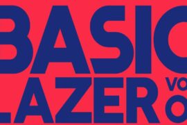
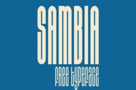
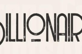
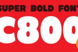
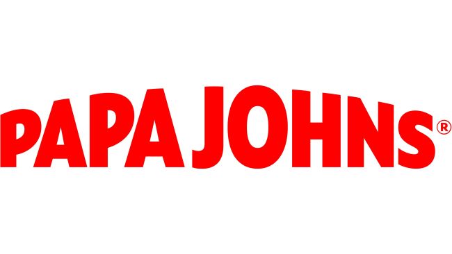
The Papa John’s Font delivers the same bold and inviting energy as the pizza brand itself. With its strong, rounded lettering and slight arch, the Papa John’s Font instantly grabs attention while keeping a friendly, appetizing feel. I think this font stands out because it balances classic pizzeria charm with modern simplicity, making it perfect for menus, packaging, and advertisements. I think the font is Scatio Black but please check alternative font below.
Papa John’s Font
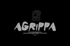
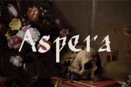
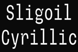
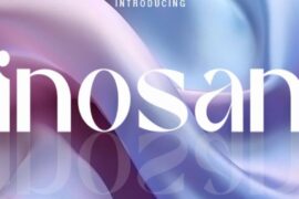
Free Download Papa John’s Font (Alternative)
Its sturdy shapes and confident style create a sense of quality and warmth, reminding you of fresh, hot pizza straight from the oven. Designers often look for fonts inspired by the Papa Johns Font when they need something that feels both professional and mouthwatering.
About Papa John’s
Papa John’s was founded in 1984 by John Schnatter in Jeffersonville, Indiana. Known for its famous slogan “Better Ingredients. Better Pizza.,” the company has grown into one of the world’s largest pizza chains, serving millions with fresh dough, quality toppings, and a commitment to great taste.
Since you’re already here, feel free to browse our FREE fonts collection for Fashion Fonts, Cinematic Fonts, Handwritten Fonts, Decorative Fonts as well as Sketch Fonts and Retro Fonts.
Please make sure to follow the license terms for each font. All fonts provided are free for personal use, while some may also allow commercial use. For details, check the included Read Me file with each download. If you’re uncertain about usage rights, we recommend contacting the font’s creator directly.

