

The Lock, Stock and Two Smoking Barrels font perfectly captures the gritty, edgy energy of Guy Ritchie’s 1998 crime classic. Bold, angular, and slightly distressed, the typography mirrors the chaotic, fast-paced world of London’s underground crime scene depicted in the film.
Lock, Stock and Two Smoking Barrels Font
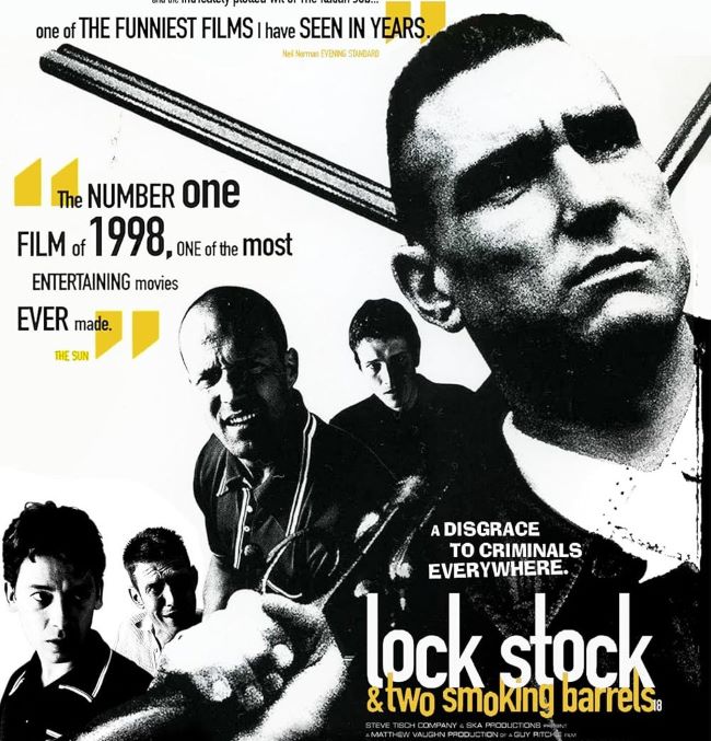
The lettering feels tough, unpolished, and rebellious, reflecting the sharp wit, cunning schemes, and high-stakes tension that drive the story. Every jagged line and uneven edge hints at the unpredictable twists, dark humor, and raw energy that have made this movie a cult favorite.
Fonts similar to the Lock, Stock and Two Smoking Barrels style often feature bold sans-serif or stencil-inspired designs with rough, textured details, giving off a street-smart, urban vibe. This typeface does more than label the movie; it communicates attitude, grit, and charisma before a single scene unfolds. The font’s unapologetic personality perfectly mirrors the film’s cast of clever crooks, con artists, and unlikely heroes, making it a vital element of the movie’s iconic branding. For designers and fans alike, it’s a font that immediately conveys edginess, tension, and a distinctly British sense of mischief. You can also check our free fonts collection.


