

User experience (UX) is no longer just a “nice-to-have” for SaaS and AI products – but a make-or-break factor. A frictionless, intuitive, and visually appealing interface can drastically increase sign-ups, reduce churn, and improve revenue.
Conversely, poor UX design can cost companies millions in lost opportunities and frustrated users (with 88% users never returning to your website or app after a poor experience)
Despite this, many B2B SaaS and AI products still make avoidable mistakes that hinder adoption.
In this article, we’ll explore 14 common UX design mistakes, why they happen, and how to fix them, all without reinventing the wheel.
Why UX Design Mistakes Shouldn’t Be Ignored?
Before we jump into the specific mistakes, it’s crucial to understand the impact of these errors on your long-term business health.
At its core, UX design mistakes aren’t just aesthetic issues, they directly shape how a user perceives, trusts or interacts with your product.
In complex B2B SaaS and AI workflows, even minor friction (think ambiguous navigation, overly long forms or unclear microcopy) can amplify and disrupt task completion and frustrate users, leading to lower engagement and higher churn.
Consider this: a study by the Design Management Institute in 2015 found that design-led companies outperformed the S&P 500 by 228% over ten years.
While this isn’t about a single UX flaw, the above stat shows the value of consistent, thoughtful design.
Having a poor user experience can have multiplier effects on your brand’s credibility, reducing trust and subtly encouraging users to explore competitor solutions.
14 Common UX Design Mistakes to Avoid (+ How to Fix Them?)
Now that we’ve understood the business impact of ignoring UX design as a key function, let’s take a look at the most common UX design mistakes made by SaaS companies and how they can fix them:
-
1. Imbalance between functionality and aesthetics
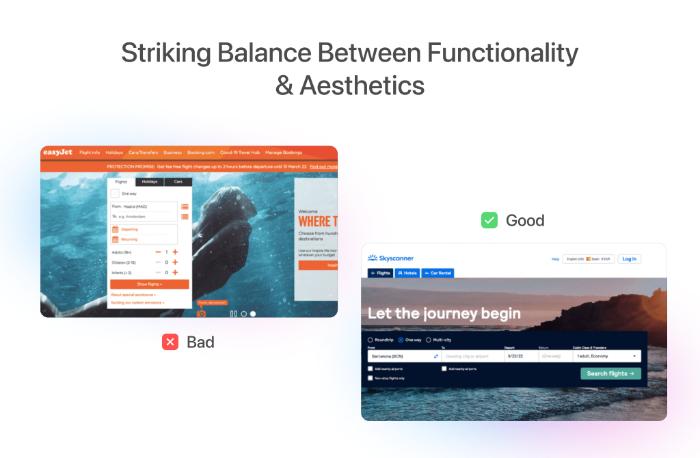
One of the most common UX design mistakes is failing to balance functionality with aesthetics.
Teams often fall into one of two traps: they either prioritize flashy visuals that make navigation confusing, or they focus entirely on functional design, which can feel cold and uninspiring.
Users form impressions of credibility and trust almost instantly – with research from Stanford showing that first impressions are made in as little as 50 milliseconds.
A visually appealing interface that is hard to use can frustrate users, while a purely functional but uninviting design may make a product feel low-value, reducing engagement and long-term retention.
How to fix it?:
- Conduct usability testing alongside visual design reviews to ensure both aesthetics and clarity are balanced.
- Use design systems to maintain consistency without sacrificing user-friendliness.
- Prioritize key tasks visually, ensuring users focus on the most important actions first.
- Leverage prototyping tools like Figma or Fray to iterate on both visual and functional elements before full-scale development.
-
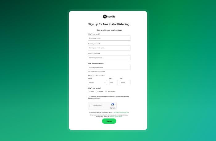
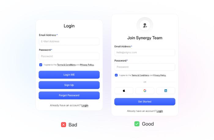
2. Complicated sign-up forms
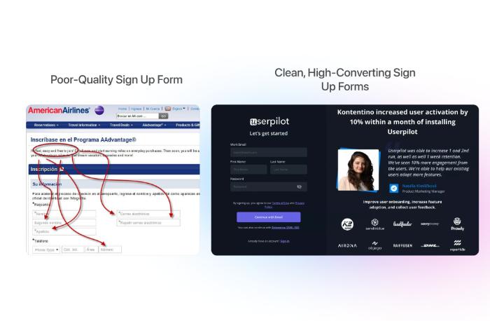
Lengthy or confusing sign-up forms are a top UX mistake. Studies from Formstack indicate that 80% of users abandon forms if they take more than two minutes to complete.
Overly complex forms introduce friction and reduce conversion rates, especially for SaaS products where speed of access is critical.
How to fix it?:
- Ask for only essential information initially; defer non-critical fields to later stages.
- Use progressive disclosure to simplify multi-step forms.
- Integrate social or SSO logins to reduce friction.
- Test form field labeling and inline validation for clarity and immediate feedback.
-
3. Poor user navigation
A confusing navigation system quietly kills engagement, even if the interface looks great. Think about it: users don’t want to guess where to click next—they want an intuitive path to get their task done.
For instance, a SaaS dashboard that buries reporting tools under multiple nested menus can frustrate users, leading them to abandon the task entirely.
NNG Group found that when navigation doesn’t align with users’ mental models, they frequently give up, even on tasks they came prepared to complete.
Netflix is a good counterexample, its navigation is simple, consistent, and predictable, which is why users rarely struggle to find content, even with thousands of titles.
If ignored, poor navigation is one of the costlier UX design mistakes which can undermine the perceived reliability and usability of your products.
How to fix it?:
- Conduct card-sorting exercises or tree-testing to align menus with user expectations.
- Use clear, descriptive labels and maintain hierarchy across pages.
- Add breadcrumbs for complex workflows so users always know where they are.
- Test with real users to ensure discoverability of key features and reduce friction.
-
4. Poor empty states
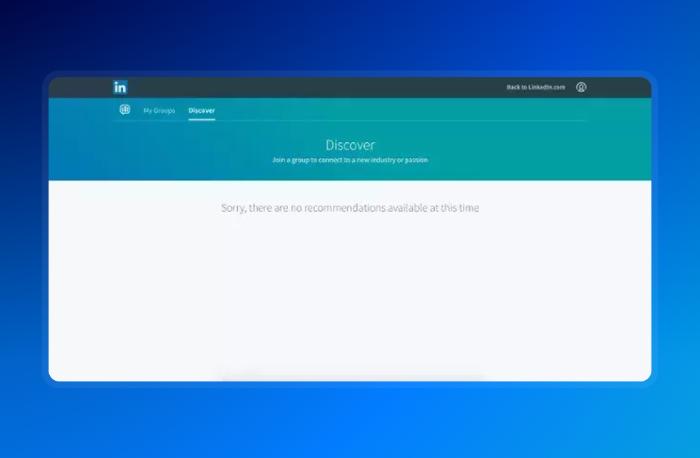
Empty states aren’t just “empty screens”; they’re opportunities to communicate with users. Think of a new project dashboard in Asana. Without any guidance, a blank space feels like a dead-end.
But a simple prompt like “Add your first task” not only educates the user but also reinforces the purpose of the tool.
Neglecting this subtle touch is a UX design mistake many teams overlook – with users silently wondering if they did something wrong.
How to fix it?:
- Turn empty states into teaching moments or inspiration.
- Provide actionable CTAs such as “Create your first project.”
- Keep messaging aligned with brand voice and tone.
- Use visuals or micro-interactions to make the state feel alive.
-
5. Poor user onboarding experience
Onboarding sets the tone for everything that follows. It’s not about showing all features at once, but rather easing users into the experience.
Slack is one of the best SaaS onboarding design examples – introducing users gradually, highlighting essential actions first and more advanced features later.
Overwhelming users with every capability in one go is a common UX design mistake, even among seasoned SaaS teams.
How to fix it?:
- Break onboarding into small, digestible steps.
- Use progressive disclosure and contextual tooltips to guide learning.
- Personalize experiences based on user type or role.
- Measure onboarding success through task completion and feedback loops.
-
6. Ignoring design thinking
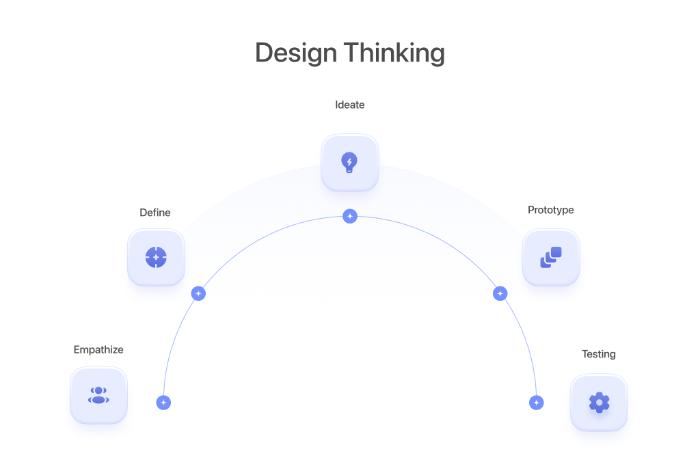
Skipping research and ideation is like building a house without a blueprint. Many SaaS teams rush into prototyping to “move fast,” but solutions grounded in assumptions rarely resonate.
Airbnb’s early team spent months observing hosts and guests before finalizing features, ensuring empathy drove design.
Overlooking design thinking is a UX design mistake that subtly increases the risk of low adoption or misaligned features.
How to fix it?:
- Conduct user interviews or shadowing sessions to uncover real pain points.
- Map journeys and identify friction areas before designing.
- Prototype multiple solutions rather than fixating on one.
- Integrate continuous feedback into every stage.
-
7. Poor button distinction
Buttons aren’t just “decorative” items on your app screen – they’re what the user will leverage to perform specific actions on your application.
If a primary CTA blends into surrounding content, users hesitate, unsure of what to do next.
Consider a checkout page where “Proceed to Payment” looks visually identical to secondary links.
Confusing CTAs (or having multiple of those on a single screen or page) are a subtle but powerful UX design mistake, costing conversions silently.
How to fix it?:
- Use contrasting colors and prominent sizes for primary actions.
- Label buttons with clear, action-oriented text (“Start Free Trial” rather than “Submit”).
- Avoid placing too many CTAs in a single visual field.
- Maintain style consistency to set user expectations.
-
8. Ignoring user feedback
Design isn’t static; users evolve faster than product teams often anticipate. When feedback is ignored, UX stagnates. Zoom, for example, iterated rapidly during early adoption phases, addressing user pain points like poor call scheduling or interface clutter.
Not doing so is a subtle UX mistake that slowly erodes engagement, often without anyone noticing immediately.
How to fix it?:
- Set up continuous feedback loops through surveys, testing, and analytics.
- Prioritize actionable insights over noise.
- Close the loop by showing users their input influences the product.
- Analyze patterns to inform systemic improvements.
-
9. Following design trends blindly
Trends are seductive but can compromise usability. Snapchat’s redesign a few years ago confused loyal users because the team prioritized novelty over mental models.
Users often prefer familiarity over aesthetics, even if a trend looks “modern.” Blindly chasing trends is a UX design mistake because it ignores cognitive patterns that guide users naturally.
How to fix it?:
- Evaluate trends against actual user needs and workflows.
- Test changes on a subset of users before full rollout.
- Blend modern aesthetics with familiar patterns.
- Document design rationale for transparency and consistency.
-
10. Not accounting for accessibility barriers
Accessibility is often seen as optional, but it’s central to inclusive UX. Imagine color-blind users navigating a chart-heavy dashboard with indistinguishable colors – they struggle silently.
Overlooking accessibility is a UX design mistake that affects trust and market reach.
Embedding accessibility early avoids costly retrofits and ensures everyone can engage with your product.
How to fix it?:
- Conduct both automated and manual accessibility audits.
- Ensure color contrast, keyboard navigation, and screen reader support.
- Include alt text and accessible form labels.
- Build accessibility into your design system.
-
11. Optimizing for search engines, not humans
SEO is valuable, but prioritizing it over usability is a subtle UX design mistake. Keyword-stuffed pages or hidden menus may rank but frustrate visitors.
ThatWare notes that users abandon pages lacking immediate clarity, even if they appear in search results.
Your UX should guide how content is presented and discovered first; SEO is secondary, not primary.
How to fix it?:
- Write for human readability first, search engines second.
- Balance navigation and information architecture with SEO.
- Test content engagement metrics along with search rankings.
- Avoid sacrificing intuitive flows for keyword density.
-
12. Over-using popups
Popups are meant to help, but too many break the experience. Users encountering multiple modals, surveys, or chat prompts feel interrupted and annoyed.
Even high-performing SaaS platforms need to be selective; intrusive popups are a UX design mistake that drives abandonment more than it drives conversions.
How to fix it?:
- Limit popups to key interactions or high-intent pages.
- Use timed or scroll-triggered triggers thoughtfully.
- Ensure easy dismissal.
- Personalize messages to increase relevance.
-
13. Slow loading speeds
Speed is a silent UX killer. A beautifully designed SaaS interface doesn’t matter if dashboards or pages lag. Google found that 53% of mobile users abandon websites taking longer than 3 seconds.
Slow load times not only frustrate users but can decrease adoption over time – which is an often overlooked UX mistake.
How to fix it?:
- Compress images and optimize media assets.
- Use lazy loading and caching strategies.
- Minimize render-blocking JavaScript and CSS.
- Continuously monitor performance using tools like Lighthouse.
-
14. Not optimizing cross-platform experience
Users expect seamless experiences across devices. A feature-rich desktop app that feels clunky on mobile frustrates users and damages trust.
Not accounting for this is a UX design mistake that silently reduces engagement and retention.
How to fix it?:
- Design responsively with priority on core tasks.
- Test across devices to uncover friction points.
- Maintain consistent branding and interactions.
- Monitor device-specific analytics and iterate accordingly.
Conclusion
Avoiding these 14 common UX design mistakes goes beyond just aesthetics – it directly impacts user retention, engagement and long-term product success.
Even a small misstep in any part of your user experience, can quietly erode trust & conversions over time.
Here are a few practical steps you can take to avoid these pitfalls:
- Review your current UX flows against these points and identify friction areas.
- Prioritize changes that affect key metrics like retention, conversion, or task completion.
- Combine user research, testing, and iterative design to validate improvements.
- Don’t hesitate to seek specialized guidance if internal bandwidth or expertise is limited.
Ultimately, whether you choose to tackle these challenges in-house or collaborate with a UX expert (like Bricx), addressing them thoughtfully can make the difference between a product that just works and one that truly delights users.
Author Bio: Siddharth is the CEO at Bricx, where he leads the design function for the company. With nearly a decade in design and SaaS, he has worked with various B2B startups to help them grow using high-conversion websites & product design. You can connect with him on LinkedIn and Twitter.

 Is he New SEO: How to Dominate LLM Search")


