When you start learning graphic design or go from the beginner level to intermediate, following the courses or conversations become like interpreting Latin without a dictionary. You can hear words similar to English but do familiar sounds make sense? No.
It is absolutely normal. Every profession has its terms and jargon. You would not get upset if you do not understand biologists so why become frustrated with yourself when you do not recognize the designer’s language on the spot?
If you are a beginner who wants to understand their classes better or a client who tries to understand why a designer will not accept the changes, here is the ultimate dictionary. You have 65 terms to discover from various aspects of graphic design:
– Basic Terms
– Colors Terms
– Typography Terms
– Images Terms
– File Formats Terms
– Logotypes And Branding Terms
– Creation Process Terms
– Techniques Terms
Basic Terms
Composition
A design consists of many elements and the way these elements are arranged is called composition. Great composition with smart hierarchy guides viewers through the design: for example, they see the header before they discover the description, and they look for details and key points at the end.

Alignment
Text or images can be left, right, or in the center. This positioning is called alignment.
Balance
Balance is about evenly distributing the elements of the design. The terms of symmetry, asymmetry, and radiality are also important here. Draw a central line: if elements on both sides are equal, it is symmetrical, if they are not, it is asymmetrical. In radial design, there is no central line but a central point and its branches, radiuses.
Bleed
Bleed is essential for graphic designs that will be printed later. It is difficult to influence the printing: there may be white space, rough edges, crooked edges. So if anything went wrong in printing, designers leave extra space outside of the planned format. It prevents designs from blank spaces or cutting off essential parts of the design. The space outside the planned format is called bleed and it does not contain any essential elements.
Grid
Designers use a grating: parallel vertical and parallel horizontal lines. It assures accurate design placement and balance.
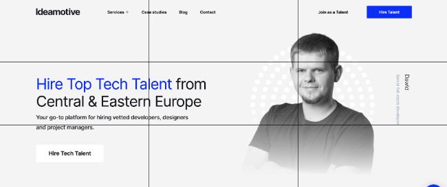
The Rule Of Thirds
The most important parts of the design should be placed on the crossing of lines in the 3×3 grid. If the element is placed in the center, the viewer is less likely to notice other important parts of the design.
Scale
Scale is a size of an object, compared to another object. Scale is used to create a surprising effect when two objects are very different in real life but equal on the image. Designers can also highlight the importance of the object by making it bigger or its shyness by making it smaller.
Aspect Rate
The aspect rate is a ratio between length and height. It is used to fit designs in different screens, social media visuals, or prints.
White (Negative) Space
White space is also called negative space and it refers to blank space between elements. It is not necessarily white and can be a repeated pattern or a colored background. The main point is that viewers do not focus on such space.
White space is as important as any other part of the design. It separates groups, emphasizes important elements, and makes design lighter. Too little white space may result in too crowded design. Too much white space has a luxurious feeling to it.
Colors Terms
Color Wheel
A color wheel is a visualization of the color spectrum fitted into a circle.

RGB
Red, green, and blue are combined together to create other colors. It is mainly used for screens.
CMYK
Cyan, Magenta, Yellow, Key/Black are combined together to create other colors. It is mainly used for print.
Hex
Every color is assigned a six-digit code, hex, so graphic designers can find it quicker in CSS, HTML, or design software.
Hue, Tint, Tone, And Shade
Hue is a pure color.
Hue + white = tint
Hue + grey = tone
Hue + black = shade
Palette
Palette refers to all the colors that are used in a design. Colors in the palette should look well together if you want to create an aesthetically-pleasing design.

Monochromatic
Tints, tones, and shades of a single color are used in a monochromatic palette.
Grayscale
Tints, tones, and shades of grey are used in a grayscale palette.
Analogous Colors
Colors that are next to each other on the color wheel.
Complementary Colors
Colors that are opposite of each other on the color wheel.
Triadic Colors
Three colors are evenly spaced on the color wheel. One color is dominant, and two others are accents.
Gradient
A color gradually turns into another color or becomes transparent.
Opacity
Opacity refers to the level of transparency. 100% opacity means the solid color, 0% opacity is completely transparent, invisible.

Saturation
Saturation refers to the level of intensity of a color. 100% saturation means vibrant colors, 10% saturation represents washed-out colors.
Typography Terms
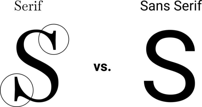
Serif
In serif fonts, you can find thin lines at the ends of some letters. It is traditional and formal. This font is fitting for any element: logos, titles, main text, print.
Slab serif
In slab serif, you can find thick lines at the end of some letters. It is attention-grabbing and trendy. Designers use slab serif in logos and headlines mostly.
Sans serif
There are no lines at the ends of some letters. It is modern, clean, and simple. You can use it for logos, small text, titles.
Script
Script fonts are close to handwriting. They are elegant and sophisticated but are quite hard to read. The script can be used in logos and titles but is barely applicable to long texts.
Ascender
A part of a lowercase letter that is above the main body of the letter. For example, you can find ascenders in letters “f”, “t”, “d”, “h”, “k”, “l”, etc.
Descender
A part of a lowercase letter that is under the main body of the letter. Descenders can be found in letters “q”, “y”, “p”, “g”, etc.
Kerning
Kerning is the space between letters in one word. Naturally, there is equal spacing between letters. This equal spacing can look actually not equal because letters have different shapes and are meant to work more like puzzles. By kerning the letters we make them work together and create more pleasantly-looking words.
Leading
Leading is a space between two lines. If lines are too near each other, it will be harder to read the text. The same works if lines are too far apart. There is no perfect leading for every font since:
– different fonts have different letter heights
– pieces of content that require different leading. For example, lists and headlines usually have smaller leading
– if the background is not white, it is better to increase leading

Tracking
Tracking is the space between letters and words in the entire text. It is important for all-caps words, for example. The bigger the space between all-caps, the better. It is also harder to read words where letters are too crammed together.
Font Weight
Font weight is the level of sickness. Thin has a low font-weight and bold has a high one, for example.
Hierarchy
Hierarchy Includes headings, subheadings that help readers to navigate through the text.
Widow And Orphan
Sometimes there are lonely words or short lines at the beginning of the end of the column. They are detached from the rest of the text, grab unwanted attention, and are not aesthetically-pleasing.
Lorem Ipsum
Lorem Ipsum is a filler text that enables graphic designers to work on designs before they have the approved text copy.
Pull Quote
The text can be too long and designers create a pull quote, a short excerpt that highlights main thoughts.
Images Terms
Pixel
An image consists of numerous small squares called pixels. It is the smallest detail of a raster image.
Resolution
We often refer to the resolution as the quality of the image. When there are more pixels, the resolution is higher and an image is considered more high-quality.
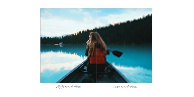
Raster Image
A raster image consists of pixels. If you try to make it bigger, you will see every pixel at some point.
Vector Images
The base of vector images is mathematical formulas of geometric figures. Their quality does not suffer when you make it bigger but they are used mostly for line art graphics like logos and fonts because they literally consist of geometric figures and usually have only flat colors.
Stock Photos
If every graphic designer needed a photoshoot to create a visual, the process would be too costly and long. As for now, designers have access to stock photos made by third-party professional photographers. There are free stock photos (their number is very limited) and licensed ones.
File Formats Terms
AI
AI format was developed by Adobe Illustrator for vector images.
EPS
EPS (Encapsulated Post Script) is used for vector images as well. Designs in EPS are very high-quality which makes them perfect for printing logos, brochures, etc.
PDF
PDF (Portable Document Format) can be opened from any computer, tablet, or mobile, unlike file formats we mentioned before. Consequently, graphic designers use it to send previews to customers who do not have costly programs installed.
GIF
GIF or Graphics Interchange Format is used for animated raster images with transparent backgrounds. It supports a limited amount of colors (256) and has small file sizes.
JPEG
JPEG or Joint Photographic Experts Group is the most popular compressed file format for raster images that can be opened from anywhere. They are compressed, load quickly, and can not have a transparent background.
PNG
PNG (Portable Network Graphics) is a better version of GIF. It can have transparent backgrounds and offer great quality at the same time.
PSD
PSD (Photoshop Document) is a format for uncompressed raster images. Clients who do not have Adobe Photoshop installed will not be able to open this file.
Logotypes And Branding Terms
Abstract Mark
An abstract mark is a logotype type where the brand is represented by abstract images. The idea is conveyed through color and form. For example, Spotify has such a logo.

Emblem
The emblem is a logotype type when the name of the company is inside an icon or symbol. Starbucks’ logo is an example of this type.
Lettermark
In lettermark logotype, stylized letters come together to represent the brand. HBO serves as a famous example of this type.

Pictorial Symbol
The brand is represented by a non-abstract image in this type of logo. Apple uses an easily identifiable apple icon as its pictorial symbol.
Mascot
Some companies have animal mascots or famous representatives/founders that they put in the logo. For example, KFC actively uses Colonel Sanders, its founder, on the logo.

Wordmark
The name of the company is the logo itself, Google being the most well-known example of such a logo.

Style Guide
A brand has to be consistent in its style for better and quicker recognition. It includes the logotype, brand colors, fonts, etc. Guide tells about how to use logos right, includes the hexes of colors, and font names for headings, sub-headings, and main text. They are especially important when you hire UX/UI designers or hire web designers.
Creation Process Terms
Thumbnail Sketch
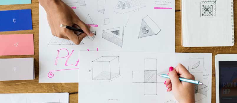
It is the first draft of a designer. A thumbnail should be quick and preferably drawn by pencil. It is the stage where you narrow down millions of concepts to a couple of them.
Mock-Up
Mock-up requires more effort and is used to choose one out of a couple of concepts discussed in the thumbnail sketch stage.

Tight Comps
It is the final result, with checked color consistency, typography, etc.
Deliverables
Tight comps are changed to the format that the client can actually open and see on their computers, meaning no AI or PSD files, for example.
Techniques Terms
Color Theory
Color theory is used to create a special mood of the design and evoke a certain emotion. For example, red is a symbol of activity and energy and is widely used in calls-for-action on websites. Blue is a very calm color and yellow symbolizes happiness.
Knolling
Designers arrange different elements so that they have 90-degree angles. It creates the feeling of organization, neatness, and symmetry.

Blur
A blurred image is less clear and less attention-grabbing. If you do not want the text to be lost on the bright high-resolution image, blur the image.
Skeuomorphism
Skeuomorphism refers to graphic designs that try to imitate real-life objects. Such visuals are as realistic as possible.
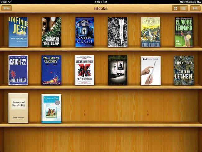
Flat
Flat is a minimalistic approach to graphic design, it usually has a lot of white space and bright colors. This approach is not trying to seem realistic at all, actively using two-dimensional images.
Bottom Line
Today you discovered 65 terms of graphic design, including definitions for colors, typography, images, file formats, logotypes and branding, creation process, and technique spheres.

