The 2018 logo trends are turning heads. One glimpse and you’ll see why. Read along as we breakdown the best ideas this year has brought to logo design.
There’s no getting around the fact that logo design matters. It helps build brand awareness and your color choices can encourage potential customers to interact with you.
To get inspired to do something with your company’s logo, we gathered some of the best logos from this year.
Keep reading to learn about some of the hottest 2018 logo trends and how you can use them for your own business.
Simple Geometric Shapes
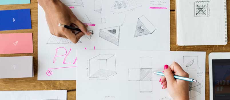
There are few things more eye-catching and memorable than a simple geometric shape.
Although these shapes have been used for centuries, they made a reappearance in logo designs this year.
When it comes to using shapes, less is more, so pick just one or two shapes to include in your logo design or have a small number of shapes that work together to create your logo.
Another aspect of simple geometric shapes that we see a lot this year is in the use of grids.
Sometimes, these are used to carefully organize letters in straight lines, and other times a grid forms the background.
Extreme Metaphors
A networking company using a tree’s root system as a logo is an example of an extreme metaphor. This and many others popped up this year, making logos more memorable.
These can often be fun or whimsical designs, which instantly put a smile on a person’s face.
When someone has an emotional reaction to your logo, they feel more connected with your brand.
Pattern and Color Layering
This refers to areas of pattern and color being layered together to create a unique logo design.
One of the advantages of this is you don’t need to pick just one color per element since you can have a pattern instead.
Because printing in a variety of colors is far more affordable today than a few years ago, many companies are starting to embrace this and using more colors in their logo.
Adaptive Logos
Something to keep in mind when you design a logo is how they’re going to be used. Most logos aren’t going to only appear in one place. That’s why one of the trends this year is adaptive logos that can be placed on:
– Websites
– Business cards
– Coffee mugs
– Stationary
– Promotional items
Having an adaptive logo design ensures your logo looks great no matter where it’s placed.
Monograms
Another popular logo design element that’s making a comeback in 2018 is the monogram. The use of monograms allows the rest of the logo design to do the talking, whether it’s an image or stylized text.
What’s especially nice about using monograms with your logo is that it’s an extremely adaptive design, and can be added to anything. Besides that, you can easily add other elements to it.
Want to Follow These 2018 Logo Trends?
You now know some of the hottest 2018 logo trends, and should have some ideas of how you can use them for your business.
If you want to get even more ideas for your logo, check out our logo inspirations section to get your creative juices flowing.


