

No matter how organised a business may be behind the scenes, it must present the right image to its clients. This means having the right logo.
Many customers first become aware of a business through its logo. Or it might be the first thing they see when searching for a product or service. If the logo does not make the right first impression, that customer may not be engaged.
Simple or Complex?
Logos don’t have to be elaborate; some of the most famous are the most simple, the Nike swoosh and coloured Google letters are both good examples. But logos do need to be scalable, which means they can be displayed on anything from the smallest product to the largest billboard. In that respect, simplicity can often be the key.
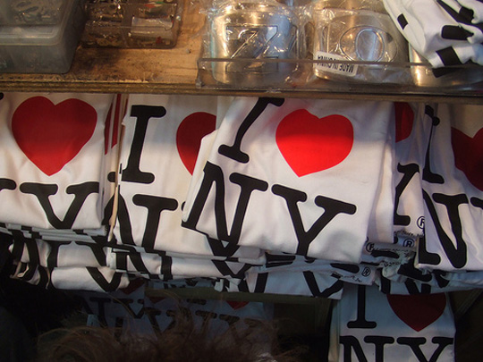
However, in some cases, an element of complexity can be used to make a logo stand out from the crowd. The ‘I Love New York’ logo designed by Milton Glaser in 1977 replaced the word love with a heart symbol. A brave move, but one that proved so successful the verb ‘to heart’ has now entered modern vocabulary. The logo also abbreviated New York to ‘NY’ and used a distinctive typewriter-inspired font.
Some logos just need to let the brand name do the talking. If your company name already tells the client exactly what you do, there is no need to overcomplicate matters with a visually complex visual logo that attempts to provide even more details. A good example is Buzz Bingo. Without even seeing their logo, you know what the business is about, so the company just needed to keep things clear and simple. The bingo-ball-shaped red logo with clear white lettering is functional but will be instantly recognisable to customers.
Rebranding
Rebranding can also be difficult. Some logos do not stand the test of time, or need changing to improve marketing potential. One of the most significant rebranding exercises in recent years was carried out by Juventus Football Club in Italy. Their recent logo and typeface change was met with resistance from fans, but has ultimately proved successful. They now have a corporate identity to match some of the biggest businesses in the world.
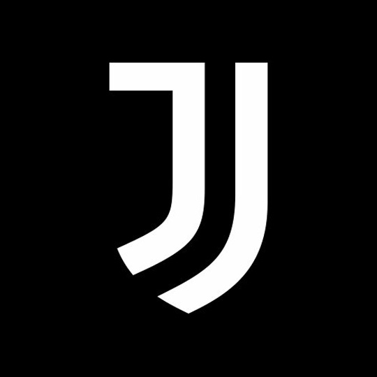 Image source: Interbrand via Wikimedia Commons
Iconic Logos
The London underground symbol that is used on Transport for London services all over the English capital has hardly changed since 1919. However, it took 100 years to get from the London General Omnibus Company’s original bar and circle symbol to the red circle with blue bar version that became one of London’s most iconic symbols.
The logo was designed with the simple intention of letting passengers know what bus or train to catch and where to get off, but it has grown to become a symbol of the city and is recognised the world over.
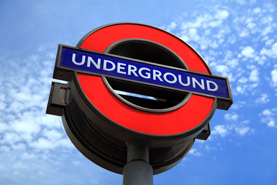 Image source: Publicdomainpictures.net
A logo for an online company should make a customer feel at home. When they are looking for a product or service, the logo should make them feel they are in the right place. They need to feel connected. In that respect, it is the customers who make the rules. They are the ones who determine whether a logo is a success or a failure regardless of the amount of time or money that is invested in the design.


