A website is one crucial aspect that signifies the success of an online business. This is why, people invest a lot of money and time in the best of web design that can represent their business in best ways possible. Concentrating so much on the most evident elements of a website, people mostly miss some subtle yet strong elements that can make a big difference. Here’s a list of a few simple elements that you can utilize to make your website more impactful.
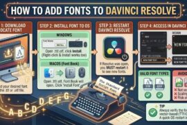
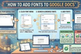
Web fonts
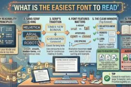
Back in the days when we had limited web fonts and designs, the focus of using fonts was more on readability. However, with millions of web fonts being available, the focus has evidently shifted to how a font represents your business and matches your style. Also, fonts have a role to play in search engine optimization. So, you can use a font effectively to both represent your business and count as a search engine optimization factor. Google web fonts provide a number of free and amazing fonts if you don’t plan to spend money on it.
Navigation
Navigation is an important feature that people would use when they visit your website. This is why; the navigation should be really simple and easy. If you add more navigational menus or make them look too artsy, chances are that it would be too overwhelming for the users. Try keeping the number to the barest minimum and keep the navigational menu at the top of the screen, where it is most visible. You can also add simple arrow marks, parallax scrolling, etc. to make it easier for the users. Navigation helps users to seek information and direction. So, make sure the navigational aspects of your website cater those purposes.
Spacing
The kind of spacing used on a website has a big impact on how a user views the website. Just because you have some space on your website, you can’t fill it all up with information or have an improper and uneven spacing. Evenness pleases people. Lines and paragraphs should have even spacing between them. Also, if you add important pictures on your website, let it be surrounded by some white space. This makes the picture catch more attention and look more important. However, the space that you plan to leave unused doesn’t always have to be white. It can be any color based on what the theme of your website is.
Contact Information
Contact information can be displayed on your website in various ways based on what your website is like and is about. Contact information can be displayed in the form of a navigation menu option that leads to the ‘Contact Us’ page or in the header. Whatever way you choose, make sure that the important contact information has high visibility. The primary information that should be included in contact information should be contact number, physical address, and email id. When people are interested in your services, they would want to contact you and this should be made easy by providing all the needed information right there.
Images
It is a well-established fact that people first attend to pictures and later on to words. And this is exactly why you need to carefully choose the pictures that you would be adding on your website. Besides being of a good quality, they should hit the bull’s-eye and exactly explain what your website is about. The images should also follow a certain style. Instead of adding random pictures of various styles, stick to pictures that follow certain style and align to the style of your website as well. A helpful tip would be that you should get custom images rather than picking stock images.
Footer
Footer is the space on a website where most crucial information can be displayed for the ease of access for people. When there’s a lot of information on a website and when people want to cut to the chase, they’d scroll down to the footer. This is why; your footer should have a brief form of important information. You can add contact information, site map, and the services in the footer.
About Us Section
About us page is the section where you have the liberty to talk about your business and history. However, what you include there depends on what your business is like. Well known and well established businesses don’t need to do a lot of talking. However, smaller businesses need to tell who they are exactly. You can very articulately include your history in ways that people can emotionally relate to you. If not so, you can also be specific and explain your experience in the field of your business and convince people of your expertise.
Call to Action
Call to action relates to something, like signing up or subscribing to your website. This option is put to use mostly by websites that offer certain services or provide some information (newsletters). You can either use icons that lead to another page and make people perform a certain action or create a signup page. Most people have a signup page, where the user is supposed to provide some information and signup with the website. Icons can be used to lead a user to download an app or something of that sort.
For long, people have been ignoring these elements. However, as you find out about it, you also find out how much of an impact they can create. While these elements seem negligible on their own, they add up to influence how your website looks. A good design firm is one which hires people who have an eye for tiny details, since everything counts.
It is true that each web-designer has his own way of going about the design of a website. But, no matter who the web-designer is and what his unique style is, the person has to have knowledge of the nuances involved in making a website attractive enough and interactive enough. After all, a website has to be presentable and useful, both.


