

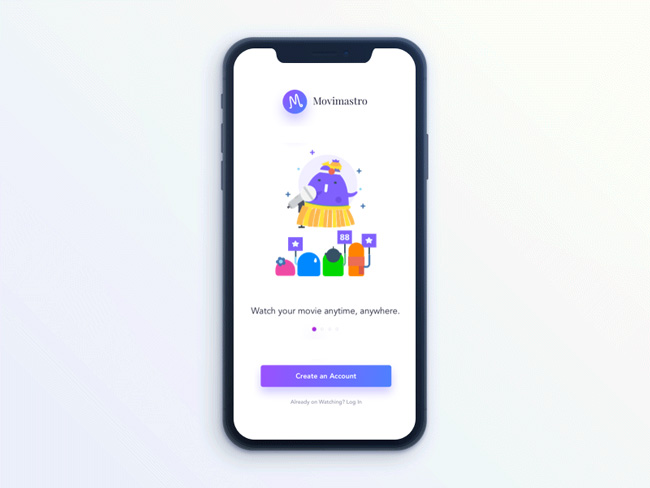
We can all agree that designing mobile apps is not an easy task. Users are always pushing hard on space limitations and they don’t really care about the sacrifice you’d have to do to fulfill their needs.
Indeed, users can be harsh-they will require modicums on complicated data because it is too much effort for them to use both hands. In addition, they will expect it to be an engaging and captivating experience.
Yes, we will give you tips that can lead you to the app you’ve always dreamed of. However, be realistic about it. What you are expected to know is how to create a top-rated app.
Sometimes, this means you would have to give up on your ‘eye candy’, in order to provide a simple, intuitive app that matches users’ needs.
Don’t ever depart from interaction design rules
We meant this one. Smaller space or bigger enthusiasm is not a justification for neglecting interaction design rules.
Interaction design is based on five essential pillars:
– Focus on the main goal: You need to know exactly who you are designing for. Make a research and determine which your target audience is. Conduct surveys and make interviews, and try to determine who will be mostly impressed by your work. Once you know this, it will be easy to set definite goals and to adjust the workflow to them.
– Usability: It is probably the hundredth time that you’re being told about it, but usability matters! You need to be sure that your app will be used easily, because otherwise no one would download it. Not even to mention that usability is the logical precursor of desirability.
– Signifiers and affordance: Affordance is the essential function, and signifiers are its hinters. For instance, underlined text stands for links which can take users to a different page. Use signifiers that are traditional and well-known, so that users will lose no time thinking about each UI element you have.
– Familiarity: You want an intuitive app? Apply familiar patterns which can help novice users to adapt as fast as possible. Stick to the basics of designing an app.
– Feedback: Quality interaction rests on quality communication. You ought to be there for your users and to signal them whether their tasks were successfully accomplished. What we advise you is to keep feedback simple, friendly, and time-efficient.
Grids are all around
Grids are essential elements of mobile app design.
All of the content is based on grids that guide users even if they are invisible in the ‘final package’.
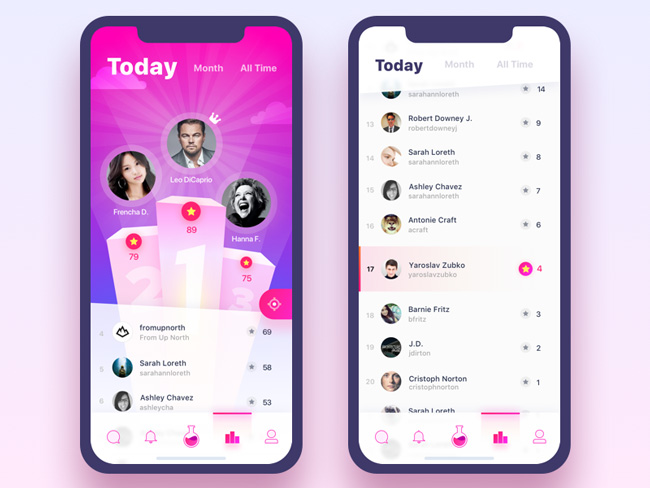
Contrasting color palettes can help the visibility of your design
Ever been in a situation where an older member of your family sends you an email which is impossible to read (for instance, yellow letters on white backgrounds)?
Some websites/apps really know how to cause navigation and reading difficulties, and you should use this fact for your advantage.
Use contrasting color schemes (for instance, the ones provided by the system) and help readers perceive your content easily.
Familiarize with your users
In modern mobile design, there are much bigger problems than size adjustment. The core of every constraint a designer may face are his users. Therefore, if you want to be successful, follow what your users want.
Don’t get all terrified. Predicting users’ behavior is not so difficult! Here are some basic tactics:
– Developing Personas: A persona is a fictional character developed on the basis of expected user behavior. These characters can show you which decisions users are going to make once they face your app and they start using it.
– Developing users’ scenarios: To develop a scenario means to predict the story of your users’ interaction with the app. In such way, you will know which actions they would take and which goals they would like to accomplish.
– Developing experience maps: This is the part where you make a complete analysis of all possible scenarios in a single interaction. Experience maps are excellent because they ‘guide’ you through every user’s action, and they are quite clear on emotions and circumstances.
Shortly said, make sure you’ve tested all major iteration that may occur within your app.
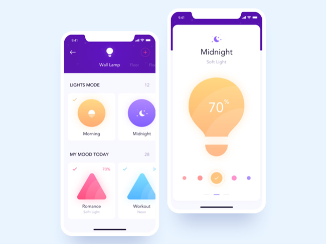
Indicate change with colors and animations
Sophisticated animations and controlled color application enable you to communicate changes of state and to give some professional flair to your app.
When users switch from one page to the other, and the background fades indicating that something will happen, users feel calmer and more confident.
The same is achieved when a specific button is highlighted, as this indicates major change is about to happen.
Logos are stylish, but they are not essential
The well-known name of your brand will not help you to hide malfunction. It may not help your business grow either. However, poorly designed logos happened to be troublous for the entire business.
You’ve probably heard that logos are timeless. Think about it. We are designing for modern design and we are struggling with an ever-changing trend. How can logos be timeless?
Logos are designed in a way that suits the age of a particular design, and that’s how it is supposed to be. Not even Coca Cola’s logo is timeless. Since 1920’s, it was updated as a clean vector in order to remain equally memorable. This might be ‘vintage’, but it’s not timeless.
Too many notifications can annoy your users
Staring your good sides in your users’ faces will not make them need your app more.
Notification-abusive designs have the same effect as an annoying friend who won’t stop calling when you’re too busy to meet him.
The same as the friend who insists to share extraordinary business opportunities, annoying apps that convince users they have the ‘revolutionary chance to change the world’ can cause the glass to spill over.
Even if your notifications are well-designed and justifiable, make sure they will disappear fast. Nobody wants to deal with the same message over and over. Therefore, take an advice from software programmers and ‘dry out’ your notifications list.
Stay intuitive: traditional mobile patterns are more than welcomed
You are not there to reinvent the wheel. We understand it is a revolutionary time for mobile design and that everyone wants to be specific in terms of elements, posture, and orientation. But, at the same time, how risky can that be?
Check outstanding interfaces and analyze the patterns they use. Replicate similar patterns and you will make users fell as if they were ‘at home’.
Don’t get it wrong-it’s not flat copying. Common UI baselines are just the layer of your creativity, and you need to personalize them in a way which will fulfill expectations, but it will never get boring.
Discover the visual guidelines of the system you’re designing for
This is important because the commonly used visual guidelines are familiar and well-perceived by users.
All of the mobile operating systems have developed their own guidelines, which are different in terms of style and information. We recommend you to check them and to have them in mind before you proceed.
Use beta-testing to estimate user interface
Once you’ve reached the stage where you believe your app is ready for the market, beta-test it and see whether you’ve been working with the right goals and intentions.
In the worst case, it will turn out that your app is not as intuitive as you thought it was, and there is no better way to find this out than placing it in front of your potential users.
Keep the app clean
The 3-click rule applied in UX design may be the perfect tool for app design too. You never know-it may turn out that you have more screens than the ones you actually need.
The ideal result of all your efforts is to create an app which is easy and simple to use.
Therefore, think about all the efforts your users would have to invest. Make sure your app doesn’t require piles of complicated actions and you’ll be successful in no time.

")


