Nowadays mobile devices come in all shapes and sizes, each with its own way of interpreting the data received and the user interface solution. This greatly determines the success of any given app design, so user experience is one of the top priorities you need to consider.
When working on a site design, these various UX and operating systems these devices have is what you need to count on right from the start.
A custom user’s experience in a specific form factor is what an app really is.
User psychology
Behind every aspect of UI design there is a psychological aspect to it, concerning the user’s trust, feeling, response, everything.
This is why UI design is such a sensitive subject because you communicate the message with everything you create, the color you choose, the white space, the text, and all.
The expectations of the new demographic
Up until recently, smartphones weren’t really considered mainstream. Sure, many people had them, but they were still quite expensive and considered a high priced toy.
Now, everyone has one, even the elderly. So, you are now not only communicating with young hipsters, but with the entire community comprised of people of various ages and tastes.
Now it is very important for a developer or a designer to adapt efficiently to these ever changing needs and expectations.
In order to satisfy these impossibly different needs, you need to design interfaces that are simple, comfortable, and familiar. The user’s response to any change or update holds more weight than maybe 50 other reasons to do so.
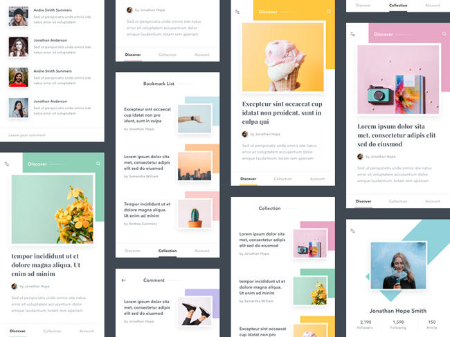
In order to meet the user’s needs, you need to first consider repairing and solving old issues and problems, before you consider changing any layouts or some new functionality feature. A good example is a homework platform, where users could toggle between current and past attempts at solving homework problems.
The feature was good, but it had a tendency to ‘lose’ the past solution attempts. In order to solve this problem, the designers completely placed the past attempts into a new tab with limitless range. This way the familiar feature appearance was almost intact, but the problem with loosing was solved and the app improved as the interface was kept streamlined for mobile users.
How to get a reaction from your users
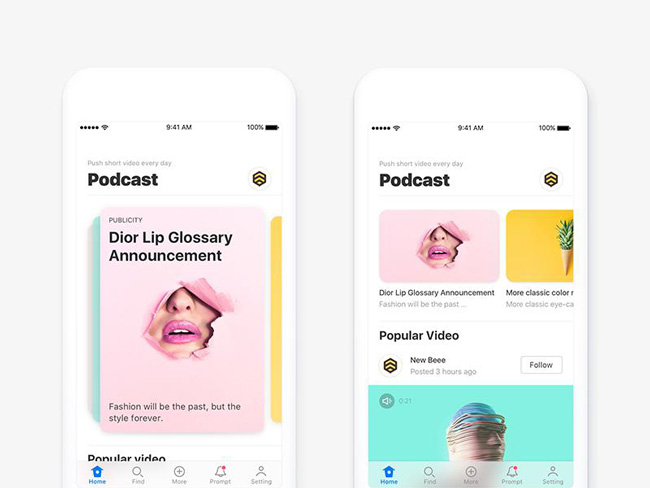
Every element on the list below should ultimately lead to a user’s action. These are textbook psychology examples of methods that trigger a reaction from people:
Reciprocation: if you do something for the user, he will likely do something for you, like offering some free bonus if they sign up for a newsletter.
Framing: users by default compare everything they see and decide on do they want this or that. Most of the time, they choose something in the golden middle.
Salience: the only thing important for a user is what matters at this moment. That is why some shopping sites advertize items related to the user’s current search.
Social proof: people always look at others when deciding on something. This is the influence of all social media.
Scarcity: people always want more the things they cannot have. That’s why companies often make limited offers.
Contrast: User’s always look for things that stand out in their mind.
Inspire confidence in your brand
You must focus on creating a great experience for the user, that will in turn inspire confidence in your brand.
A good UX, usability, and form are at the very focus of good UI design. A user expects nothing less than a friendly, easy to use interface and that their time was well spent on your site.
There must absolutely be no roadblocks to your site’s usability and it must adopt well to any device.
On-boarding, splash screen, and tips
The goal is to draw the user in and provide them with content or substance they were looking for as quickly and as easily as possible.
The splash screen is important because first impression counts, so you have that small window to engage the visitor. All tips and help you offer on your page should be precise, concise, and directed solely to what the user needs.
If you plan on making an on-boarding sequence, you must consider it only if it’s absolutely necessary and serves the purpose of engaging. It must not force the user into pointless waiting.
This does sound unscrupulous, but if your mobile app isn’t perfect and flawless, the users will either complain or skip it all together.
Look at how other designers are designing for popular apps. It will help you in making a better design.
Home screen and navigation
Every home screen needs to provide functionality and it needs to engage the user to take action that will complete their task and meet their expectations.
Navigation must be logical, task-oriented, and above all clear to every user. The location of navigation buttons also must have consistency.
Primary navigation buttons and the main content should be visible by default, but secondary content should be hidden thus leaving the pages appear clearer and orderly. The secondary content however must be available easily, with a tap or swipe.
Different screen sizes and different expectations
The user’s experience differs greatly from mobile devices to CPUs and other, as you already well know.
On a mobile device, the user is constantly touching the screen, thus the size of all the elements as well as their workings is imperative.
The feel your navigation buttons have is very important to the physical touch of the mobile app user, contrary to the mouse click of the PC user. This is especially important because mobile app users generally enter a web site in order to complete a certain task or for entertainment.
They rarely use a mobile device for reading or research. This is why your interactive interface must be up to snuff.
Also, it’s important to be careful when designing a mobile dashboard. Users expect different things from a mobile dashboard than from a web app dashboard. The screen is smaller and the user interface real estate is far more important.
Permissions, sing-ups and sign-ins
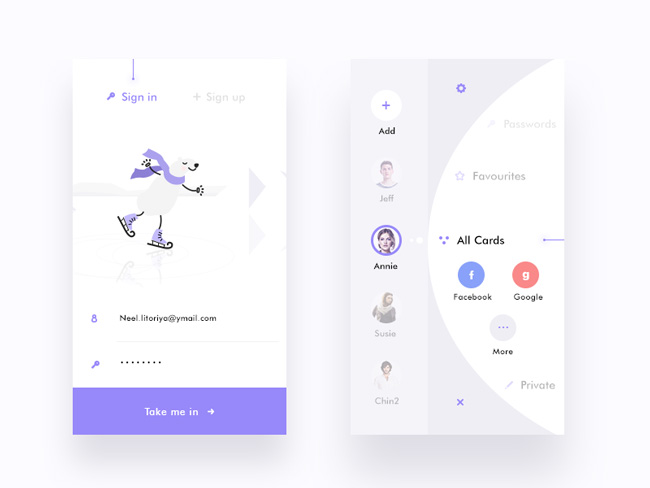
The main difference between a mobile app and a mobile site is that an app enables the user to be constantly logged in. They also benefit from high personalization and convenience that is build up with their transaction history, behavior, and other details.
But, it is advised to postpone the need for a sign-up as long as possible, to a point when it is absolutely necessary, for the user to have these values.
Mobile Users’ expectations from the interface
Every action or command must be tap-able, easy to reach and notice.
Images and graphics must load fast, or they should all together be excluded from the mobile experience.
Every option needs to fit in the general context. You need to clearly point where can the user go next and what can he expect, and also the user shouldn’t be required to know and use every possible option.
Your app must follow up on all mobile devices functionality, like calls, mapping, and other.
This integration needs to follow already established patterns that are easy and already accepted. The average mobile user’s attention span almost equals zero, so if something doesn’t work the first time they try it, the user is most likely to quit.
Ending thoughts
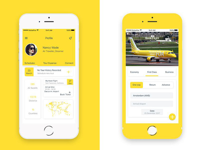
Major updates in design can cause a backlash, which is why they are risky. But, on the other hand it is definitely bad not to address certain interface problems and fix them.
Good project management combined with wise UX methodology can keep your app updated without causing any user discomfort. It is a good thing to invest just a little extra time and effort into user testing and it will definitely pay off in the end.
When users use a different device to access a familiar site, they expect it to work and look more or less the same as it was before, but at the same time they do want it to be tailored fit for the device they are currently using.
If you can satisfy a device specific user’s expectation, you will thrive and enjoy user’s loyalty, providing them with good experience.
Plainly put, everything is important, from a good desktop experience to a good mobile experience, but as you can see they are often not the same thing.
You must adapt to the way users feel about, interact with, and use their devices.

