

Designing is undoubtedly challenging. Designing for the multi-screen world is way more challenging than designing for the single screen world. Problem is multi-screen designing is not optional, but a must.
A large number of people use two or more screens. They expect to access relevant information on every screen. While some screens are more suitable for online purchase, other screens are optimal for information gathering.
A designer needs to understand the priorities at the time of developing a site. If he’s working on an online shop, then his priorities are product experience, progress in payment processing notification and shopping cart.
Here are some of the multi-screen design challenges:
No target audience
Before commencing the work, a designer asks for the following information:
– The business/industry
– The theme
– The target audience
Pinning on multi-screen target audience is impossible because there’s none. Almost everyone these days has a PC at home and a mobile device inside his pocket. What’s more is the emerge of IoT is making offbeat devices Internet-enabled. Very soon people will access Internet via wristwatches, eyeglasses and camera.
Automation tools can help, but to a very limited extent. Tools like Hubspot, Marketo, Getresponse, etc can offer a granular view of the incoming traffic as well as the devices they are using.
The tools can be used, but the insights offered by them are of little help as visitors can switch between devices.
Because there’s no target audience, there’s little input. Designers have to speculate design elements in regard to every new device, and they have to do it themselves. Had desktop users been essentially different from Smartphone users, their job would become very easy. But the same person changes his preference as soon as he moves to a new device.
No consistency in interface
Two devices have two completely different interface. However, the renderable site/app is the same. Let’s see what options a designer has. He can leverage responsive design. RWD (responsive web design) loads UX elements depending on the screen size and other specs of a device. The display remains the same irrespective of the device being used.
However, challenges arise that designers find difficult to handle. One challenge is difficulty in spotting a hyperlink. Because smart devices have small screen, users find it difficult to identify hyperlinks. The only way to fix it is to highlight the hyperlinked area exclusively on small screens.
A rule of thumb for UX designers is to keep a gap between each end of the viewport and the screen. But IoT devices have screens that are so small that keeping such a gap is almost impossible. Designing a unique site layout for IoT and not-IoT devices could be highly challenging for designers.
Smart TV
Even though a new phenomenon, Smart TV is quickly gaining momentum. The burden of complex design process, however, fall on a designer’s shoulders. The key challenges are:
– Integrating ads
– Distance between TV screen and users
A Smart TV features content items of different format. The size of images can greatly vary. Most importantly, the texts, spacing and other font elements, as well as interactions require a design approach that’s totally custom. It’s difficult for designers to adopt such an approach unless they are super creative.
They also lack technological support. On an average, the distance between TV and viewers is 6-feet. Due to this distance, the size of the pages is irrelevant. What’s important is the objects on the page. Responsive design doesn’t offer any help in this.
Ads on Smart TV are different from ads featured on any other device. Ad content is not developed in accordance with the responsive approach. That’s why integrating it into fluidic responsive layout is a challenge for designers. The difficulty increases as designers have to retain the dynamicity of Smart TV ads.
Conversion centric priorities
The designer cannot adopt a screen-agnostic approach. He has to prioritize one screen over another.
Why so?
Because some screens outperform others when it comes to conversion. Many marketers report ease at progressive profiling for lead generation for desktop traffic. On the other hand, handheld traffic scores higher in other areas. See the infographic below:
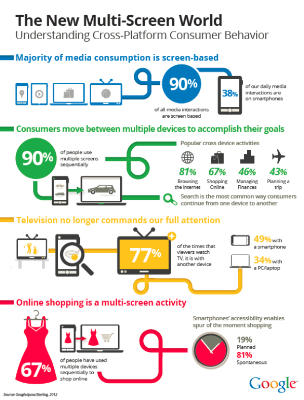
The infographic shows online shopping to be a multiscreen funnel, with Smartphones at the end. Alongside, 77% of time viewers watch TV with their handheld devices, meaning they can access Smart TV content via their mobile phones at the same time.
Smart devices trigger spur of the moment shopping, aka spontaneous shopping or unplanned shopping. It makes up a sizable percentage of online shopping. Prioritizing it translates to prioritizing Smartphone screens. This could make desktop users feel they are left out. Normally, traffic comes from a variety of sources. But traffic that easily converts may be accommodated by a selected number of devices.
Understanding the content
This is probably the hardest part. UX designers have limited understanding of content. They rely on quick fixes. Designing for the single-screen? Use lorem ipsum script. Designing for Smart devices? Use responsive design.
However, with increasing importance of content, we now come across various forms of it. Not all of them are text-based. Some are quite radical, such as real-time infographic. More importantly, visual content is slowly taking over the non-visual realm. Infographic, explainer videos, etc are all products of this trend.
This trend puts designers at a loss. Before developing a layout, they have to speculate all the visual aspects of design. Most of them are okay with it as long as they understand content. But handheld apps and their many variations, some may be GPS-based, some gaming and some social networking make their job challenging. The funny thing is such apps may not show up when they site is rendered on desktop devices.
To apprehend the uglier side of the challenge, understand that IoT devices are sensor-enabled. Content, especially interactive content – if it ever makes way to IoT, then designing suitable UX elements and navigation would be highly challenging.
Summing it up
The multiscreen world will expand. The challenges discussed here are real. The design community is doing their best to overcome them. Hopefully, they will come up with workable solutions to overcome them and content delivery across devices will be a smooth experience for all.


