
Every design work has its own requirements but typography stays as the main component across all projects. Regardless of how good you are at designing digital graphics and websites, there is always something new to learn along the way. Every font has its own set of characteristics and personality. Selection of a right font is crucial to the success of every design project, and if done correctly will go a long way in creating visual harmony, balance, and design unity. This makes the process of font selection an important skill that every graphic designer needs to master. Here are 10 important tips to enhance your typographic knowledge, while pairing the right fonts to boost the appeal of your artwork:
1.Invest Time & Search Around
Find the right font for design projects takes a lot of time. But, do not succumb to the idea of using the same few fonts over and over again to save time. In fact, invest time in discovering new font options to use the ones that can have a powerful impact on the entire look of your design.
2.Stick to One or Two Fonts at Max
3.Choose Typeface According to Project Theme
Fonts are used to portray meaning behind a message. Select a font which blends according to the personality of the business theme. Similar to images, fonts have the power to strengthen a message. A font must always exhibit the meaning of a message, its mood and characteristics.
For instance, classic fonts such as serif, Adobe Garamond or Baskerville are recommended for a sober look. Use San Serif fonts like Roboto, Futura and Helvetica for a light and modern appearance.
4.Do not blindly follow Trends
Do not blindly follow the typographic trends. Gotham is an excellent font but is not recommended for everyone. It is always good to stay on top of the design trends, but relying heavily on trends will not turn your work into the greatest art piece. Instead, search the internet to try and test a few new fonts to see what looks great.
5.Use Contrasting Fonts
 Contrast is another main graphic design principle. Any design with a perfect contrast looks clear and pleasing to user’s eyes. By varying the font details such as forms, weights, and styles with different colors, you can create easily create a contrast. Also, use fonts which add to the contrasting look.
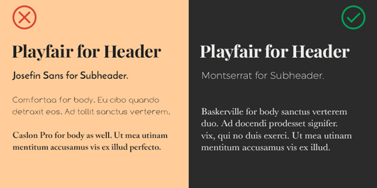
Do not use similar typefaces to achieve contrast. These are not only difficult to differentiate but are also confusing for the readers. There is a simple tip to font selection. Use two font faces and place them side by side to each other. Squint to see if the fonts look the same or different from one another. Also, do not go for a huge difference between typefaces, as this may also create a visual imbalance in your overall design piece. Stick to slight differences to achieve harmony and unity in your design.
6.Must be Legible
Although it sounds like a simple tip, yet many designers ignore it. Using black on black with a tiny and super-slick font may look amazing but the goal is to make everything easy to read for the users. What if doing so makes it difficult for the user to understand and read the message? Always use combinations which are legible first and then go for the visual appearance.
7.Learn to Differentiate between Serifs and Sans serifs
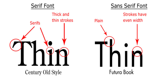 A serif with a sans serif is one of the most common typeface combinations. Doing this saves time and also helps to achieve a good contrast between letters. As mentioned above, do not use fonts that look too similar or too different and create a proper Serif and San Serifs combination.
8.Make Your Typeface Breathe
Use character leading, kerning and tracking to ensure the messaged you have typed can be digested and read properly. Whether you are designing a logo or something else, do not stick with the default Type settings. In short, make sure what you have written does not look either too cramped or cluttered.
9.Browser Compatibility
Browsers are always changing. Select a font which is compatible with the latest browsers on desktop and mobile devices. Google fonts are a good option to try in your project.
Bottom Line
Typefaces and fonts are essential to creating a strong, distinct and unique design. They can either break or make a design. Follow the above-mentioned rules to make sure the typography in your design work stands out.
Author:Muneeza Shahid is a passionate blogger and Full stack designer at Medialinkers who likes to review the latest technology updates. She has been writing on the SEO, graphic design and wordpress topics for the last 4 years. Follow her on Google+.


