
Minimalism is in full force in the web design industry, and rightfully so, since consumers are more willing to purchase items or services when they aren’t bombarded with useless information or graphics. It’s tough trying to figure out whether or not your next design should have a minimalist approach, since sometimes it just doesn’t fit with the brand’s purpose.
However, that’s why it’s nice to take a look at some inspiration before deciding.
In fact, the folks at Designbeep provide an article that lists some inspiring web designs with several minimalist components. Make sure you take note of the techniques and tactics you notice while scrolling through those examples. It may seem like the sites in that article take minimalism to the extreme, but we don’t expect you to copy them completely.
Instead, try to understand what makes those sites standout, and how you can incorporate bits and pieces of those designs into your own work. It’s also not a bad idea to check out this Smashing Magazine article, which details the overall principles of minimalist web design, including:
- The principle of “less is more”
- Omit needless things
- Subtract until it breaks
- Every detail counts
- Color minimally
- White space is vital
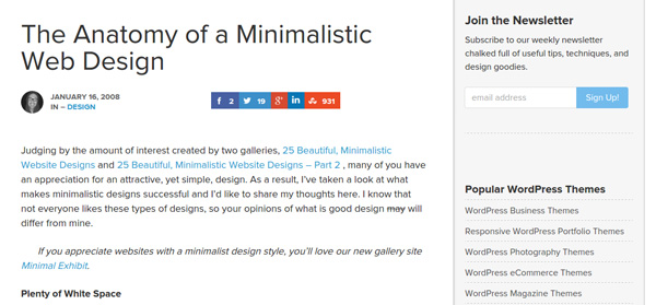
Once you’ve browsed through some inspiring designs, it’s time to understand exactly what’s contained in a minimalist site, so I’d recommend checking out this article, which details the anatomy of a minimalist design.
Do You Know How to Implement a Minimalist Design?
While choosing whether or not minimalism (or what level of minimalism) is right for you, it’s essential to see if you truly know what we mean when talking about this type of format.
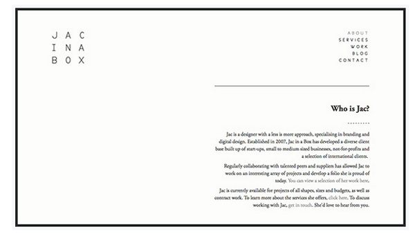
To start, a minimalist structure almost always takes advantage of negative space.
This negative space serves to manipulate the user’s flow, hopefully pushing them to the pages that sell the most. However, negative space doesn’t only mean that you should insert a bunch of white space in your design. Not only is this space calculated and meaningful, but it doesn’t have to be white. The idea is to focus on a single color for this negative space, and you’ll often notice that the most popular options are black, grey or white. Yet don’t be discouraged if you’d like to use a different, yet lighter, color.

What are some other components of minimalist web designs that you should know about?
- Minimalist designs use vivid and large images.
- It should have a focus on bold and dramatic typography.
- It takes advantage of contrast.
- The navigation is insanely simple.
- The ultimate goal is to achieve visual harmony between all of your elements.
Do You Know Why Minimalism Helps Sell?
As a designer, you are trying to use your creativity to either help yourself sell more or to assist another company or individual who wants to utilize your designs for selling. That’s the ultimate goal: To move more product.

Why is it that minimalist designs sell so well?
First of all, a minimalist format ties into your overall marketing strategy, since it forces you to polish your message. There’s a strong chance that you’re trying to cram too much information down customer throats, so a minimalist layout helps mitigate that problem.
In addition, you can take away the clutter that prevents users from converting. Some elements on a website or mobile app are simply useless, or distracting, when it comes to selling products or services. With so much negative space, your design gives customers room to breath and move around. Navigation is much easier, and the sophistication level increases.
Finally, a minimalist design helps you display your unique selling proposition, which ties into your message, but it’s usually harder to explain with just a few simple words.
Seeing if Minimalism Fits Into the Brand You’re Designing For
Minimalism is a type of sculpting through subtraction. It’s not about how much you can add to reach perfection, but rather how long it is going to take for you to reach a point in which nothing else can be taken away. You want to chip away at that stone and clear it out until only the essentials are there.
However, a problem often arises with this type of view. Most designers have clients, and many of these clients don’t want to cut out everything. Therefore, you must obviously abide with what the client wants in order to make your money.
However, it’s also worth mentioning that an ultra-minimalist design may not actually be the best solution for your own brand, or for a client who is vying for that ultra-minimalist look. Let’s say you run a software company with twelve software package solutions. Maybe the software helps golf courses run their POS systems, and the packages are rather complex.
Although your initial landing page may seem minimalistic, at some point, customers are going to need details on what the system actually does. But once again, the first step is trying to make a sale, so minimalism should have a strong presence in the first few steps.
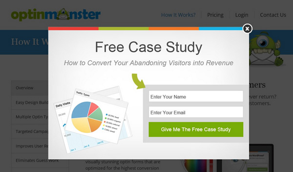
Some might argue that items like pop ups and sliders have no place in the minimalist realm. However, these tools are wonderful for lead generation and for bringing back customers, so it would be silly to get rid of them. This is another example of where you can potentially throw out the rules for minimalist design, since sometimes you just can’t sacrifice necessary tools.
Over to You…
Now that you’ve had a chance to see how minimalism works, and how it can benefit your designs, let us know in the comments section below how often you attempt to include minimalist components in your designs.
It’s pretty clear that most often a minimalist design is the way to go. That’s just how the industry is going, and it’s how customers want to see design. After all, when someone goes to a site they are looking for a product, not a full animated presentation with ads popping up and crazy typography. Regardless, share your thoughts below and tell us what minimalist jobs you’re working on now.


