

2014 has seen the popularity of typeface trends to increase. Typography – an old school and banal method, used by the low wage employees in printing houses back in the days, has suddenly turned into a highly sought after trend in the web designing industry.
Typography is not a coding necessity; it won’t optimize your website or make its navigation more user-friendly. But it is still on the focus and that’s chiefly for its emphasis on content. Content is currently at the focal point of the web marketers and anything that swings around content, begins to hold importance simply at its face value.
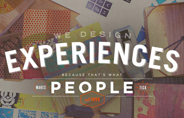
Typeface trends experiment with font size and type; some of them are remarkable and make the browsing experience incredibly alluring for users by highlighting the aesthetic side of the fonts. The font size could be upped or the letters may get outstanding clarity; altogether, the readability of the content gets amplified, which make the content marketable.
2014 has been smooth for typography. But what about 2015? Will all the relevant trends of 2014 continue to retain their importance or the focus move to any new trend? We’ll find the answers to these questions in the paragraphs below.
Mix and match typography
This trend originated from designers arbitrarily mixing and matching fonts. Started out as an experiment, this trend soon attracted attention from designers. The best thing about mix and match typeface is the way it assimilates different fonts. A combination of stylistic fonts can do wonder for a website.
In the year to come, mix and match typography will see an increase in importance. Many sites are already displaying an assortment of several matching yet different fonts. In 2015, this trend will receive even more emphasis with the invention of new matching fonts and their mixing.
Handwritten fonts
This trend gets the downvote. It has been mildly popular in 2014 because social media users were communicating with each other using handwritten fonts. Content illustrated by handwritten fonts look stylish and personalized. But handwritten fonts don’t go together well with business websites, blogs, case studies and white papers. They may be applied in newsletters, but otherwise, all other content formats with them look quirky.
Handwritten fonts will continue to exist in 2015 just as it was existent in 2014. But their importance for websites other than the ones with excessive embellishment will shrink. A theater group might use handwritten fonts in its billboard ad or newsletters, but that’s it; a corporate blogger won’t give two hoots about setting up his website with fonts written by hands.
Responsive typography
Responsive typography is all about making different fonts readable across different screens. You may have to use one family of fonts for headers, rendered on desktop screen and another type for smaller displays such as mobile handsets. Responsive typography can pull that through.

Another consideration is the line length; the optimal length of a line is 50-75 characters. If the content is to be rendered on desktop screens, then you have the leisure to select a font that makes 50-75 characters fit in one line. But if it’s a small screen device, then don’t select the width for the text content area and allow the typeface to spread across the screen’s width. There are specific media queries to make that happen.
The responsive trend has literally reshaped the web designing industry; responsive typography is an offshoot of this trend, and it has already been accepted by the designers. In 2015, it may become the most dominating of all typography trends.
Flat design
Flat design has been in the background from 2013. In 2014, it has managed to make its way to prominence. The bottomline of flat design is simplicity. Sites with flat design are simplistic and prioritize function over form. Flat design relies on a minimalist approach; it steers clear a website from design jargons and fills it with sharp edges, flat illustration and open space.
Flat design is among the trends that will see their importance growing through 2015. Users nowadays don’t like websites that are staffed with ornamental design elements. They prefer sites that are easily browsable and whose design elements and content are comprehensively in sync with each other. More so, when accessed from handheld devices, sites with flat design load very fast. Smartphone users can’t wait for a site to load because they browse the web on the go. Flat design with its minimalist approach provides them with precisely what they want.
All the four of the hitherto discussed typography trends have been on the spotlight all through 2014. Even handwritten fonts have been used on a number of websites, mostly experimentally though. But as we’ve speculated in this article, it’ll very possibly fail to retain its importance unlike the three other trends.


