Web design, like the other fields of online marketing, has also experienced several transformations during 2014. Some of the older ideas worked, so did not. Some new ideas are expected to emerge with time. Several new web design trends are expected to emerge in 2015. So, the year is expected to be an interesting one from the web design front when an amalgamation of old and new is likely to take place. Here’s a quick look at the trends that are predicted to rule the web design world in 2015.
Images will Rule
A picture speaks a thousand words. Sure you have heard this a thousand times as well. Yet, this old adage remains true to this day. It’s still easier to convey through the images. So, that’s what you are likely to see in web design in 2015. Images in web design will remain important in 2015 as well. In fact, their significance is expected to increase a great extent.
The home page of most of the websites are going to have large images. However, there needs to be a proper break for the images on the home page. Only then they are going to be effective and impressive enough. In fact, the images should end at the break and from there, the content for the page should begin.
Typography will be More Important
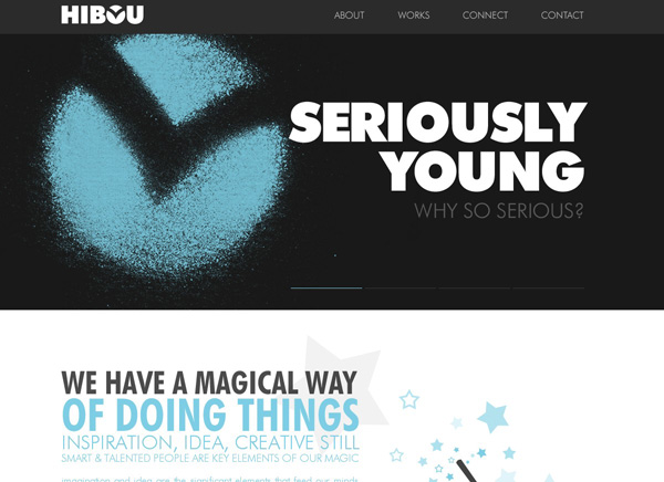
Did you know the fonts that you use are so important? Yes, that’s what is in store for 2015. There is expected to be increased stress on typography in web design. Earlier, the type kits that would help website owners use different types of fonts for their site were quite expensive. So, not everyone could afford them.
But with time, the prices of these type kits are becoming reasonable. In fact, several designer fonts are even available free of cost now. Hence, more and more websites are making use of these fonts. So, the designers will have more flexibility in using the fonts. It is sure to add variety to the websites to a great extent.
More Dynamic Background with Images and Videos
The backgrounds won’t be dull colors anymore. They won’t only be simple pictures. If you want static backgrounds ang big background images,look for images that are sure to attract the viewers at one go. Large, vibrant, and beautiful images are going to be the priority now. And the images should be arranged in the most conventional ways. This would help the pages attract viewers’ attention without fail.
But there’s going to be more to the background designing in 2015 than including attractive images. Web design is expected to become more dynamic in 2015. And website backgrounds would reflect that too. Most of the websites are likely to include videos for backgrounds. They may not be something overtly promotional, but simple HTML videos. They will run on a continuous basis on the background of the web pages, thus attracting the attention of the viewers.
Both the videos as well as the bright pictures in the background will add some dynamism to the web page.
The Less the Better

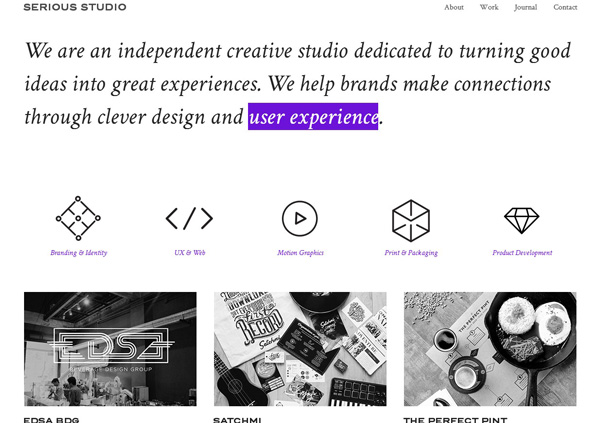
Gone are the days of websites with innumerable images and text. It’s time for minimal websites where the white spaces also play a major role. In fact, the more the white space, the better the performance of the websites. This is going to help the websites be more elegant as well. So, most of the websites are now going to embrace minimalistic web design. The objective is going to be simple: to convey more through less. So, the flat design, which gained ground in 2014, is expected to be in vogue in 2015 as well.
Responsive Web Design will be Imperative

Responsive web design has become an extremely popular term in 2014 itself. A large number of websites have already shifted to this form of design. The trend is expected to continue in 2015 as well.
In 2015, more people are likely to use internet-friendly mobile devices. They are going to view the websites more from their mobile devices than from a desktop computer. So, responsive design will become almost imperative. And websites are expected to embrace responsive web design with an aim to remain relevant.
Interactivity is a Necessity
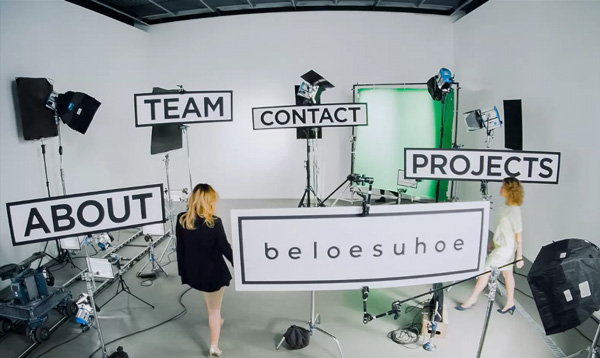
Engage your audience! Well, this is something you must have heard a million times. But how can you do that? The best way, of course, is to interact with your audience. And for that, you will need to an interactive content and design. Share stories with the viewers. Design your website in such a way that the viewers are offered enough opportunity to become active while visiting the website.
Interactive Websites through the Tile Look

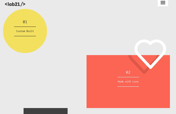
Even a few years back, neither the web designers nor the website owners would think of this kind of look for their website. But then came Pinterest. And with its immense success, the type of design it has followed also became popular. A large number of websites now have the tile look. And this also ensures interactivity, as the viewers need to click on the tiles to continue viewing the website.
Parallax Scrolling will Add Fun

With more and more people viewing websites on mobile devices, scrolling is going to be more prominent. There will be less clicks now. And there are going to be different forms of scrolling too. Among them, parallax scrolling is gaining ground fast.
Want to tell your story in a single page of the website? You need to depend on parallax scrolling. In fact, this is going to be one of the most popular trends among the web designers in 2015. This is the form of scrolling where the background images of the website scroll slower than their foreground counterparts. So, this is likely to add some fun to the website. But make sure you stay away from infinite scrolling.
Hand Drawn Images to Surface
When it comes to the artistic renditions of different icons and other parts of a website, hand-drawn illustrations are going to become more important. Along with the photos, they are going to be the major parts of the websites in 2015. Big, bold, and attractive – that’s what the fonts are expected to be in the websites. But wait, this form of design is not for all. This renders a bit of informal touch. So, if you are planning to create the website of a formal corporate organization, it’s better to stay away from this.
The last quarter of 2014 has already begun. And it’s time to be ready for 2015. The web designers need to follow these web design trends to remain relevant and competitive in future.


