When you are hired for a graphic design project, there are several ways to go about it. One, you can tuck in all the input client gives and simply remain true to what they expect from you. Two, you take the design a little beyond how client envisions it. Or, three, you inject a whole new level of creativity and imagination to the design, which may not look like what the client has envisioned, but it surely fits the brand message just perfect.
And when it comes to designing a logo, the process follows the similar tone as above. Now, if you happen to be a designer entrusted with the responsibility of designing a company’s logo, how do you go about it? Let’s help you out a little with this tips:

What Message is the Brand Vying to Send Across
There may be a million brands for LED televisions, but each one of them has an individuality and a unique brand value. And this brand value also comes from the company’s history. What you got to do on your part is to run an extensive research on the company’s past and present, while getting an understanding of what direction it is likely to take in the future. Your logo can be a mix of brand’s past and present, and if there is any room, you can inject an element that describes the way forward.
Add Your Unique Flair to the Conventional Typefaces
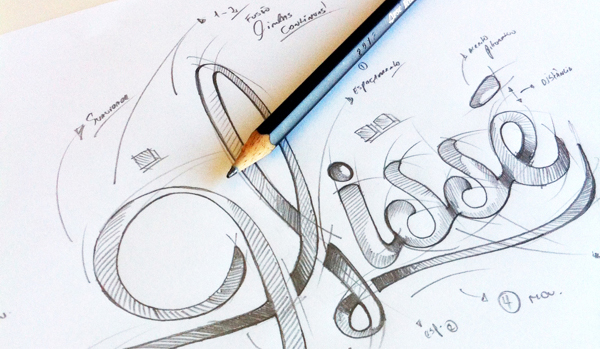
Graphic designers are among the most creative souls on planet earth, and it is only natural that they let their artistry drip on to every design they ideate and create. That said, when you are designing a logo, there has to be a restrained approach to your endeavor. Logos are part of a corporate entity, and they have to be subtle while they are unique. So, while you choose a font that looks different, do not pull your foot off the conventional paddle.
Add a Right Mix of Colors and Effects
Those fancy effects and colors sure make your logo catchy, but when the need is to be minimalist, or colorful in a more subtle manner, do not flood the logo with too many colors. Use only the effects that look different, not extravagant.
Don’t Let Clutter Creep in
one of the mistakes that even the biggest of designers sometimes fall prey to is not making their logo as readable as it should be. The letters in the logo are cramming for space, which leads to the readers squinting their eyes to read the logo properly. And this is what defeats the whole purpose. When you are selecting a typeface, do bear in mind that the user should not be made to struggle, even if momentarily, to read the letters. The patience runs pretty thin with just about everyone, so if you are making people spend an extra second just to read that logo, you aren’t indulging them, instead you are testing their patience. Also, make certain that you do not use those corny clip arts. The clip arts, believe it or not, are used by many designers for logos, and it is one practice that needs to be get done with as soon as possible.
Steer Clear of the Stock Fonts
When the purpose is to stand apart from the competition, using stock fonts may not serve the purpose that well. The fonts that you find in Photoshop are hackneyed now and there is no dearth of alternatives you can find for the fonts. However, when client clearly puts forth their expectations on the table that they want a Times New Roman or Calibri, there isn’t much you can do. But, you can try and suggest them to go with something that is a little less common.
Do Not Use too Many Fonts
When you don’t want your logo design to be coming from a novice, keeping the font-number in a single logo to minimum is recommended. The diversification it might add to the logo isn’t desirable and even if the logo stands out by the virtue of multiple fonts, it won’t stand out to impress. Moreover, not every font suits a particular brand message.
Add Your Own Flair to it
Now, we have already suggested that you must show some restraint to your design, but you don’t have to restrict your artistry to an extent that the logo looks bland. Carefully ensure that the logo stands out in terms of its color, effects and font, while making it readable as well.
Don’t Ignore the compatibility of the logo with different mediums like T Shirts, mugs, etc.
As a part of its franchise, companies often use logos on the free mugs and T Shirts it distributes among its employees and customers. So, when you are creating a logo, you need to keep in mind that it should adapt to the different mediums.
Steer Clear of the Standard Mistakes
Logo designing mistakes are made in abundance, and they indeed prove to be major hindrances to a company’s endeavor. Here are a few such mistakes:
– Not being original
– Creating oversized logos
– Not paying attention to the client brief
– Mishmash of a design
Once you get down to crafting a logo with these considerations in mind, do not hesitate from pushing the envelope.


