
Aren’t the demand for advanced business techniques are gradually increasing day by day to upsurge the lead and the sale? Every business, including the online businesses wants a new innovation for their website. For instance, every eCommerce business wants a mobile version of their website .One design for the BlackBerry, one for the iPhone, iPad, notebook and what not. The list never ends and so the madness. In the field of web design and development, it is becoming a little difficult to keep pace with the endless new resolution and devices.For the designer, creating a website version for each and every new device is almost impractical. So would the businesses suffer from losing their visitors? Or is there any other option?
Well, of course, there is an option!
Responsive web design is the approach that suggests that any design and development should be responding to the consumer behaviour and the environment based on the platform, screen size and alignment. As the user switch from the laptop to iPad or iPhone the website should automatically alter to accommodate the image size, resolution as well as the scripting capacities. To make it simple, responsive web design enables a website with such technology that automatically responds to the user’s preferences. It capitalizes on the optimal view of customers with an outstanding designed website. Most importantly, the user has an incomprehensible privilege of viewing any website on their favourite devices without compromising on the quality. Isn’t this a great option for the business sector? (I am sure, it is)
Nowadays, the entire commercial industry is quite dependent on responsive web design, especially, the eCommerce industry. Owners of different eCommerce business are independent simply because of Magento.Magento is one of the major backbones for the eCommerce business.
Every web store makes the utmost use of Magento because of its flexibility, simplicity, user friendliness and easy accessibility in the market. While most believe that it is the outstanding performance of the Magento which makes it distinct from other platforms, however, they fail to understand the designing factor behind its popularity. A website with creative and useable design would definitely fetch more customers and huge benefits along with it.
The Magento stores are thoroughly becoming responsive in the designing industry. Magento theme designs are exponentially improving over the past few years. To get a better insight, let us find out, how the Magento stores are integrating responsive web design making eCommerce transaction reach the expanding audiences.
However, before knowing how to create a responsive theme for Magento, it is important to be familiar with the Magento files. Making a theme responsive is usually done through CSS3 media quires. As creating a Magento theme is time effective, therefore the best solution is to either download a blank theme or buy a theme to customize it accordingly. With the increase of different devices, responsive web design is the smartest way to ensure that the customers get an optimal experience irrespective of what devices they are on.
Magento responsive themes
It is essential to find the right responsive theme for Magento website.Before a theme is selected one must check the following features:
- Cost-effective feature
- Compatibility with browsers
- SEO friendly
- User friendly
- Quality of the theme
- Easy to install and set up
- It should provide 24/7 support
Some of the popular themes that can be downloaded or purchased are
BeautyShop
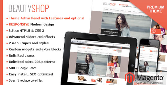
Theme Source
Dramming
 Best fits for Cothing store, cosmetics shop, flower shop, beautyful shop, hat store, apparel store, fashion store and any Magento store if needed an easy customization template. Compatibility: 1.5.x.x, 1.6.x.x, 1.7++
Theme Source
MetroShop
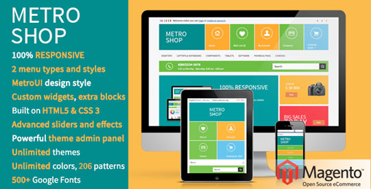 MetroShop is a universal 100% responsive Magento theme for any kind of shop with stylish MetroUI style design and powerful backend and it’s created with using the latest HTML5 and CSS3 features.
Theme Source
METROS
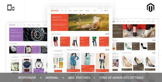 Metros is a clean, minimal, modern and responsive METRO STYLE magento theme with powerful admin configurations and bunch of features like unlimited colors,cloud zoom etc.
Theme Source
BigStore
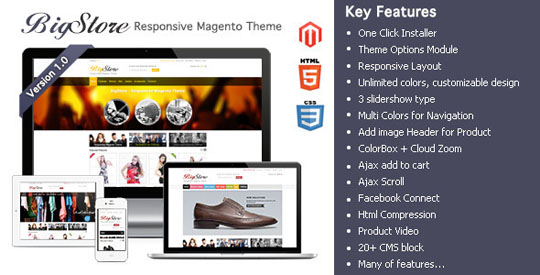
Theme Source
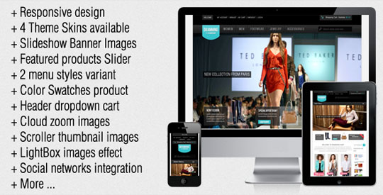
SportShop
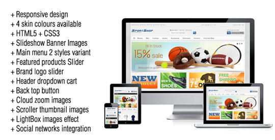 The theme is clear, easy to customize Magento template. Many new features such as slideshow powerful admin module, 2 menu variant Featured product slider, vertical product slider, brand logo slider, Dropdown shopping cart, back to top button, thumbnail images slider, Cloud zoom Images with lightbox extra links and blocks and so on.
Theme Source
Shopper
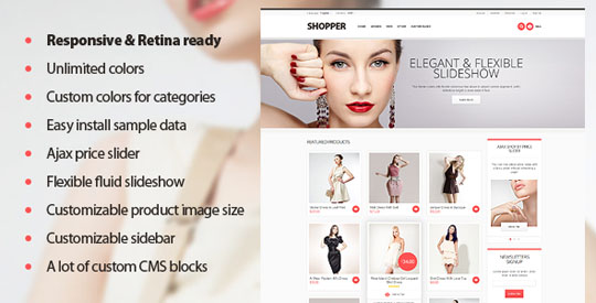 This theme comes with flexible colors control system which allows to control every pixel of your theme and set completely different color schemes for different categories. Compatibility: Magento Community Edition 1.6.x.x (1.6.0.0, 1.6.1.0, 1.6.2.0), 1.7.x.x (1.7.0.0, 1.7.0.1, 1.7.0.2)
Theme Source
How to make the Magento store more responsive?
One of the greatest ways to make Magento more responsive by designing is making use of Search Engine Optimisation. Since a single website is constructed instead of multiple websites for several different devices, the traffic will naturally get directed to one website, ultimately making it more convenient for the business owner. However, considering the following points would help to make the Magento theme more responsive:
– Adapting Smartphone, iPhone, iPad, laptops or desktops for enhanced response
– Making use of responsive viewer of the product or responsive front page slider
– Trying out a style which is contemporary and simple
– Trying out a browser which would be well-suited to the device
– Editing the social network sites to become more responsive.
The three important ways how users switch between devices are:
– Searching a content on a second device
– Directly navigating to the destination site, and
– Sending oneself a link via email to revisit later.
Hence, why responsive web design is the best choice for the Magento stores?
Easy to search and update: unlike other apps, which necessitate constant updates from the users, a responsive designed website is updated on a real time basis. The user does not have to modify anything from their end. The website will consistently function on any device. However, if at all any changes are made the users have no additional step to fulfil.
Reliable: responsive design allows a browser to deliver content rather than relying on a downloaded app.This mends the reliability of the web presence.

")


