

Logos are a unique marketing element that can speak for a company without words. So, once you see a logo about selling pizza, you’re sure to remember it at the right moment. And this means that the brand helps in the interaction between the buyer and the company, building a strong bond between them.
In addition, having a bright emblem firm can easily attract any client at least just to draw attention to it. So without a cool logo, your brand is unlikely to be successful. And if you also have it in one of the 2022 trending styles, your chances of success will increase tenfold!
Logo Trends 2022
Minimalism and originality, restraint, and playing against the rules – logo trends 2022 combine a variety of directions. And now we’ll get to know them closer.
Style of the ’90s
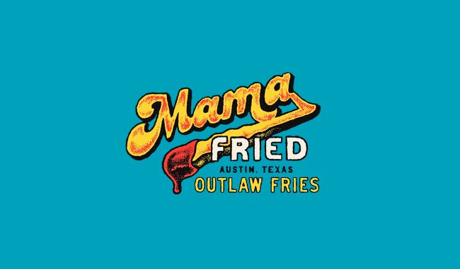
The last decade of the XX century was defined by many different genres and styles: from pop culture to grunge and punk. But one thing is for sure: in every subculture, there was a place for experimentation.
Today, trends of the 90s are back not only on the fashion catwalks but also in graphic design. This manifests itself in bright colors, abstract geometry, and whimsical patterns. For text logos, you can safely use non-standard combinations of fonts, bold shadows, and contrast outlines. This style suits brands that want to attract attention and are not afraid of innovation. Representatives of the trend – Trolli, Mr. Men Little Miss, Just Dance 2022, and others.
Negative space
Negative or negative space is empty areas in or around letters, images, and symbols. This trend is not new, but invariably relevant, because it is impossible to repeat the technique: it depends on the characteristics of each logo.
To use negative space creatively, think about how to integrate the symbol of your business between letters or inside one of them. This will help reinforce the logo’s message without making it visually complicated. Also, ambiguity attracts attention and makes you hold your gaze. Which means it’s better to remember the brand. Representatives of the trend – Criteo, Newsy, Festik.
Experiments with fonts
Unusual typography – is one of the ways to give individuality to a logo. By experimental font, we mean everything that contradicts the rules of traditional font design. It’s not necessarily something fancy or illegible. The main thing is the effect of surprise, as the different heights of the letters, ignore the kerning or unusual lines.
When applying this technique, it’s important to strike a balance between creative and marketing goals. Despite its creativity and uniqueness, the logo should convey the right message, resonate with your audience and remain readable. Otta, Lorenz and Olympia are trendsetters.
Layering of elements
This trend opens up almost unlimited possibilities: layering (or overlay) can be applied to letters, colors, shapes, symbols, patterns in different combinations. This method makes any logo unique: that’s why the trend hasn’t given up its position for several years.
Overlays make the image deeper and more three-dimensional, helping to set accents and show the connection between the elements. To use the overlay effectively, focus on the message you want to convey with it. Representatives of the trend – CupRus, Momentive, Izzi.
Bright colors
Going through hard times, people need more positive, so cheerful colors are very much in demand today. A bright splash works instantly: it makes a logo expressive and gives your audience positive emotions.
Adjust the brightness scale to quickly revitalize an outdated logo. Design the whole logo in a new shade, use it as an accent or combine several colors at once. The main thing is to make them evoke the right reaction in potential clients. Representatives of the trend – Fandom, DXC Technology, Weston Park.
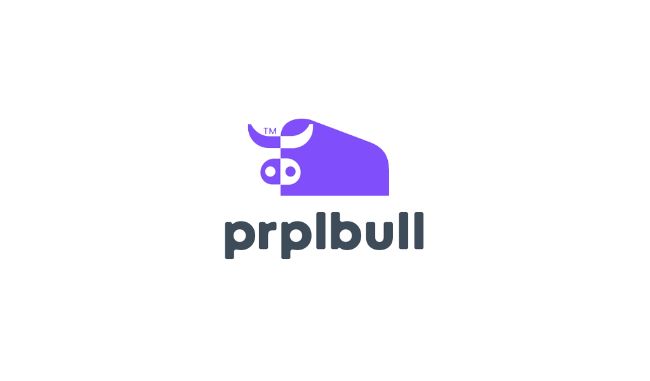
Laconic
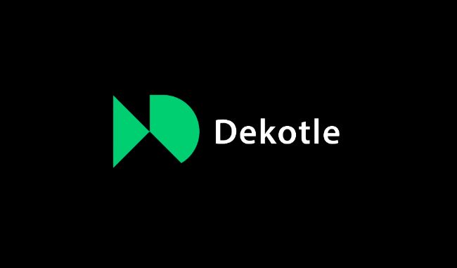
Minimalism is a universal trend, and that’s why it is still actually not for the first year. Its main principle is that less is more. Despite the simple geometry, typography, and composition, each element has a specific function or idea.
Such a logo allows you to quickly read the essence of the brand, it is easy to remember and recognize it. Technical advantages include the ability to display the logo on any media and in any size without loss of quality. In addition, a minimalistic icon is considered to be timeless, which means it will not require updating for a long time to come. Representatives of the trend are Yandex, Swivel, and Hungry Harvest.
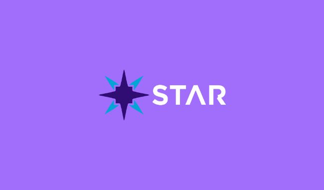
Geometric Figures
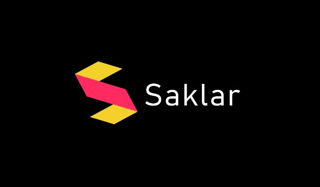
Simple geometric shapes – square, circle, triangle, line – form images that symbolize the business. The power of such an identity is in its pure simplicity.
On the one hand, the basic elements of geometry are associated with clarity, structure, and restraint. On the other hand, their combination allows for a creative approach to the process: the use of saturated colors and the creation of unusual combinations of shapes. Representatives of the trend are FRVR, Renault, Jotform.
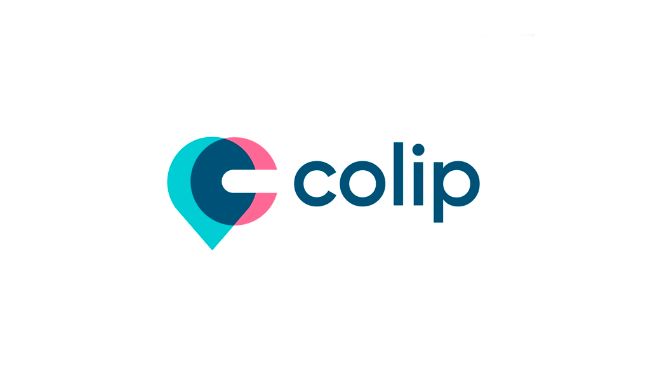
Tricks with signs
Another trend connected with exact sciences suggests replacing letters with mathematical signs and geometric shapes: for example, a combination of two letters “o” with the infinity symbol, and the letters “i” with a parallelogram and a circle. The additional accents can be set by picking up the right colors and fonts.
Work with signs – a way to quickly and easily modernize the identity and attract attention to it. Such logos look laconic and informal at the same time, making you look at them longer. Representatives of the trend – MOOC, KeyLoop, ZIP.
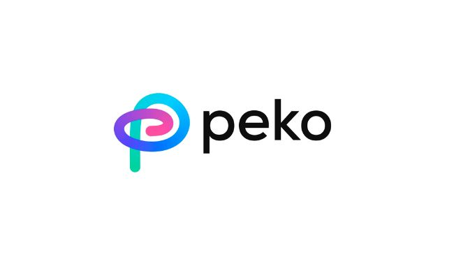
Gradient
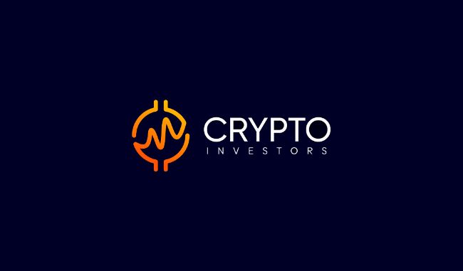
This trend develops every year thanks to digital technologies, which help to create unusual color transitions. Gradient allows one to fully concentrate on color and control users’ attention, adding depth, volume, and dynamics to a logo.
It is important to remember that the general rule for modern gradients is smoothness and delicacy. At the same time, the trend allows the boldest experiments. Color transitions can fill the entire logo or create accents in individual components: the symbol, the background, the inscription. The gradient can vary between shades of the same color or several contrasting colors. Representatives of the trend are Partymania, Payoneer, Canva.
Optical illusion
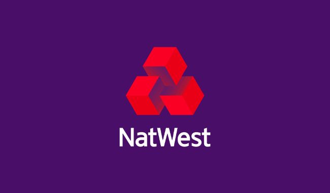
A good logo has several levels of meaning and shows: The simple shape is not always what it looks like. When the parallelepiped turns into an “m,” it’s an optical illusion.
On a visual level, working with shapes, colors, and perspectives in a logo creates a three-dimensional effect. And on the semantic level, it makes people see such images differently than “flat” logos. The creation of optical illusions creates unlimited space for expressing meanings and helps to remember a brand better. Representatives of this trend – Unity, NatWest, MajorKey.
Conclusion
To succeed, brands need to be flexible and adaptive, including in the creation of corporate identity. Whatever your business, you can find solutions for yourself among the 2022 trends. Don’t forget that you don’t have to blindly follow design trends or radically change your logo: find ideas that work for you and think about how to integrate them into your identity.


