In the past year, just like with everything else, web design trends have changed. Most of us keep updating our handheld devices with the current technology.
With these changes, our concept of what makes up good aesthetics and user interface also changes. With all this innovative technology, the need for a website to improve and adapt is imperative.
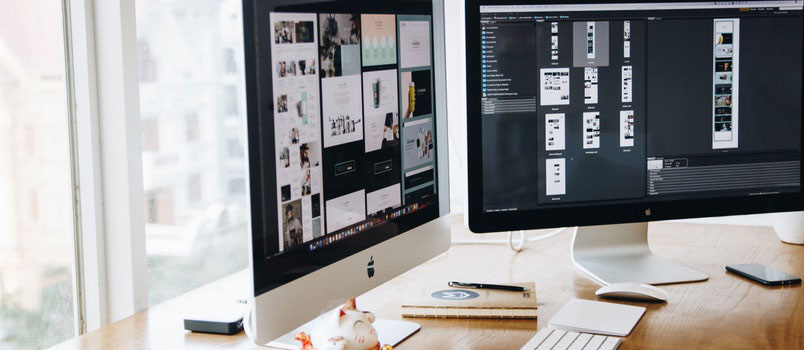
More consultants and developers are studying how best to improve a website. What was in trend and cool last year may be outdated and redundant this year. If you’re a web designer, I would like to share with you a few trends that you should definitely stay away from.
A hero image that is huge
First, let us find out what a hero image actually is. When there are a series of large images displayed on the homepage rather prominently, it can be considered as a hero image.
Like most trends, the hero image also tends to act more like a band aid when it takes over.
While you may feel that all you require is a good photo and a button, there is a lot more to it.
It is usually best to avoid the hero image taking up the entire space of the screen and confining the images to the top part of the monitor. There are some people who specifically request that their images be relegated to smaller sections.
If you focus on the imagery, the important content gets lost further down.
Graphics that look boring and unimaginative
It began with Geocities with every possible color being used. By the year 2007, sites like The Food Network made their presence felt with their 3D gradients, shadows and big buttons.
From there on, the flat design soon evolved. While the Flat design as a feature was supposed to be utilized sparingly, it became popular and filled up websites.
The main issue with a flat design is that it is difficult to find out where the button is. With everything blending together, there was little indication about where interaction came into play.
Websites that are non-responsive
Based on the device viewing it, a responsive web design will adjust the size of the web page. When they have trouble reading or navigating the site, visitors to the site are likely to move on.
This is more so when navigating a site with the tablet or the smartphone. Lately, sites that not mobile friendly are being penalized by search engines.
Autoplay Videos
When you use auto-play videos on your website, you may be discouraging visitors from content engagement.
It is not popular with people since it can be annoying, meaning you may be encouraging a high bounce rate.
Parallax scrolling
In the hands of a professional, parallax scrolling is good. However, when everyone else finds access to it, it can be a problem.
There was a time when it was used stylishly to add depth. However, today, with most WordPress themes, it is a standard feature.
That is why it has seen a lot of abuse. You may well ask; when is it a good idea to use parallax? For lighter websites, parallax is ideal as it has been found to be more fun with users.
While parallax does not need to be eliminated completely, a certain amount of restraint is called for.
